Comprehensive Guide to Web Design

Gurpreet Kaur
Design (UX/UI)
Published on 18 Dec, 2020
22 min read
The web has become a popular destination today. An average person tends to visit it plenty of times in a single day. From finding out the weather forecast to booking a cab or ordering in, you can do it all by exploring the different aspects of the web and enjoy doing so. However, have you ever wondered how our experience of the web is made enjoyable? A ten-year old and a seventy-year-old can find an equal sense of satisfaction through the umpteen websites they surf through, despite their different intellect, but how?
The answer lies in the web design. What is that? Web design is a process that continues throughout the life of a web project. It starts with planning and conceptualisation of the website, goes on to arrange its content online and continues with the production and maintenance of the sites.
This blog will try to cover every spec of the concept of web design, from its importance to its universal application to its principles. Before we get into that, let’s delve into the two categories of web design, which are adaptive and responsive websites.
Adaptive design
Like the name suggests, this kind of website design adapts itself based upon the device type or browser width. It makes use of a “user agent” that informs the server about the device that is in use, it could be a desktop, mobile or tablet and consequently shrink or enhance the screen size. In a different scenario, the design will use media queries and breakpoints to let the server know the version to implement, namely,1080p, 720p or 480p, offering much more flexibility.
Responsive design
The other option is to use a responsive design, which works with the proportion of container space taken up by a single element and shrink accordingly. If a header is at 25% space on a desktop site, it would remain at the percentage even in a mobile device. Like adaptive design, it also uses breakpoints to establish the need for the server and keeps changing constantly.
With that knowledge, I believe we are all set to commence into our comprehensive guide to web design. So, let’s start.
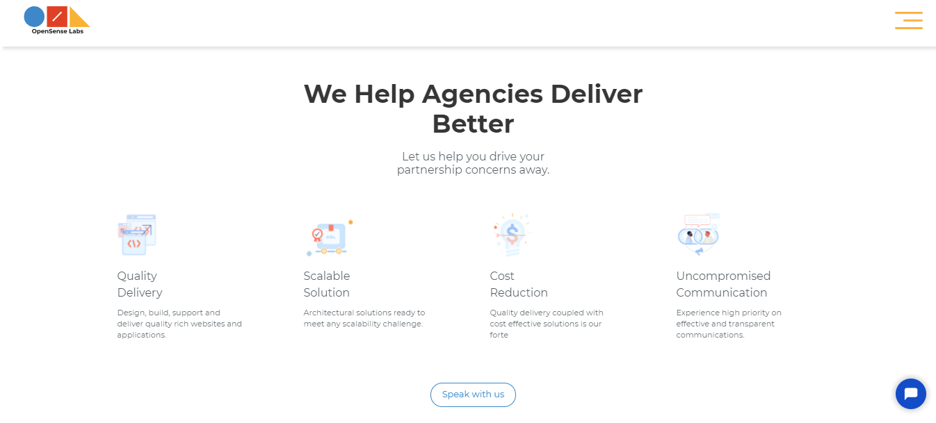
The Importance of Web Design
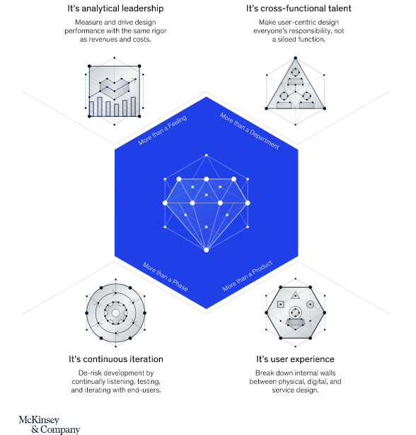
The image above clearly depicts the importance of design. Web design has to be idolised for business success through leadership, inclusion, continuity and user experience. You cannot confine it, it has to have free reins for it to boom.
Website design is indeed one of the major contributors in your online revenue. You could say that a good web design is directly proportional to a higher revenue. Now, let me let you why. Like I have said before, the web has become quite popular, people go on it regularly and check your company's online persona to see whether you are worth their time and money or not. If you are able to impress them with your design skills, you are bound to experience an impressive conversion rate.
In simpler terms,
- Design is important because it acts as the first impression of your business.
- Design is important because it creates a consistent brand image and encourages the user to put his trust in you.
- Design is important because it gives you an advantage over your competitors.
- Design is important because it enhances your UX, making the user’s time enjoyable rather than frustrated.
- Design improves your performance, reduces the load time and the bounce rate, increases the conversions and amplifies consumer service and satisfaction levels.
Let me exemplify this, today nobody would want to spend their money on a product that they haven’t researched thoroughly, be it a watch or a car. And where do people go to execute the research? Yes, to your website. So, if you answer all the questions the user might have in your product description and alleviate all the worries, the user will most likely buy from you. And all of this falls under the web design umbrella.
So, yes web design is critical for your website’s success, for your sales and for the longevity of your business.
The Prerequisites of Web Design
Before delving into the principles of web design, it is important to know how you would prepare for it. There are certain requirements of web design that need to be fulfilled before you can get on the floor with the actual designing.
Finding the inspiration
Being inspired is the first step of designing, after all can you design anything without inspiration? I think not. So, explore, research, get to the very basics and see what you like and what you don’t. Go to Pinterest, if you have to, but start looking. This would set a great tone for the entire designing project because you would have some idea of what the end would look like.
Finding the purpose
After inspiration, comes the part where to find your purpose. You are building a website, there has to be a reason for that. Identify it and design accordingly. Majority of the time, the purpose of a site is sales, be it memberships/ subscriptions or an actual tangible product. Keep the purpose front and center and design to capitalise it. If indeed you are selling a product, design the pages in a way that each page is an encouragement for the user to click on that buy button. Take Amazon for instance, every time I go there, either I make a long and extensive wishlist for future purchases or actually buy things. That should be the target.
Finding the needs
There are also specific needs that a website has before its design process actually begins.
- The first would be to establish your space on the internet through a web hosting service. Then you would need to adopt a domain name through which the users will identify you. Along with this, you would also need your domain name and server to be in sync, so that the browsers know where to find you.
- Next, figure out what structure your site would have, how many pages would it have, what kind of content those pages would include and which of those are going to be your landing pages for marketing purposes.
- Then comes the functionality, you cannot just wing that. Remember we figured out the purpose of your site in the previous point, that purpose would help you in figuring out the kind of features your site should and should not have. For instance, the functionality of an informational site is drastically different from an e-commerce website. All of this is decided before the designers go on the floor with the process.
Finding the tools
You cannot work without the tools, so finding the ones most suited for your project is a key requirement of web design.
If you wish to build a desktop app, then tools like Sketch and Photoshop are perfect for the designers as well as the developers to create the code for the designs. However, if that is not the case and you are aiming to build a site, then you can make use of Website Builders like PageCloud, Wix and Squarespace to name a few.
Remember to do your research and maybe even get a free trial before committing to any one of them.
Finding the personnel
To use the tools, you also need the right team. Designing websites is not a one man job, you need the right mix of skills to get the best possible outcome.
- Designers to create mockups of the site;
- User experience experts to ensure that the mockups align with the target audience’s needs;
- Developers to get the coding out of the way, the front end developers would take up the presentation layer, while the backend developers would work on the background;
- Content writers and SEO experts to write for the project and make it visible on the web through searches.
Now, you are prepared to get into the nitty gritty details of web designing.
The Principles of Web Design
Web designing is a long and complex process, there are a lot of considerations to be kept in mind before the process can be considered even half-way through. Here is how we at OpenSense Labs divide the process into different segments of development and ace every one.
Information Architecture (IA)
Through Information Architecture, designers are enabled to prepare an organised layout of the information that has to be relayed to the visitors; navigation and menus, being the spine of an information architecture. However, it is the user, who is the highlight, it’s his perception and expectation of the information that guides the architect to build the perfect IA.
Now, how does a designer achieve perfection? This is done by researching the user to the T along with focusing on usability testing. User interviews, card sorting and observing the way a user interacts with your current design through usability testing are the pathways you should be seeking. For instance, when a menu has been decided, a tree test helps the designers know its suitability. And that is IA for you.
Navigation
Navigation is one of the most crucial aspects of your design strategy, so getting it right is the first order of business. Navigation refers to the system a visitor follows to get through the various parts of a website. Since the aim is to ensure that the user goes as many pages as possible, it has to be simple, concise and pretty blatant. If a user has to put in an effort to navigate your site, you are certainly doing something wrong. The lesser cognitive load while navigating, the better UX. The visibility of the navigation bar is paramount.
So, how do you do that?
By putting the user first
First, you have to understand the needs of your users, at least a majority of them, and create a navigation bar based upon that. This would also help you get an apprehension of the user’s priorities, like how much he repeats a task. Also, the user must always know where he is, meaning the current page he is perusing through must be highlighted from the rest of the pages. Nobody likes being lost.
By embracing the search
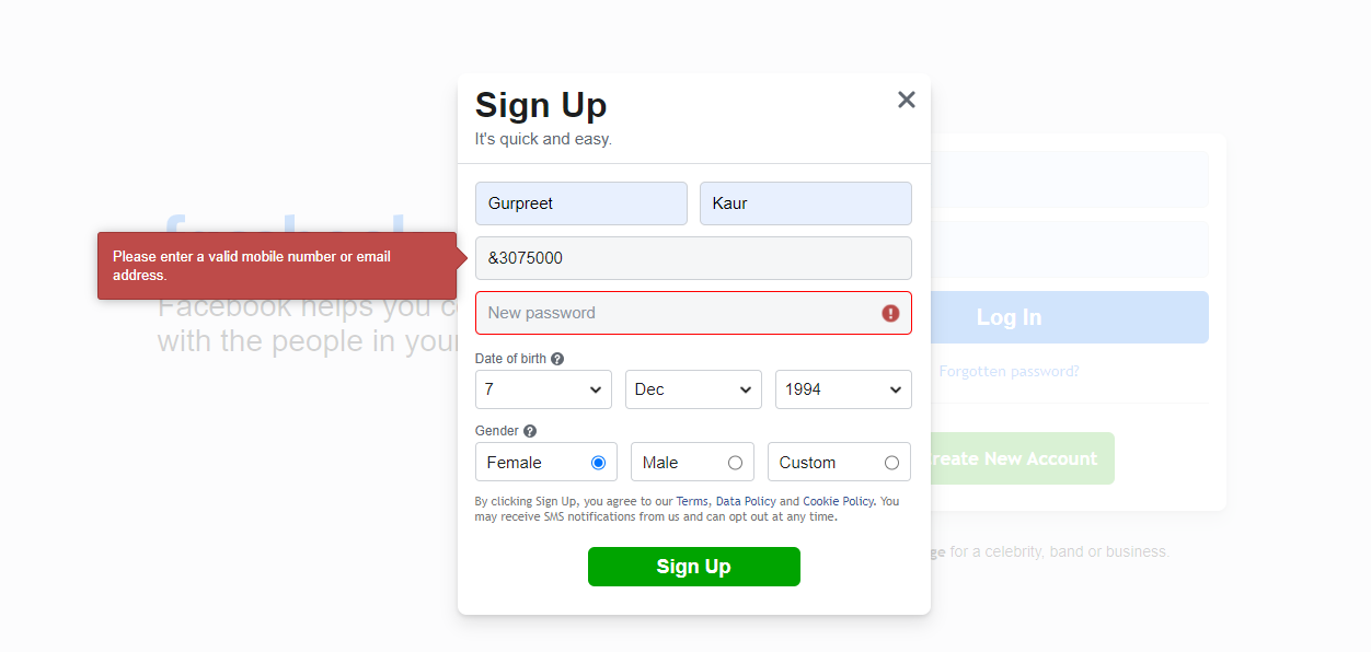
You must know that many of your visitors come to your site with a specific intention. So, how do they get to that? The search bar is the most obvious answer. It acts as a shortcut for the user to get to what he is looking for. Therefore, it needs to be front and centre. At the top of the page would be ideal, either left or right with a magnifying glass icon for added visibility. Can you imagine searching for a search icon? It also needs one more thing, a decent input size; you have to be able to see what you are typing into it. To get a perfect federated search solution for your website, read about Elasticsearch and Apache Solr.
By valuing the user’s time
This is in regards to the back button. Imagine a scenario, you were reading an article, a pretty long one at that, and half way through it, you saw an intriguing link, you click on it and upon returning through the back button, you are at the very beginning of the said article. Now tell me, would you be frustrated? I certainly would be. So, ensuring that when a user clicks on that back button, he is back to where he left is quite imperative.
By separating the breadcrumbs
There are certain secondary navigation links, aka breadcrumbs, in every web design, which i sfine. However, they become a problem, when they overshadow the primary navigation bar. Separating each level by using arrowheads or slashes is a good practise. Remember that secondary navigation is only there to support the main navigation.
By keeping the links in line
There are going to be external and internal links on your site and you need to provide a distinction between the two for the user. Once a link has been clicked on and visited, its colour must change from the rest. Apart from this, you have to ensure that all the links work, a 404 error is a strict no no.
By optimising scrolling
Everybody scrolls, they start doing it as soon as the page loads. So, by optimising on it, you can actually make the navigation experience better. The content and the media is an essential part of it. Write an impressive introduction or add a great visual to intrigue the user and he will start scrolling.
You also need to ensure that the top navigation bar should always be on display. If that isn’t the case, the user might feel lost, especially in pages that are pretty long and that is not an experience a user came to you for.
Page structure
The page structure is integral in enhancing the visibility of your interface, so that every element is easily found by the user. It is truly up to you to decide the structuring of your pages, however, I would suggest that you follow a grid. Because a rid helps in segregating the different elements of a page at the same time keeping them combined, it makes it easier for the user to understand the logical progression. One of the classic examples of modern day grid-like page structure can be availed through Layout Builder module and Paragraphs module available in Drupal as can be seen below.
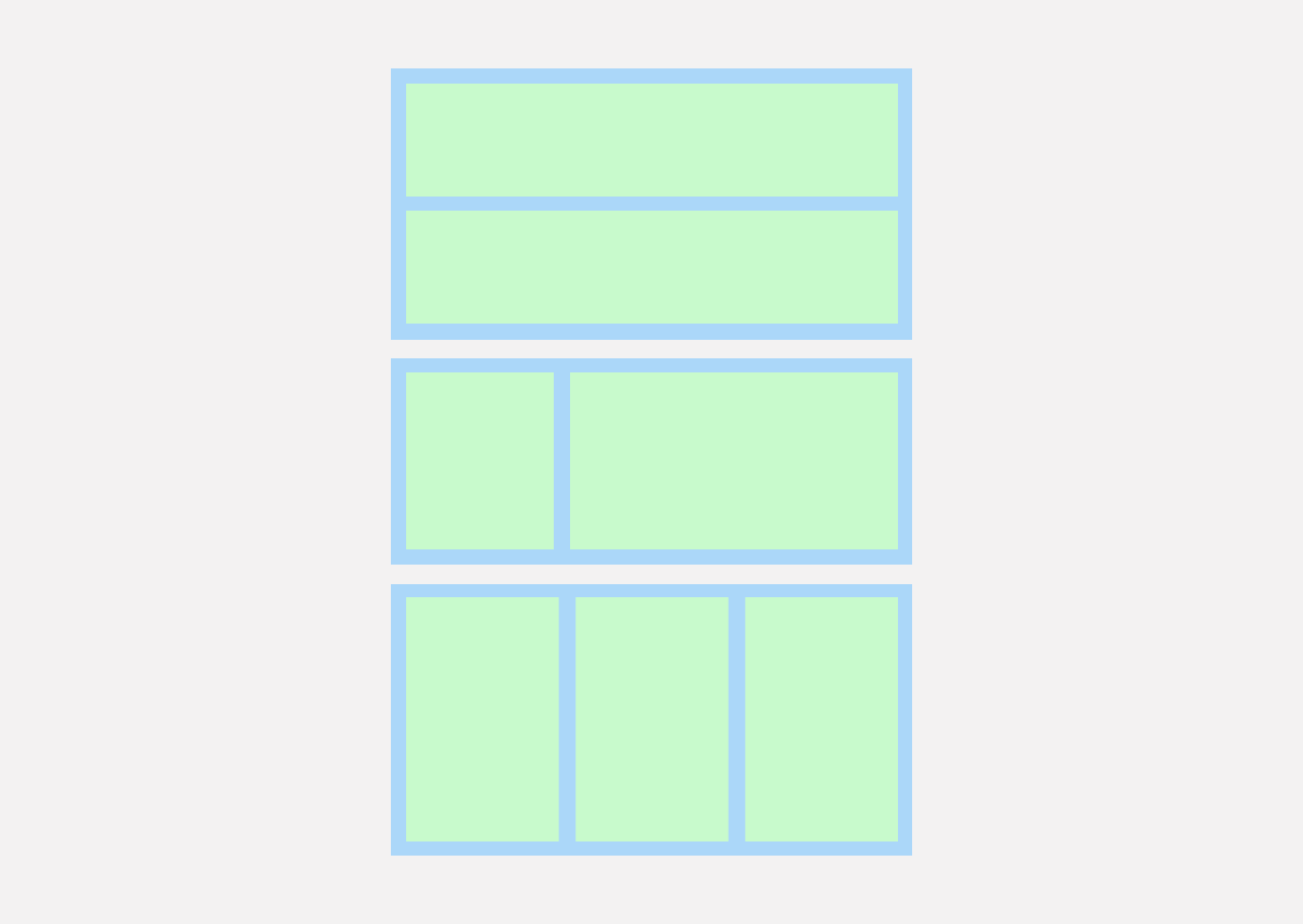
You must also aim for a structure that your target audience is familiar with, assessing your competitors is the best way to do that. Familiarity helps in building the user's experience upwards.
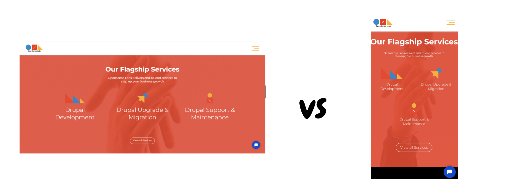
Visual hierarchy
After page structure, comes the visual hierarchy of a page. When a user visits a page, there are certain aspects that the designers want them to look at the first glance. Deciding that refers to the concept of visual hierarchy.
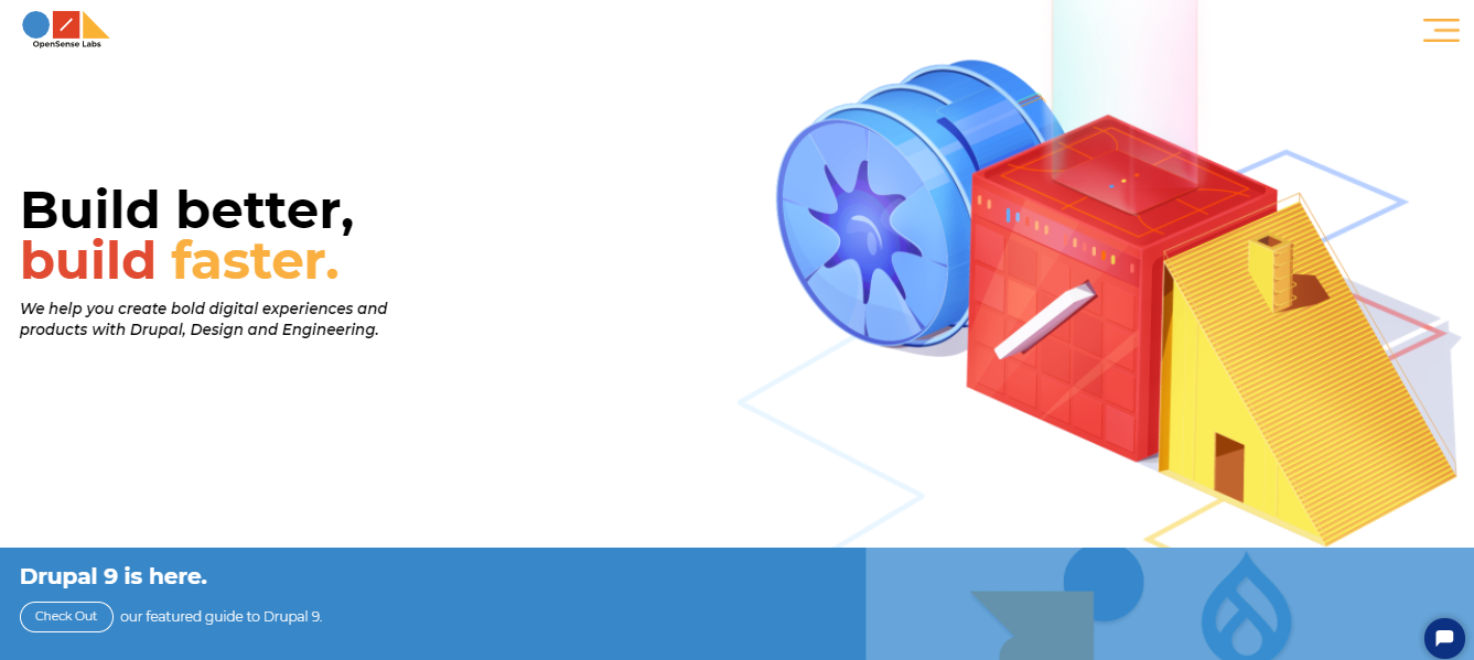
In the above picture from OpenSense Labs, ‘Build better, build faster’ is the highlight. A user would read without much effort from his end. The company logo is another important element. Then comes the Drupal 9 bit, being their speciality, they have made it prominent as well.
So when you design a page, keep in mind the elements that you want to be highlighted and make their size, position and colour prominent on the page.
It would also be beneficial to capitalise on the user’s natural way of scanning. It could be the F-shaped pattern or the Z shaped pattern. The former works with written content and the latter can be used for the non-textual pages. These further help the user in scanning easily.
Your visual hierarchy process would be easy to build, if you create mockups first. This would help you in knowing where each element would lie and avoid any errors.
Content
The content of your pages allows the visitor to understand you and your objective better. The simpler the content would be to read, the better that understanding is going to be. For that, you simply need to implement three things.
- One is to be a minimalist with your words. Inundating a web page with content will only confuse a visitor. Keep it simple, provide pointers for easy maneuverability.
- Second would be to keep the language simple, you cannot use highly complex and technical writings on a web page. Yes, there is a possibility that some users would understand it, but are we aiming for some or all?
- Third is to ensure that your sentences are short, preferably with one idea. Noisy sentences can often baffle the visitors; 20 words or less has to be the target. Also avoid caps lock for everything that is not an acronym.
Moving on from the writing style to the specific contextual elements of a web page, let us understand how you should work with them.
Filling out web forms
Where user interaction is concerned, web forms are the most integral. The reason being they allow you to know your users’ personal details. Any confusion here, would make the purpose of the form futile. Keep things to the point, ask what is needed with a logical progression in the questions.
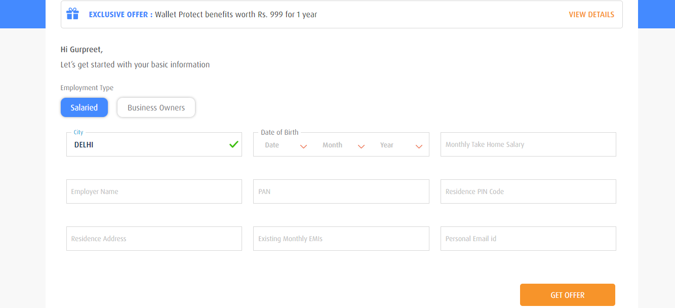
Another tip to follow would be to group similar questions in one category. For example, the educational qualifications can come under one heading and the contact information could be a separate heading.
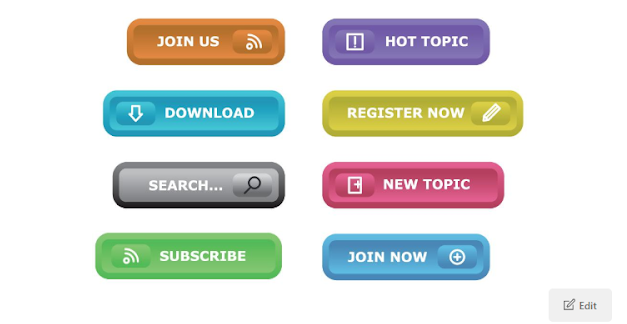
Tapping the buttons
Buttons are basically links that are designed as a button to tap on; like the ‘Buy Now’ button on Amazon we love so much. These are essential for a website to enhance its interaction with the visitors. So, you have to be certain that all the buttons are actually buttons with a link taking the visitors to wherever it says it would. A non-functional button is a frustration button. Then you should also remember to aim for consistency while designing these, so that users can easily identify them.
The most important consideration for buttons is what is written on them because that is the only thing that would attract the user. Be descriptive, be clear, be concise and make it attractive.
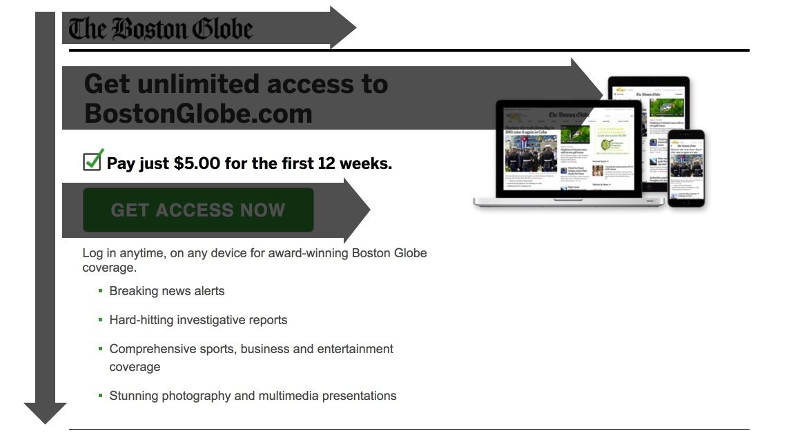
One of the most important buttons would be the CTAs, the Call-to-Action button. These encourage the user to become a customer and improve your conversion rates. Therefore, a CTA that stands out from the normal text, that is a size different from the normal text, that has negative space to make it even more prominent and that is labelled with encouragements is the CTA that will generate more conversions.
The above screenshot shows how OpenSense Labs, after having told the visitors all its benefits, lures them to click on the CTA.
Enunciating SEO
After doing all of this, you also have to ensure that you follow certain SEO guidelines to enhance your visibility on the web and search engines. By focusing on the title tags, URL structure, HTML and XML sitemaps and making them user friendly can totally elevate your SEO game.
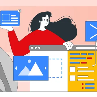
Media
Imagine this blog, without a single media element, an image or a video, describing what is written in the text, would that be a great experience? I don’t think I need to elaborate on the answer, you know!
So, how do you work the media in your favour?
Images
Images are a must in web pages, however, you cannot just add them for the sake of it. The pictures on your website should be related to content on it. They cannot be random images of people or objects that serve no purpose or add any value. Other than that, the pictures should also be of good quality, distorted and blurred images are a big no-no.
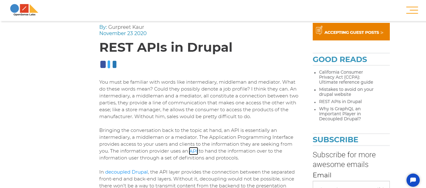
This is a screenshot from one of our blogs, the image here is simple and concise. One glance at it and you would know what the succeeding information is going to talk about. That should be the target.
Videos
Videos have become equally important to images and the internet speed is to blame. They are an easy way to understand a concept of a product, its features or even the message of a brand. However, you need to use them wisely.
- Do not autoplay videos, if the user wants to see it, he would see it without autoplay as well. And definitely do not have the sound on by default.
- Always include subtitles and transcripts for people with disabilities.
- Finally, if you are adding promotional videos, which is a great idea, keep them short.
Animation
Animation is another way to add a pop of interaction on your site, it is easy and it is fun as it breaks the contextual monotony with ease.
- You can add animated effects to point out user mistakes like a wrong password.
- You can add animated effects to your brand logo.
- You can add animated effects to highlight the navigation transitions.
- You can also add animated effects to provide visual feedback to the user, like how much percentage has been downloaded.
Responsiveness to Devices and other Media
Responsiveness is crucial for your site’s web design, which means that your design should be flexible enough to accommodate any device that the user might be using, be it a mobile or a desktop. Statista reported that as many as 48% users surf sites on their mobile devices. This figure does make the responsive design of essence.
So, how do you achieve the level of flexibility in your design that will help it optimise a desktop and a cell phone equally?
The foremost thing to do would be to focus on your layout and make it a single-column one as it would be easy to go through on the small screen of a cell phone. Since the space on a cell phone’s screen is limited, you can only show information that is absolutely necessary. Here the Priority+ model works really well. You would show the info that is needed and the rest would come under the ‘more’ button. Then, the size of images also needs to be appropriated when designed for responsiveness.
Apart from these pointers, it is also important to understand that the clicks on a mobile phone are different from that on a desktop or a laptop. So, you need to be very cautious in the size of the buttons and links along with making them prominent from the other text. You can achieve all of this by creating HTML templates that are mobile-friendly or simply going for a separate mobile-site altogether.
Mobile responsiveness aside, a website also needs to be responsive to other integrations such as cross channel and social media. Linking campaigns and integrating with social media platforms like Google+, Twitter, Facebook, Instagram and LinkedIn can do a lot to bring in business and generate a higher lead count.
Load time
Nobody likes waiting for a site to load, however, in spite of a site possessing great speed, there are factors that make it load slower than the developers wish to. These could be a weak internet network or a heavy site. So, what do you do to ensure that your website does not appear slow to the users?
The primary thing to do would be to check your site for all the factors that could slow it down, for instance heavy images or having too many HTTP requests, and resolve them. Secondly, you can create an illusion of a faster loading speed for the visitors. This can be done by displaying the structure of the page in question first, thus, giving yourself a few more seconds to load the content. Facebook does it and so does Instagram.
It is important to always keep track of the time it takes to load your content, as that would give you insights about the performance of your site. Remember that every second you delay is a second that would cost you. Nielsen Norman Group agrees with this notion and their three response-time limit should be set as an ideal here. Access the complete web performance guide for your Drupal website here.
Accessibility
A web design would be considered incomplete, if it is not addressing the accessibility concern. People with disabilities need to be able to access your site without any difficulty. There are certain web accessibility guidelines you can follow to avoid that.
Contrast
The contrast ratios should be made keeping in mind people with a weak eyesight. Reading blue on a black background would be easy for someone with a perfect sight, but not the others. Smaller text needs a 4.5:1 as a text to background contrast ratio, while the larger text can have a smaller ratio. WCAG’s guidelines for contrast would help you in getting to the perfect ratio.
Colour
You might be able to tell black from red, but everybody cannot. So, just focusing on colour to point out a feature or a mistake is unethical. You have to use words as well.
The colour red is used to highlight the error, along with it a symbol is also used. And when you go to the erroneous column, a dialogue box appears to tell you what the mistake is. This is a perfect example of accessibility.
Keyboard-savvy
Motor impairments inhibits people from being able to use a mouse effectively, so they opt for the keyboard instead. So, make sure that your site is keyboard-friendly at least as much as possible. You can achieve this by making sure that all the interactive elements are accessible and the keyboard focus is loud and clear.
Screen-readers
There are going to be visual elements in your design, that is a given, however, someone blind will not be able to see them. So, for every image, you need to add an alternate text that a screen reader can read, describing what is happening in the image.
It has also become a trend on instagram as well, with many influencers using alternate texts to describe their posts.
Testing
To ensure that your design works well and is equipped to go with your site, you have to test it out and that is the final call, the final piece in the web design puzzle.
There are two tests you can perform;
- One is testing repeatedly throughout the designing process. Feedback is pivotal here, it’s similar to constructive criticism. You might feel shattered that your design got such bad feedback, but in the long haul, you would be thankful that it did. Because through that you were able to create something much more powerful.
- Second would be A/B Testing, this works best when you conflicted between two designs. So, you run with both of them with separate audiences and see the responses. The one with the better analytics would be the better choice.
Being original
Being original goes a long way in creating the identity of your brand and bolstering the image of your company. You have to be creative, you have to think outside the box, you have to step up from the cliches and doing so will compel the visitors to become your customers.
However, you have to do all of this by keeping in mind that originality does not mean that your visitors have to struggle navigating your sites. The set standard for certain categories of websites, like e-commerce, have to be adhered to. And then there is the contact us page that is an essential element in the design of every website out there. Despite this, you would still find that no two sites would have an identical contact page. That is the kind of originality I am talking about, unique yet not foreign.
Even though Google and Bing essentially perform the same taks, yet their UI is quite different. Same elements, yet different. That is originality for you.
Being consistent
Your website is basically your brand and your brand can only have one image to portray. That is why your design needs to be consistent, portraying one single voice. By creating pages with the same colours palette, same typefaces and similar backgrounds, this consistency can be achieved.
Imagine you are on a site, the landing page is all bright colours and bold fonts. When you move on to a different page, you find that the tone has completely changed, and the colours are muted with a minimalist feel. How would you feel? A little lost? A bit confused? That would be it.
So, aim for consistency. I am not saying that you have to follow the same layouts, that would be impossible because some pages would have a lot more content than others. Just focus on keeping the same tones throughout.
Without a second thought, you will be able to tell that these pages are from the same website. Design consistency is what makes that possible. You will see that there are elements that are different, yet there are elements that are similar. That is because every page does not have to be an exact replica of the next for the sake of consistency.
Being credible
Lastly, your credibility is what is going to make the visitors put their faith in you. You can work on all of the above elements, but what happens if the user still doesn’t trust you? The users won’t convert.
Long-term conversions and sales are directly proportional to your honesty. When you are honest and clear about what you are selling and that too on your home page, users will start gravitating towards you. Tell them what you are selling, why you are doing and how it would benefit them in the most honest of terms and they will consider you credible and trustworthy.
Along with this, you can also be upfront about your pricing without any disguises. If you are claiming a cost to be $10, then it should be the same at the checkout. If there are going to be additional costs, mention that along with the $10 price. Trust me, your users will appreciate it immensely.
The Final Call
Web design is a continuous process that only ends when a project dies, never before that. This is just the beginning of a long road ahead, adopting the aforementioned guide would certainly be a help to your design process. But the bigger task on your shoulders as a designer.
I would like to end by adding one more thing. Whatever you are going to design, if you design it by keeping the user and his perspective of the site in your mind, you could never go wrong with it. Good luck.
Subscribe
Related Blogs
UX Best Practices for Website Integrations
Website Integrations determine whether users stay engaged or abandon a site. I experienced this firsthand with a delivery…
How design thinking acts as a problem solving strategy?

The concept of design thinking is gaining popularity these days since people across different industries are using it as a…
10 major challenges that come across during an agile transformation

It’s no longer a mystery that agile was created as a response to the various concerns that the traditional waterfall…