
50+ Tips for Improving User Experience

Harshit
Design (UX/UI)
Published on 21 Aug, 2018
22 min read
Who doesn’t like a great experience? In fact, many business models revolve around great experiences.
May it be fine dining or a mobile app, user experience sells like nothing else. In my experience, it is also the USP, in some situations.
With the help of our design team, we curated a set of helpful tips for improving on your website’s user experience.
Beginner tips
Modern navigation has revamped by design legends worldwide, some even say that navigation is more important than many design components.
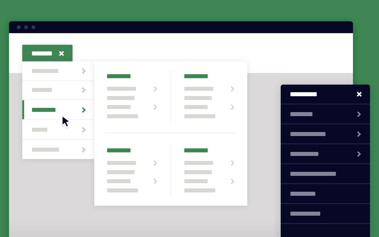
1.Use mega drop down menus
Avoiding simple drop down menus is not only good for visitor experience but it’s also good for search engine crawling. Mega menus are flexible and expandable menu loops which display menus in a two-dimensional drop down layout. They prove to be a great design component as they accommodate even the lower-level site pages to be displayed at a glance.
For bigger websites, the simple drop-down menu hides the actual sub-contents. Mega menus show everything at a glance which help users understand their choices.
Grouping of content is extremely important for easy navigation and mega menus support it. Simple drop down menus don’t support grouping of content.
Mega Menus support pictures, and allow space for further illustration of the categorised menu.
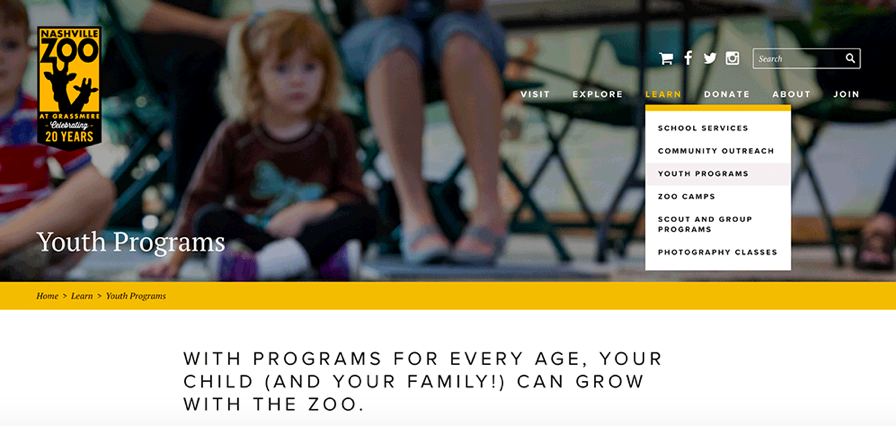
2. Use Breadcrumbs
Orientation is really important if people get directed to some deeper page within the website via some other source. Breadcrumb navigation will help users visit other prime sections of the website.
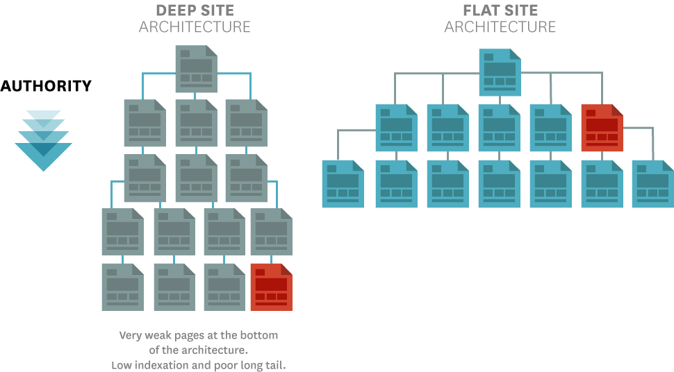
3.Shoot for Flat Navigation
In order to achieve a great navigation, the Information Architecture and the hierarchy of the website should be worked alongside each other. A flat navigation means every corner of the website must be accessible to users within a 2-3 click-depth.
Anything more than that may lead to a poorer navigation. As the website hierarchy becomes more in-depth, your visitors may get lost or find navigation really tough.
4. Reduce Defections
Visitors may bail on you the moment they try to access a page and they are served with 404 errors or any kinds error for that matter. Induce possible navigation to some interesting page within the website. This may help your visitors bounce less on your website by redirecting them to pages they likely do seek.
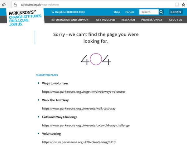
UX has established itself as a brand differentiator. Most people can’t differentiate how they feel about a brand from how they feel about the experiences they have with that brand. It will always play a crucial role in drawing visitors again or making them feel good about your brand. Defections are a great way to keep them within the website grid.
5. Don’t forget Favicons
From personal experience, I do love good favicons. These are small things which matter to me and to many others. I read magazines, and I like to bookmark some to favourites, so I don’t have to hit the search bar again. Use favicons for improving your website’s recognition.
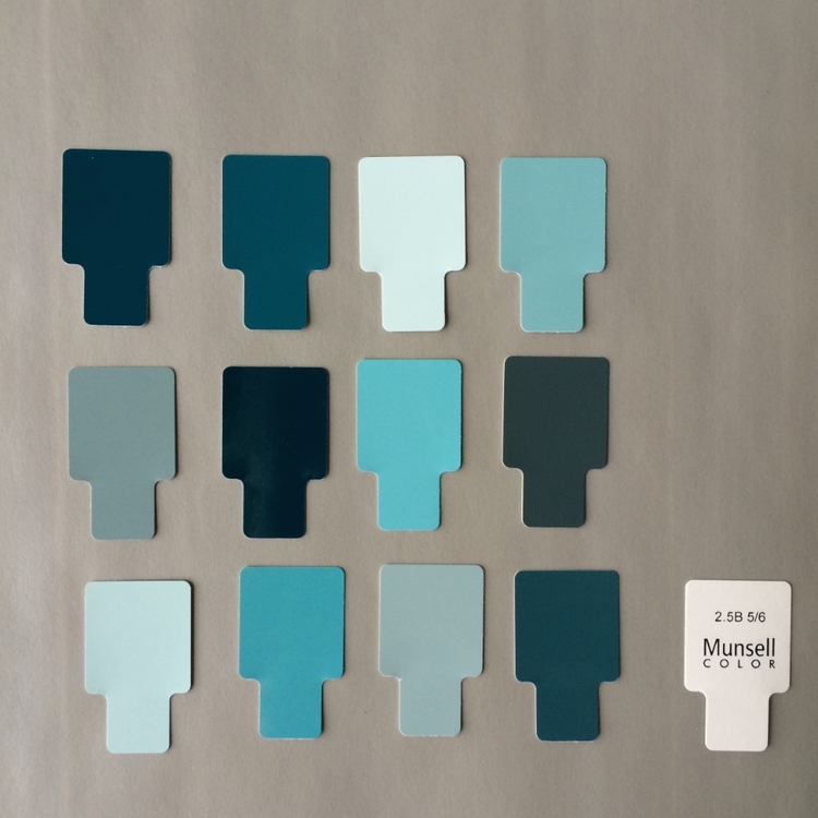
6. Use a subtle color across the website
Colors do matter. Your color palette does too. You don’t want to dump the entire box of crayons on your site. Shore up your color palette all across your site with 2-3 main colors that work well together.
7. Use Sufficient Text-to-Background Contrast
Make sure to have sufficient contrast between the font and the background. Text becomes difficult to read if it doesn’t contrast well with the background. For example grey text on a black background or vice versa. A good example would be white on black or vice versa.
You should not ignore the importance of white spacing. It’s always good to have some room. The white space alongside your content is very user-friendly. A complex fish-market is never soothing to the eyes.
Using a sharp text to background contrast helps with accessibility as well as improving your website’s overall visibility. For meeting accessibility standards you need to make sure you have the contrast of at least 4.5:1 between text (and images of text) and the background behind the text. This is a guideline by W3C itself.
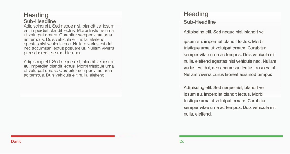
8. Minimize Line and Paragraph Length
Line lengths are important to a reading experience and people prefer shorter lines of texts, say from 45 to 72 characters. You should try to fold your lines within this frame and also use shorter paragraphs as it gets really monotonous to read long form content with fist-sized paras. Properly using white space in paragraphs and lines can increase comprehension upto 20%.
Avoid having paragraphs longer than 6-8 lines. It’s easy for readers to lose their place with long paragraphs. Use paragraph breaks to create some spacing. You should also try to use bullets and numbers when it comes to long list of content. To make the points easily graspable and differentiable.
A lab research conducted by Wichita State University confirms that having appropriate white spacing actually improves comprehension.
9. Reading Level
Aim to produce content around the 8th-grade reading level. Your content should be dumbed-down for a regular reader to understand. In case you are targeting a broad spectrum of consumers or say a B2B audience, still target a 12th-grade reading level for enhanced reading ease and a better user experience.
10. Use a color string across the website
Instead of using different sets of colors across the website, you should ensure you are using one color string throughout. Frequent shift in color strings may lead to a less uniform user experience. On the other hand, using one color string, may mean a uniform experience for all your visitors.
11. Add Scroll cues to encourage scrolling
In the case of some websites, the landing pages might be extremely long or they might contain many folds and users might need a little bit of orientation throughout the page.
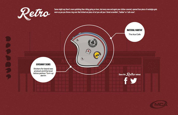
Scroll cues help in providing a very guided user experience. Any visitor would be able to know how far have they come along the page and how far behind are they. Scroll cues can be in form of interactive icons with some intuitive on-hover effects. Like the helmet icon on this website.
12. Use easy fonts
Fonts matter and we know it. If a designer picks a funky font for a service business website, users will hesitate in taking the company seriously or professional for that matter. While choosing fonts, you should be careful. If already deployed, you should go through your font family and check whether they appeal to your target audience.
Using easy and soothing fonts actually helps your visitors. It provides nice visibility and readability.
Choose softer and less aggressive fonts for your site like Montserrat or Helvetica.
13. Make social actions more accessible
Social actions should be popping right at your visitors. Allowing them to share content at their preferred channels anytime they want to. A good practise is to keep the social action bar sticking to one place while the reader continues to read further.
Also, making your social actions easily hideable can prove to be a better user experience. You can also make it accessible enough to be able to comeback on request form users.
14. Always make sure somebody's attending the chat
Your helpdesk plays a key role in providing a great user experience. There should be someone always to attend request from prospects. It’s a simple concept, you feel good when you are attended and don’t when you are not.
Try to make your website chat extremely helpful, less salesly and more engaging round the clock if you are an international business and during your national working hours.
15. Make your CTAs appealing
Sometimes ago, a research proved that orange was the most conversion friendly color when it comes to CTAs. The current CTAs on your website may have been there for a while but you need to test them out. Conduct several A/B tests, test colors and even try reshaping the CTA.
However, you should not have too big a button, similarly not the one which hurts your visitors eye. All you need to make sure is the CTA’s color and depth is easily distinguishable from the rest of the website. It is responsive to provide users the required feedback.
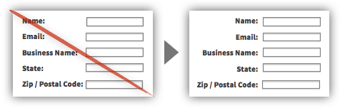
17.Clean up lengthy forms
Trim out the information you don’t need from users. Don’t ask it for the sake of your damn database. The information you need can be acquired in 4-5 questions/fields.
Instead of opening up a lengthy form with 12 fields, ask for the information which you think the user wouldn’t hesitate in providing for the thing they require in return. Use fields which contrast well with the landing mat’s background. That’s for better readability and visibility, ultimately resulting in a sound user experience.
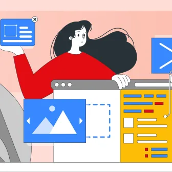
18. Use Media content
Using media content in your blogs, article, any form of content is always helpful, everyone enjoys graphics. Using lengthy paragraphs of information is a good practise for newspapers and not for a website. It results in people bouncing off your website as they get bored of reading the content.
Using interactive images in between your writings may help them stay for a longer period of time and they might end up enjoying your content.
19. Utilise Caching tools for faster delivery
Caching should be utilised for faster delivery of some proportion of the website. It is better off if i say, something is always better than nothing.
Therefore, in order to provide a faster delivery of content to prevent the user from returning, you need to enable the caching mechanism on your website. There are plenty of free tools to help you with cookies and also optimising our own web pages for a fast delivery on the poorest network.
20. Optimise Images
Optimising the uploaded images on your website actually helps in improving the delivery. You should optimise images which are bandwidth hogs and use caching tools to boost up rendering.
21. Don’t use horizontal scrolling
Horizontal scrolling is a horrible experience in itself. It’s the worst scrolling pattern and can hurt your user’s experience.
It has become popular as people couldn’t find ways to showcase information in the most appropriate way. Mega menus help in resolving those hindrances and can obviously be used to display complex but categorised information.
22. Replace Hero Sliders with a video
Instead of using sliding images you should have a video instead. Sliding images don’t stay in the mind’s of your visitors across their sessions. Plus it’s not memorable an experience. Using a video instead will be much more remarkably engaging and entertaining for the user to browse through the site further.
Hero videos have always been a fantastic way to provide an engaging visual online experience and this is the reason we have seen it make its way into website designs. Many digital brands are cottoning on to hero videos as a way to quickly enhance user experience.
Intermediate Tips
23. Warm and bright colors should stay forward
Warm and bright colors should stay forward as they provide boosted visibility and readability due to the use of vibrant colors. Layout elements become more distinguishable and noticeable due to increased contrast. This is why designers always practise mid level contrast and use high-contrast to highlight elements only.
24. Show a skeleton of the website
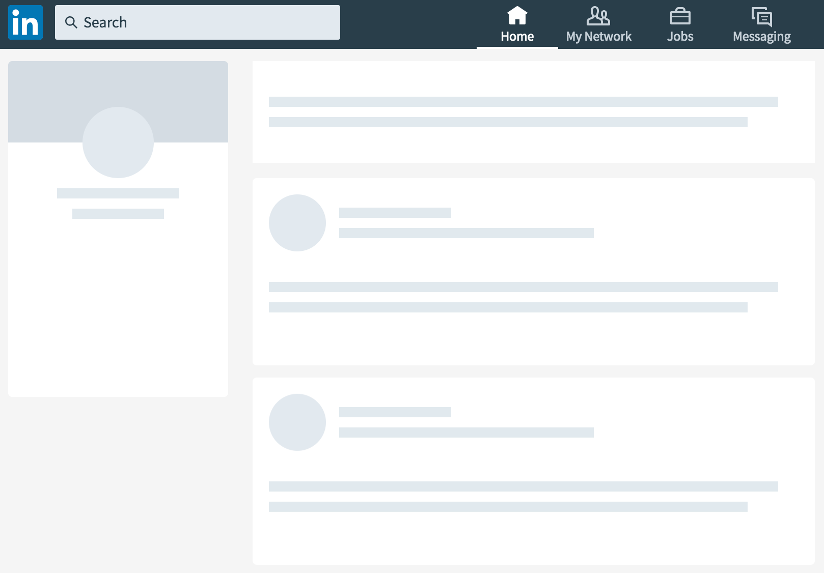
This is generally a good practise. As they say, something is better than nothing. All the social giants - Facebook, Twitter, Linkedin, Instagram - do follow the same practise of displaying the skeleton rather than showing the visitor a blank page while the content loads. This is a general advice as the little animations ease the negatives of waiting. Anything which neutralises the negatives of waiting is good for user experience.
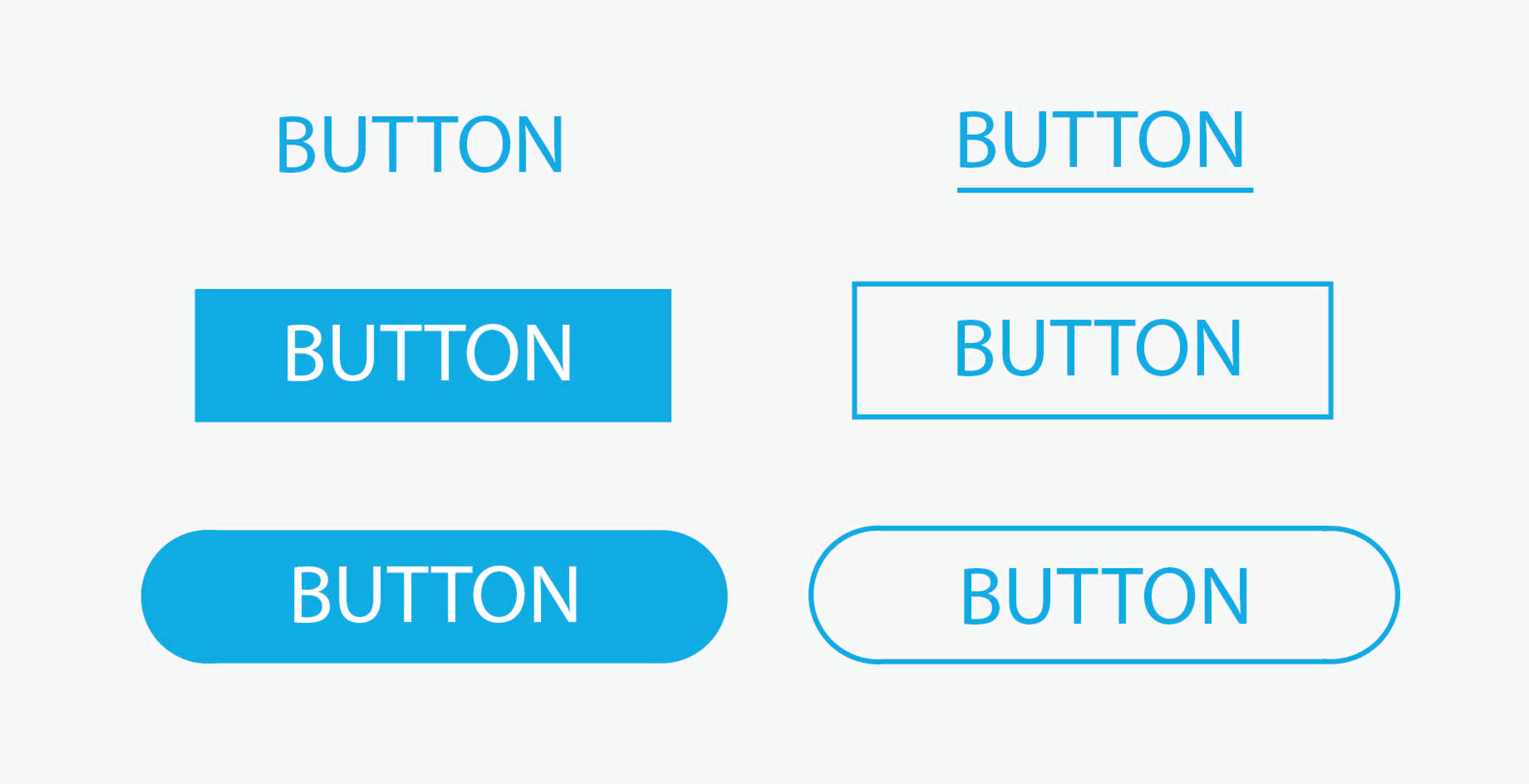
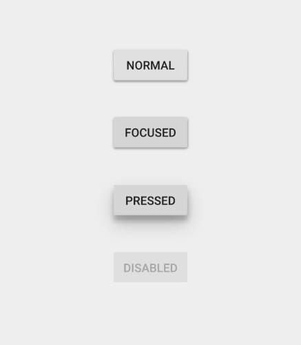
25. Make buttons on your website more responsive
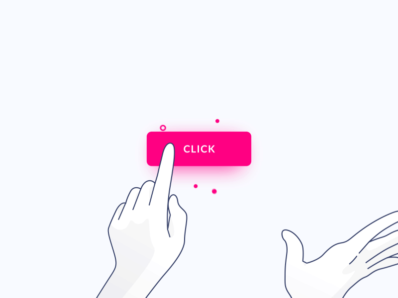
Buttons, CTAs are the clickable elements of your website. Having them to respond as per user interaction is key to adding up to a good user experience. You needn’t make them as bright as the sun but they should stand out from the rest of the content. Here’s what you can do:
- Make them easily recognisable from each other, incase you have too many actionable buttons.
- Make them responsive enough to support response on hover, tap, click and release. These actions are common in all kinds of interfaces.
- The color of your buttons should not be repulsive. Like red is associated with anger or it known to be a repulsive color. It should also contrast well with the color in the background.
- A button should convey exactly the action it is going to take once pressed. Don’t try to be witty, keep it simple and convey the right information right off the bat.
Here are some interaction points and how your button should respond:
26. Replace carousel dots with peeking images.
Dots have become an industry standard and they are here to stay, but there are better ways to display content on the carousels. As dots are very less visible on mobile devices, you can have the images to peak form the left and the right in order to show the content which is approaching. Here’s an example of a carousel with peaky behaviour.
27. Carousels that slide automatically should switch to manual once users interact with them
Having this little piece of functionality can depict concern for the user’s interactions. Switching the carousel to manual on interaction is a great experience. The users can switch to the next image as per their momentary preference.
28. Use Accordions on Mobile
One of the most pleasing advantages of implementing accordions is that they often allow users to get the big picture before focusing on details, and they can effectively mitigate the common problem of overly long pages. Instead of clustering the page with information and making it overwhelming to read information, you should go accordion!
29. Provide a way to collapse content after it has been expanded
Apart from expanding content in accordions, you should also offer users a way to collapse the accordion or the hide the expandable information. This helps in providing room on the interface, which helps in further navigation on that particular landing page.
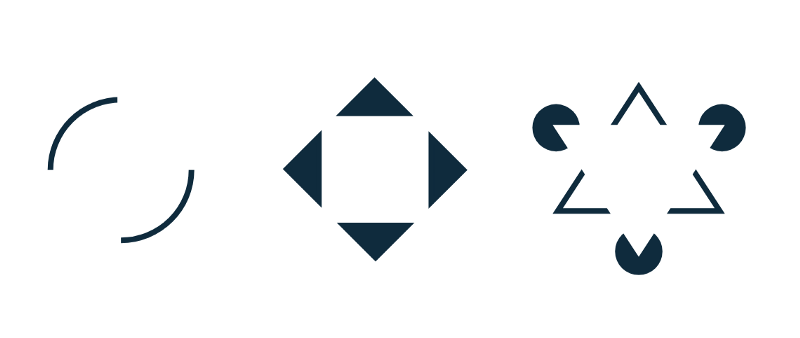
30. Icons must describe a purpose rather than just simply being there
Every icon on your website must be indicating something. Other than just being there, it should be self-explanatory in nature. Icons do save you some screen real estate and add to the aesthetic appeal of your website.
Some icons are easily recognisable, they are universally understood icons which can help the users navigate and take action throughout the website.
While some may be equally conflicting in nature and may trouble the users in understanding its core functionality, as it varies from website to website or app to app.
The heart and the star may mean different things for different properties.
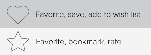
For such icons with multiple meanings, you should avoid using them, or in case you don’t have an option you should provide labels which describe their respective functions. For websites, instead of using labels, which would occupy some of your real estate.You can utilise the hover functionality instead on website.
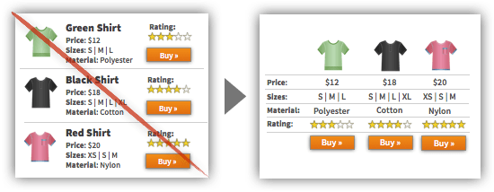
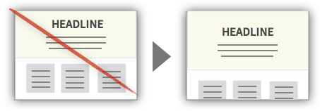
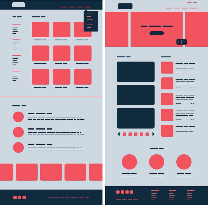
31. Differentiate the primary and supporting elements
You can use the color contrast or size differentiation to clearly separate primary information from the supporting details. Displaying them in an equal manner would not help you show information which is either sequenced or prioritised for a better understanding.
Here, in the image, the primary information is set apart from the secondary and detailed version. It is easily distinguishable and distinct.
32. Restrict your color palette
This isn’t something you should strictly follow but it should be kept in mind. You colors used throughout the website shouldn't be too vibrant or diverse. Stick to no more than 3 main colors while designing the website. Every component should look like it belongs here. Using too many sharp colors will not only prove to be a bad experience for your users but also deteriorate the visual appeal of your website.
33. Primary action is visually distinct from secondary actions
Having distinct primary and secondary actions means the user won’t be confused when interacting with your product and will be less prone to making mistakes. For example, Upload, Cancel, or submit buttons must be clearly distinct from each other.
You should conduct usability testing, observe for common errors that result not from the user’s intent, but from poorly distinct primary and secondary actions. Also, when reviewing the design, make sure that color, size, positioning and other elements differentiate the actions.
34. Form submission is covered in a visually distinct manner
It is essential to give the user a confirmation of whether an action was successfully performed or not. After submitting any form, the user should be notified of the successful submission so that he can head to other sections of the website.
Check all areas of your product where the user inputs information. After any user has provided complete input, you should trigger a confirmation text to assure that the action was successful. Make sure the feedback is water clear.
35. Make alert messages consistent in design and position
Alert messages should be consistent in position and color. Any aesthetical changes or positional changes may create an extra amount of load onto the user. It is always good to keep the users aware of where the alerts are positioned and how frequently are they going to appear.
Having alerts coming from different directions, having different colors and shapes can distort attention.
36. Typography: Stick to no more than 2 distinct font families
Using multiple font families can be a turbulent or devastating user experience. In some cases, it is not even easy to pull off more than two font families, matching them is where things get real tough from a UX perspective.
For usability and visual purposes, two font families improve visibility, readability and comprehension as well. Just make sure that your design isn’t mixing more than two font families. You should also make sure that the families you chose are properly matched.
37. Font used for text content is not bigger or smaller than 12 px
It’s not a rule but readability is severely deteriorated when the font sizes go below or beyond 12 px. A study conducted by Nielsen Norman group found that on a regular webpage users have time to read at most 28% of the words during an average visit; 20% is more likely.
38. Use uppercase letters on only headers, labels, and synonyms
Restricting the use of uppercase words always fuels understanding, it is visually less sturdy and appears easier for the users in the overall experience. They should only be used when things need to be emphasised.
What you can do is, conduct a thorough content check to make sure that uppercase letters are only being used in headers, any labels, or acronyms for that matter.
39. Progress Indicator of multiple-step workflows
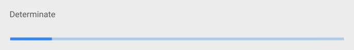
Progress Indicators provide immediate feedback which doesn’t keep users wondering of any workflow. They don’t feel oblivious and that’s what a good UX intends to do.
In case an action or workflow is taking longer than usual, the progress indicators should communicate it to them and provide a precise idea of the remaining effort or time. There are two advantages to this:
It reduces uncertainty among users.
Progress indicators provide a reason to wait. Another tip would be to provide them something to do in the meanwhile, maybe a explore other sections of the website or app while the activity keeps happening in the background.
40. Foreground elements should be easily distinguishable from the background elements
This is quite regular a ting but it should always be taken care of. You cannot have your background flushing with your foreground. That’s going to screw all the design elements. Here’s an example:
I hope you can notice the contrast between the navigation bar and the background. This contrast and the shadow effect in the bottom serves the fact that these elements are on top of the other elements. Clearly separating the background from the foreground.
Two of the most common techniques to do this are:
Use contrast, color, size, scale or shadows to provide depth
You can also use boxes to separate content overlapping
Expert Tips
41. Use Micro-Interactions
Some more examples are Facebook’s like button, or the refresh action or the typing indicator in messaging services. These microinstructions make up to provide an amazing user experience, they do seem negligible or small but it stays in the human head for a long long time. Micro-interactions are also known to increase user engagement.
42. Avoid interface elements without a clear meaning
I say this because users usually ignore touching elements without a clear meaning. Until and unless an interactive elements makes sense or represents its functionality, users are more likely to let it stay and never touch it.
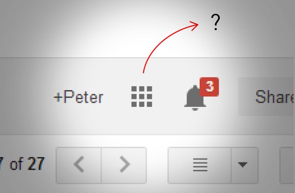
In some Gmail update, google decided to use this abstract icon to be a collection of all of its other services - Google Sheets, Calendar, Drive, Google Keep etc.
Google’s decision to simply and move everything behind one icon left user’s confusing and they mostly never touched it. Therefore, it is recommended to use elements which convey naturally. Avoid using elements which might leave people wondering.
43. Build a Typographic scale
Your website’s typographic scale affects all the other parts of the system. Not only do you have to decide the type faces which you’ll use throughout the website but also the consistency scale which has to be maintained. Test a new typographic scale against your current one and see which leads to a better user experience.
Having a typographic scale actually helps you in building a rhythm throughout the website.
44. Use Signifiers
The possibility of an action on an object should be clearly specified in the User Interface. Signifiers provide strong clues on what is to be done next. It maybe tapping on a button or just pressing next or clicking on the drop down to unveil the content even further. Signifiers are known to ease the navigation for users and should be part of any great interface.
45. Pre-fill forms as much as possible
Incase you have filled any web-form recently, it must have not been an easy experience if all the details had to be entered by you manually and the website owners helped you fill nothing.
For a great user experience, you can always help the user by pre-filling information in the form. Not all of it, just the one which is authorised to be pulled from his database.
For Example:
- You can always know a person’s country or city by their IP or geolocation.
- You can also prefill their email on a check-out page if they came from one of your newsletters.
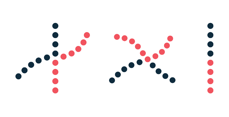
46. Try not to make their eyes zig-zag
Reduce the amount of back and forth eye movements. Try to provide the information in a straight format. Here’s what you can do:
Move congruent data to a straight view to help users compare items better:
47. Align all the form labels directly adjacent to the elements
Instead of having the form labels aligned to their respective right side, you should consider aligning them to the fields instead. It doesn’t just feel neat, it also provides a great user experience.
48. Offer a translate button for foreign languages
There might arise a case where content on your website may appear in a language other than the local or desired one. You should be offering a translate button for that particular text. These small things amount to a great user experience.
49. Indicate whether content exists beyond the fold
It has become an industry practise to auto-hide and bring scroll bars as per interaction and to be honest, with no hint being provided. It signifies that there is no content beyond the fold.
It is extremely necessary to provide the user with some or the other hint that content does exist beyond the fold or the scroll.
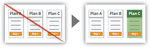
50. Simplify all the choice tasks
As we all know, choice requires effort. You should simplify choice making by providing the most selected options. Like on the product plan page, you can offer a highlighted plan which was chosen by many other similar users.
You can also provided a curated list of the most common search terms on your website. It is always helpful to know what’s trending on the website. For example, when I tap on the search bar for typing a term, i should be provided with a list of items which were searched by other users and then the search results should modify as per my current search keyword.
51. Use cool colors in loading animations
Using cool colors in loading animations is science backed. You should work on reducing all the negatives of waiting and with cool colors like blue, users perceive the loading times to be quicker than usual.
52. Add Copy Buttons to movable text or output
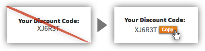
Any item with a purpose to be copied by the user has to be provided with a copy button. It can be a coupon code or a number or a password. It eases the user experience as they see an option to add the given temporary text to the clipboard and copy it right there.
52. Add tooltips for both noobs and experts
Tooltips are a great way to help the novice users understand a jargon or any terminology for that matter. Using tooltips can be a great user experience for SaaS platforms as well as websites.
It isn’t always necessary for the user to know everything in some niche and tooltips help in educating the users continuously along the session.
53. Put Some of Gestalt’s principles to use
Arriving from old 1920’s psychologies, Gestalt principles are a set of laws which describe how humans perceive objects by grouping similar elements, recognizing patterns and simplifying complex images.
Understanding human perception while designing any UX can make it all the better. Some of Gestalt’s cognitive principles can influence greatly our arrangement of visual information within UX design and they can be used to understand how and why visual information can be misinterpreted by users. Some of my favourites are Continuity, Closure, and Proximity.
Continuity
Continuity states that once something is introduced as a series, the mind will perpetuate the series. Our brains are known to follow a predictable pattern and the smoothest possible path.
Continuity forms a composition which helps us in navigating and directing ourselves throughout the interface. Proper alignment of elements eases the eye pattern and further toughens the perception of collective information.
Hence creating order and singularity throughout the interface. Anything which disrupts continuity can mean the beginning of a new section, entirely different from the one above.
Closure
Any group of elements will be often taken to be a single entity. Also it can lead to forming a closure in a person’s head even if some parts are incomplete.
According to the Gestalt’s Closure principle – “When presented with the right amount of information, our brain will jump to conclusions by filling in the gaps and creating a unified whole”
Following this, we can decrease the total number of of elements needed to communicate information, hence reducing complexity and making designs more minimalist and engaging.
Closure also help in minimising visual noise and conveying a message in comparatively less space.
Proximity
The proximity principle states that - “Objects which are closely held towards each other represent similar information, organising content and decluttering layouts”
This intends to improve the overall visual communication and user experience, giving the web property a minimal and eccentric feel throughout.
Items which are related by any means, should be held closely to one another while the one ones which are entirely different should be held apart from each other.
Here, white space will always play it’s real part in creating contrast hence, guiding the user’s eyes in the direction which it is supposed to. While it does also boost visual hierarchy and information flow. This further contributes well in reading and scanning layouts. As people usually skim through, this can be a very contributing factor in a great user experience.
Wrapping up
Using these tips for your next design gig can overly satisfy your users. From providing an intuitive interface to having the best possible information disposal, you would be seeing a plunge in user retention over time.
Whether you are a design agency or a web development agency, you can apply these principles to ensure great client satisfaction and deliver remarkable results.
If you are facing trouble getting a hook around any of the above. We are here to help and design is our sweet spot. Reach us out at [email protected] and speak to our design experts. And do share this article if you found it useful.
Subscribe
Related Blogs
UX Best Practices for Website Integrations
Website Integrations determine whether users stay engaged or abandon a site. I experienced this firsthand with a delivery…
How design thinking acts as a problem solving strategy?

The concept of design thinking is gaining popularity these days since people across different industries are using it as a…
10 major challenges that come across during an agile transformation

It’s no longer a mystery that agile was created as a response to the various concerns that the traditional waterfall…