
Guide to responsive web design in 2022

Maitreayee Bora
Design (UX/UI)
Published on 24 May, 2022
8 min read
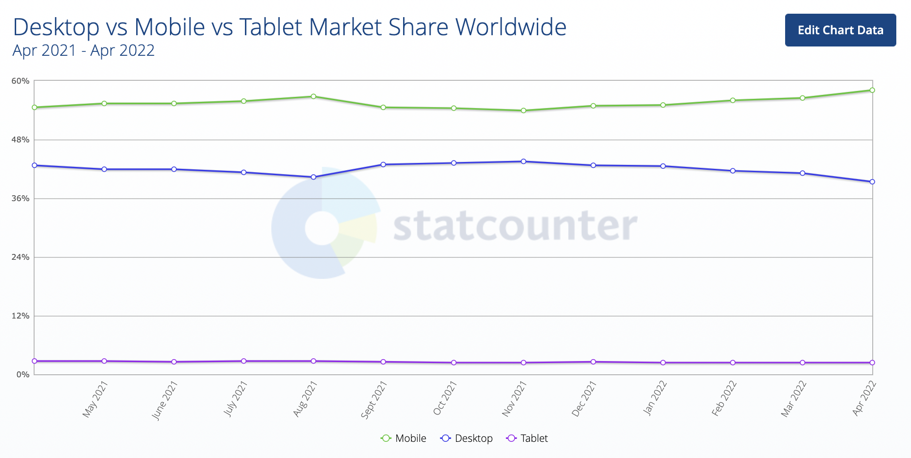
Gone are the days of designing a website for just a single desktop screen. The growing technology and the extension of mobile websites are demanding web designers to display their work across several devices.
Let us here have a practical example of it. If I ask you how much browsing do you do on a daily basis on your phone vs your desktop? What will be your answer?
Well, I already know it. So, here comes the need for a responsive website design that can help you check a website on any device you like. Today this article is all about it.
This piece of work will inform you about all the essentials of a responsive website design including its future as well.
The concept of Responsive Web Design
Responsive web design can be termed as an approach that enables code and design to respond to the size of a device’s screen. That means it gives you an excellent viewing experience regardless of looking at a 4-inch android phone, a mini-iPad, or even a 40-inch cinema display.
Responsive websites necessarily use flexible images, fluid grids, and CSS styling in order to alter the site’s design and display it in accordance with the width of the browser.
Therefore, the designers focus on seamlessly tailoring the UX and UI of a website design over various platforms and devices.
The need of Responsive Web Design
Some businesses previously used to create two versions of one website, i.e., one for desktop users and one for mobile users. Many of them still do it today.
But with the rapidly increasing mobile users’ viewership, having two separate versions of a single platform is very time-consuming and also requires high maintenance practice.
So, in today’s time, you can simply have one responsive website which is ready for all kinds of devices. By doing so you can retain your mobile viewers and maintain your website at a very lower maintenance cost.
You’ll find that unresponsive websites generally distort the way a website appears on devices such as mobile, and tablets. But that isn’t the case with responsive websites.
A responsive website provides its users an optimal viewing experience regardless of the different devices a user uses.
And most importantly, responsive websites have a greater possibility of ranking high in Search Engine Results Pages (SERP). It improves your SEO efforts across all the different platforms.
So, with responsive websites, you can surely retain more clients in the long run.
Responsive web design vs Adaptive web design
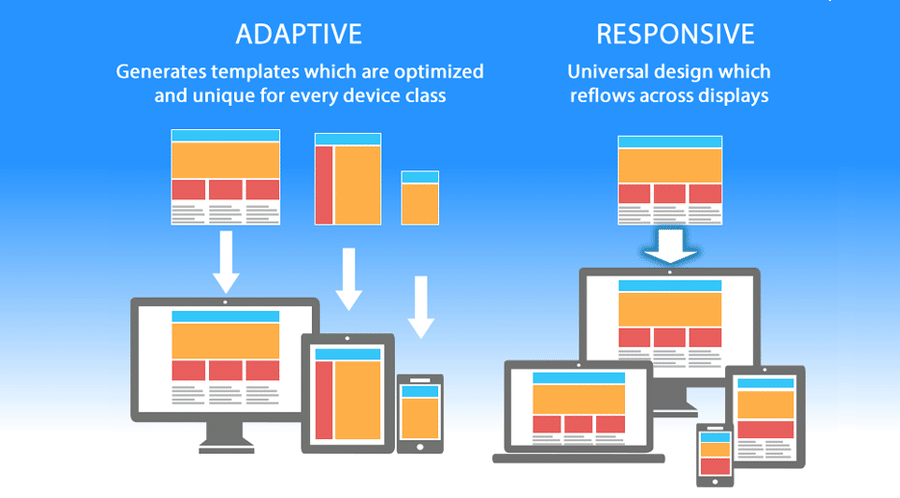
Let’s now look into the difference between responsive design and adaptive design. Well, the difference between them is that the responsive design can adapt the rendering of a single page version.
On the contrary, the adaptive design tends to deliver various completely different versions of the same page.
Even though they are both considered pivotal web design trends that allow webmasters to control how their website looks on various different screens, their approach is completely different.
So, with responsive design, users can access the same basic file via their browser, despite the device, but CSS code tends to control the layout and render it differently depending on screen size.
And with adaptive design, you will find a script that checks for the screen size, and then can access the template designed for that device.
The building blocks of responsive web design
This section covers the basic foundation for responsive website design and also its different building blocks.
- CSS and HTML
The main foundation of responsive design can be considered as the combination of HTML and CSS. These two languages have the capacity to control the content and layout of a page in any given web browser.
HTML majorly looks after the elements, structure, and content of a webpage. Even though you can control the main attributes like height and weight within your HTML, yet no longer it is observed as best practice.
CSS can be used for editing the design and layout of the elements which you include on a page with HTML. Also, you can include CSS code in a <style> section of an HTML document, or even as a separate stylesheet file.
- Media Queries
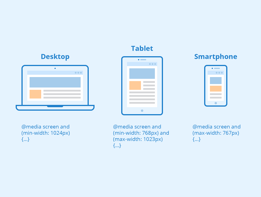
Media queries can be considered as filters that are applied to CSS that respond to the kind of screen type, device, displaying browser, or even device orientation.
Basically, a media query tends to design according to a rule-based on the minimum and/or maximum width parameters, besides other factors such as browser, resolution, and orientation.
- Fluid Layouts
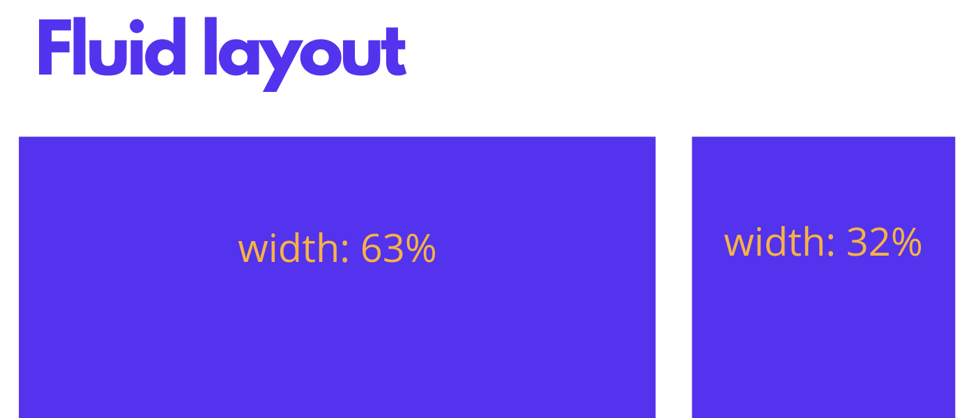
A fluid layout is considered an important part of modern responsive design. Back then in the olden days, you would have set a static value for every HTML element, such as 600 pixels.
A fluid layout instead depends on dynamic values just like a percentage of the viewport width.
Such an approach helps in increasing or decreasing the different container element sizes depending on the size of the screen.
- Flexbox Layout
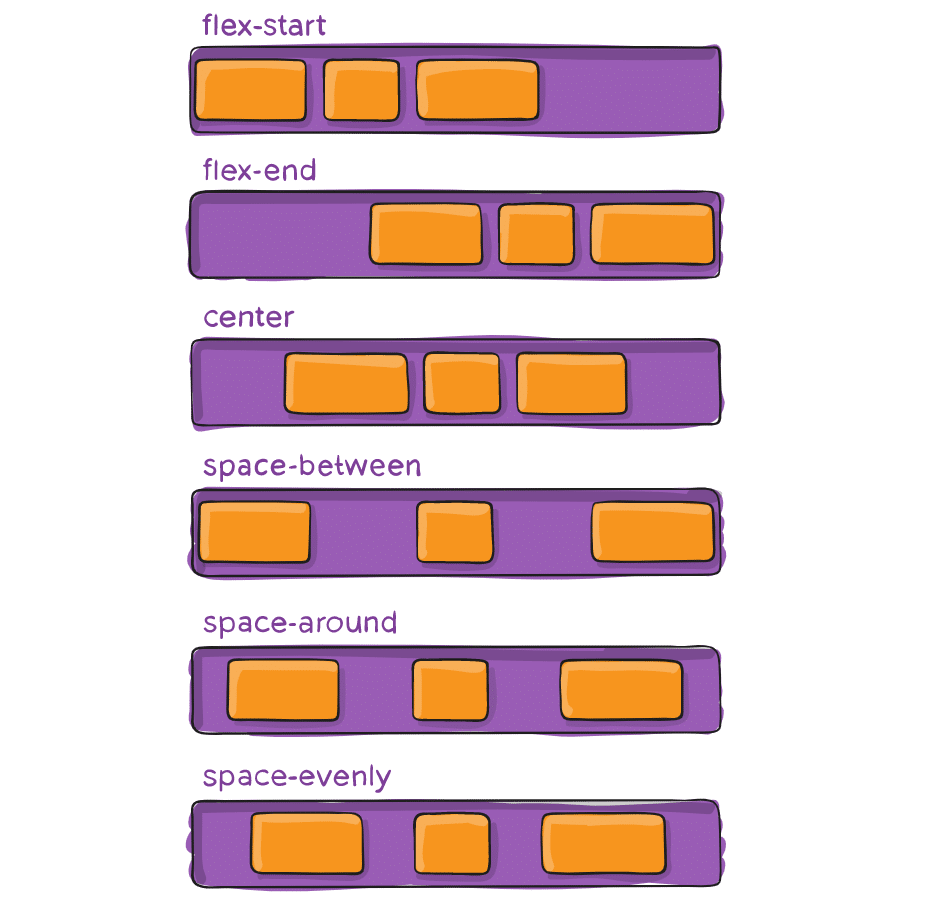
A flex container expands items to fill available free space or shrinks them to prevent overflow. These flex containers have a number of unique properties, like justify-content, that you can’t edit with a regular HTML element.
Flexbox can be considered a CSS module that is designed to be a much more effective way to layout various elements, even so, while the size of the contents inside the container is not known.
- Responsive images
Responsive image techniques just like sizes, srcset, and media HTML attributes, enable various different scaled images to be delivered depending on the resolution and size of the accessing device.
This also further enables you in optimizing your image delivery to enhance the overall performance of your application or website.
- Speed
While you’re looking to create a responsive design for your site, you must prioritize the loading speed.
Let’s say, the pages that are seen loading in 2 seconds have an average 9% bounce rate, and pages that are seen taking 5 seconds have a bounce rate of 38%.
So, your approach toward responsiveness need not block or even delay your page’s first render any more than it requires.
Well, there are various ways of making your pages faster such as implementing caching, and minification, optimizing your images, avoiding render-blocking JS, and using a more efficient CSS layout.
Best approaches for creating a Responsive Web Design
This section will familiarize you with the most popular approaches to creating responsive web design.
Go for the “mobile-first” approach
Mobile websites tend to have the most UX challenges, therefore, designing for mobile and scaling “up” helps in generating the best results.
You need to design for perceived size, realizing that users go for larger designs on smaller screens in order to avoid pinching and zooming.
Also, it is essential to make sure that designs are intuitive in each and every layout and size – specifically the smallest mobile size.
Allowing touchscreens
User interfaces generally differ based on the method of interaction: mouse and keyboard vs touchscreen.
Therefore, touchable elements need to be large on small screens in order to be usable, with adequate swipe space, responsive buttons and links, touch gestures, simple navigation, and optimization for the thumb zone.
Determining which elements to be included on small screens
Designers prefer using responsive breakpoints in order to decide what exactly does or doesn’t happen in each and every layout style. It is essential to decide what is visually and functionally required on the smallest screen to help support.
Aiming for accessibility
Accessible web design applies the 4 principles of web accessibility such as robust, operable, perceivable, and understandable.
Mobile accessibility needs to include adequate contrast (ratio 4.5:1 for normal text or 3:1 for large text), active elements must be focusable, design for large perceived text size, with accessibility features in order to support machine reading, alternate navigation, voice to text input fields, and features that do not depend on color contrast to indicate function.
Selecting a pre-designed theme or layout
Pre-designed themes and layouts can be really beneficial in order to create or convert a website to be responsive. While working with a theme, you would need to make changes to colors, content, and images within the guidelines of the framework for ensuring the updates remain responsive.
Responsive Website Builders
Website builders are an easy, quick, and very flexible way to create an excellent responsive website. They can fit well for both tech and non-tech-savvy people by offering an environment where one can create a website right from the scratch without even writing a single line of code.
You will find that some of them majorly focus on responsive behavior, while the others look for mobile-friendliness, providing tools in order to create a completely optimized website, especially for mobile devices.
Grid Systems
Do you love to code or maybe build everything from the scratch, also controlling every stage of development? If yes, then responsive grid systems should be the right choice for you.
Since they already have everything, you might require such as rows, columns, containers, classes for ordering and arranging, and some of the primary styles that easily adapt to screen sizes.
Important tools required for creating a Responsive Web Design
Let us grab onto three of the essential tools that help in creating an excellent responsive web design.
- Web browser can be one of the most effective tools in order to preview designs on the web. You can install some different browsers to receive a good range of feedback. And then can start to resize the browser windows.
- The mobile device is one of the obvious tools that can be used to preview designs since it displays how your website will exactly look under certain conditions.
- Google’s resizer can be a very good resource that can quickly preview your website on various devices.
Learn more about the topic here:
- Humour in web design
- Cognitive accessibility in web design
- Design considerations for accessibility
- Building user trust in UX design
- Ethical design
- Ethical technology
- Complete guide to web design
In closing
I suppose by now you have a proper understanding of responsive web design, right? Along with the fundamentals, you also now know the future of it. Isn’t that great?
So, I am hoping that by recognizing the future possibilities, you will feel more encouraged to opt for building a responsive website for your business and succeed in offering a seamless user experience to your users and clients.
Subscribe
Related Blogs
UX Best Practices for Website Integrations

Website Integrations determine whether users stay engaged or abandon a site. I experienced this firsthand with a delivery…
How design thinking acts as a problem solving strategy?

The concept of design thinking is gaining popularity these days since people across different industries are using it as a…
10 major challenges that come across during an agile transformation

It’s no longer a mystery that agile was created as a response to the various concerns that the traditional waterfall…