
Design Considerations for Accessibility

Gurpreet Kaur
Design (UX/UI)
Published on 31 Dec, 2020
12 min read
Wouldn’t you say that websites are meant for everyone. If a children’s clothing site is not able to serve the needs of all the parents that fall in its target audience, what would be the point then, right?
We know every person is different, from the way they see things to the way they analyse them. Our differences do not make us less than the next person; web accessibility has ensured that, at least in the web domain. There are people who have certain physical conditions that limit some of their abilities, they are simply differently-abled from the rest of us.
- Colour blindness can affect the visual perception of a website.
- Wheelchair user-concerns can affect mobility.
- Hearing problems can affect the auditory elements.
- Photosensitive epilepsy can induce seizures in a person through certain elements on the web.
- Dyslexia can affect the cognitive awareness of a user.
- Sleep deprivation, an incidental issue, can affect your accessibility as well.
All of these and more can impair the user experience for people who are suffering from them. That is where web accessibility comes into the equation. This blog will talk about the ABCs of implementing the best practices when designing for web accessibility.
What is Web Accessibility?
Where websites are concerned accessibility becomes an important consideration that can actually become their breaking point, if not done the right. Before I start on the long tirade on how to make the web accessible, it is equally important to understand what it actually is.
Web Accessibility can plainly be understood by its purpose, which is to make websites and their numerous tools and technologies in such a way that people with disabilities can easily use them. It is actually as simple as that; building websites that cater to the differently abled people.
A more thorough definition would point towards making websites that;
- Can be perceived by people with disabilities;
- Can be understood by them;
- Can be easily navigated by them;
- Can be interacted with;
- And they can also contribute to the web through them.
This concept or more like a principle takes into account all the disabilities that have an affect on the web user experience, be it auditory, cognitive, visual, speech, neurological or physical.
You might be thinking that that is all web accessibility is responsible for, to make the web more accessible for people with disabilities, but there is more.
- From different input modes to bright sunlight affecting the UX;
- From transient disabilities like fractured hand to ageing hampering your abilities;
- From a slow internet connection to an expensive one;
- From people in rural areas to the people in developing and under-developed nations;
Web accessibility is meant for all, it takes into account every aspect that can impede on a person’s web experience, eliminate them and make the web a place that is all-inclusive to the core.
It is a concept that is meant to highlight the web accessibility, that is a given because of its name, at the same time, it is also a concept that works towards usability and inclusion. All three are pretty closely related, perhaps that is why they are considered to be the fundamentals of web accessibility. You know what that means by now, however, with usability, the purpose is to build designs that can be used by everyone, while inclusion focuses on diversity, aiming for the participation of everyone in the experiences the web can offer.
Do you not think that web accessibility is crucial in the way we design our websites? I am certain you do.
What is the standard for Web Accessibility?
In 2008, the new web accessibility guidelines were implemented and even in 2020, they are still prevalent. These guidelines have set the standards for accessibility that all web experience provides must adhere to. These are the WCAG 2.0 guidelines and they can be summed up in four principles.
Make websites perceivable
It is after perception that you actually start becoming involved in something. That is why the first principle of the WCAG 2.0 guidelines is making sites perceivable. How do you perceive something? Using your senses, right? Sight, sound and touch being the players here. So, the elements on your site need to be focused on these senses to be truly accessible. To exemplify, it would help a blind person to hear the description of a video to perceive what is going on in it.
Make websites operable
Making a site operable means ensuring that all users can use it with ease, by all, you know I mean including people with disabilities. Operating a website has to do with its navigation and interacting with various components. As per this principle, your site should be equipped to operate well in a keyboard-only navigation without any time constraints along with helping the user out, if he were to make some errors.
Make websites understandable
Next is the understanding of a website, your users should not have to spend a lot of time to understand some simple instructions. Therefore, the third principle focuses on using clear terms that make even the complex of issues easy to understand.
Make websites robust
This last principle is a bit on the technical site. Using a clean code for HTML and CSS that meets the overall standards would make it very easy for other technology, third-party included, to depend on your site. It would make your site more robust and thus, easy to process.
How to design for web accessibility?
Now comes the important part, knowing the semantics of wens accessibility won’t do you any good, if you do not know how to implement them in web designing. It is not going to be a drastic change in the design palette of your existing website, rather some minor, yet thoughtful, changes can go a long way in achieving the accessibility standards. So here they are.
Aptness in contrast
I’m going to start with contrast because I feel that contrast is one of the major problems seen in accessibility, despite it being a basic one. The text and the background needs to be in contrast to make the text pop. It could be in images, buttons or plain CTAs. For this reason, WCAG has set certain parameters for contrast ratios that need to be followed to achieve the basic requirements of accessibility. There are three types of text generally seen on websites, and all three need to maintain a separate ratio.
For body text, the ratio is 4.5:1;
For large text, it needs to be 3:1;
And for black and white text, the ratio is to be set at 21:1.
You may have noticed that the larger text had a smaller contract ratio, the reason is simple, larger text is easy to recognise. A size of 24 pixels or a 19 pixel bold would really be hard to miss.
Aptness in colour
Did you know that one in every twelve men is colour blind? It may seem like a lot, but that is true. The inclusion of people suffering from colour blindness, low vision or total blindness, thus becomes very important, because they account to a massive proportion of web users.
So, just using colour to highlight a component is a colossal mistake in terms of accessibility. You have to use other ways of highlighting the same component.
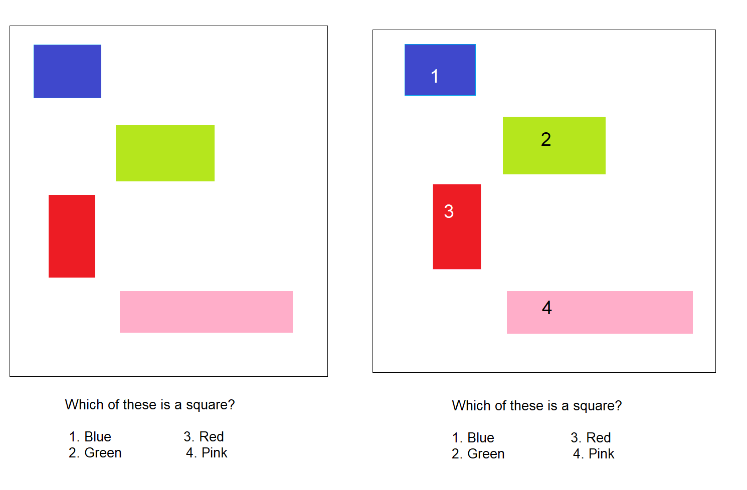
While the first image is a perfect example of what not to do, the second one can be considered as an epitome in using colour and keeping accessibility in the picture.
Aptness in forms
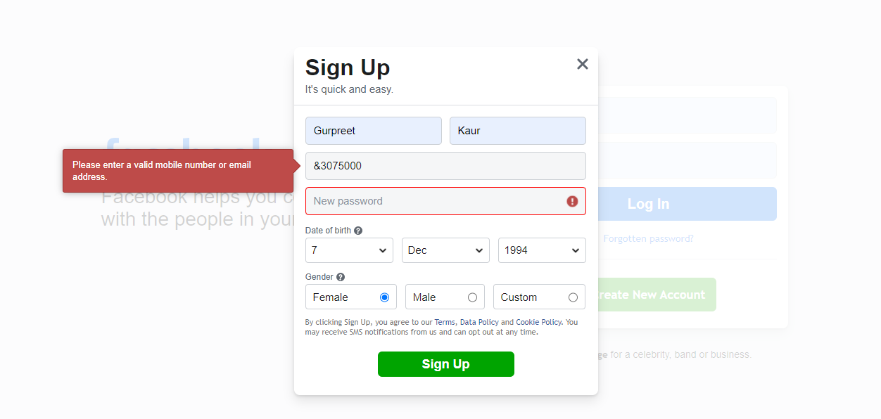
Today, you would hardly find a website that would not accompany a form to fill, after all that is their way of connecting with the audience. So, making the forms accessible to all audiences is key. And sufficient labelling is the way to do it.
Every field that you have in the form needs to have a corresponding label that isn’t too far away from it. Adjacent labels are much better than the ones inside it that disappear after the field has been filled with content.
You may know that oftentimes a form is filled the wrong way, so letting the user he has made an error is also crucial. This needs to be done using colours and an instruction or some sort of a sign because someone with colour blindness might not be able to see the red that is being highlighted in an erroneous field.
Aptness in focus elements
There are certain elements in a web design that require more focus than others, these are essentially the interactive elements of a site, such as the BUY NOW button. You would have read these two words before even reading the sentence because they are in capitals, meaning they are focused.
The same ideology has to be followed by you in web designing. You should have a different highlight for when a button is hovered over, when it is reached by the keyboard and when it is touch or click ready.

If your focus elements are not highlighted properly, by say a keyboard, can it be possible for the keyboard user to actually get the full experience of your site, I think not.
Aptness in media
Media is another integral part of your website, some might even say it gives life to an otherwise dull webpage and they are not entirely wrong. To keep the liveliness alive, you have to make the media truly accessible.
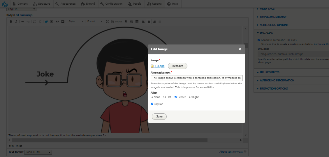
Starting with images, it is extremely imperative that you provide alternative text to the same. Adding a caption and description is equality pivotal for audiences using a screen reader. Almost all the CMSs have a pretty prominent alt text option while you upload an image, ensure that you use it.
What alt text is for images, transcripts are for the audio elements of a website. For the users with auditory difficulties, transcripts that are the sole medium of inclusion. With videos, it becomes necessary to include an audio version of what is happening in them. Considering explaining complicated graphs and tables is another step closer towards accessibility.
Lastly, I want to mention autoplaying audios and videos. Nobody wants to listen or see them and they only make the user rush to find the button to stop them. So, as a general rule of them, add audios and videos in such a way that the user willingly plays them.
Aptness in navigation
A user won’t just access a single page on your site, if he does that, then you won’t ever achieve your targets. To go through all of the pages and potential of a website, a user would need to navigate through it and you have to provide an obvious way to do that. You can do that by multiple ways with the provision of orientation cues, a site map is one of the most common ways.
All of this depends on the layout and the structure of your website, so ensuring that it is meaningful and logical would go a long way in achieving accessibility. A well structured layout should have a couple of things in order;
- It should be flexible and resizable;
- It should have a minimum of 320 pixels;
- And it should be able to zoom upto 400% and in close proximity.
All three help people with disabilities navigate easily. Imagine you are using a magnifying glass to read through all the content and options on a website, would you not prefer that the things you are looking at are close to each other? You don’t have to tell me, I already know your answer.
Then come the keyboard users, you have to be mindful of them as well. Without getting into the reason for people using a keyword instead of a mouse, I would tell you that for these people the tab key is the most crucial. You have to keep in mind when creating the order of your design, since you do not want your user to get lost while navigating.
Aptness in content
The content on your website is its heart and soul; it is what lets the user know of your intentions and your work. Therefore, being extra diligent with the content and its placement is prudent to avoid clutter.
Let's start with readability, you cannot write your content like it is Da Vinci Code, yes, some people might still understand it, but that is not the aim right. Use simple language with short sentences, short paragraphs and common vocabulary because if the audience is not understanding it, well then, it’s a moot point.
Then there is the spacing issue, you need to adequate spacing between paragraphs, lines and individual letters as well.
It is recommended that the paragraph spacing should be twice the font size;
the line height should be 1.5 times the font size;
And the letter and word spacing should be 0,12 and 0.16 times the font size.
After doing so much, also try using a font that is easy to read on multiple devices, Arial and Sans Serif are a couple that are just that.
Aptness in controls
Then comes the bit about controls, and what are we controlling? That would be ‘the interactive elements.’ Every website has them, be they in the form of buttons or links, they are going to be there. Accessibility would be achieved when these controls are designed so that every person, despite their disability can use them.
For instance, a person suffering from tremors might not be able to interact with a really small icon. He would find it very difficult to select or unselect a checkbox, the same is also true for the elderly, who suffer from a reduced dexterity due to age.
Therefore, the size of a control needs to be 44 by 44 pixels, as per the recommendation of WCAG. However, even the size of 34 by 34 pixels could be deemed acceptable, anything below it would be prejudicial.
Aptness in feedback
As a last point, I want to mention your part in the user engagement process. When a user does something, whether it is right or wrong, your website should give him an indication of the same.
For instance, he has filled a form, then there has to be a confirmation message or if there has been a modification in the page he was using, there has to be a notification to alert him of the same. This is called your feedback to the user and it has to be prominently displayed for the user to really get it.
Aptness in effects
Photosensitivity is a disorder that can cause headaches, nausea and make the sufferer dizzy. Photosensitive epilepsy is a disorder that can induce seizures in the patient from just fast flashing lights. Since many websites use effects and hyperlinks that blink rapidly, these people would suffer a great deal if they go on and use the said sites.
Therefore, accessibility guidelines mandate that you use animations and effects that do not make people suffering from epilepsy and photosensitivity suffer more. This could be achieved by trying to use;
- Animations that are small in size in comparison with the screen;
- Animations that go in the direction of the scroll and follow its speed;
- And animations that are not constantly moving or blinking.
To be on the safer side, try to provide an option to pause or hide them, if the user wants to. Some sites even give the option of slowing them down, now that is a thought.
Access this ultimate guide to plan for web accessibility. And, for a complete guide on web design, read this.
Conclusion
I want to conclude by saying that designing for web accessibility may mandate that you follow a certain set of principles, but that does not mean that it is inhibiting your innovative streak. Think of it as a chance to transcend your abilities and make your web experiences all the more valuable.
For that to happen, you would have to constantly evaluate your site, especially in the design and development phase. An accessibility audit would help a great deal in that. It would help you in knowing the areas that need improvement and guide you through the accessibility transformation.
Subscribe
Related Blogs
UX Best Practices for Website Integrations
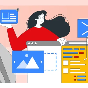
Website Integrations determine whether users stay engaged or abandon a site. I experienced this firsthand with a delivery…
How design thinking acts as a problem solving strategy?

The concept of design thinking is gaining popularity these days since people across different industries are using it as a…
10 major challenges that come across during an agile transformation

It’s no longer a mystery that agile was created as a response to the various concerns that the traditional waterfall…