Humour in Web Design

Gurpreet Kaur
Design (UX/UI)
Published on 21 Sep, 2020
14 min read
There are two kinds of instances that we never forget in our lives; one is when we hysterically cry, and the other is when we hysterically laugh. The other moments in our lives are bound to lose their place in our memories, but not these. Have you ever forgotten a time when you laughed like crazy or cried like a baby? You know I am right.
These moments are not necessarily associated with your personal lives, these can be related to the professional and commercial experiences you witness at any point. Now, I would not be talking about the upsetting consumer encounters you might have had, since I do not want to dampen your day. Instead, I will be talking about the kind of experiences that make you go all smiles.
We smile because we are happy or smile because someone has cracked a funny joke. Jokes do not have to be limited to social gatherings and Whatsapp messages; they can transcend to the world of web design. Yes, you read it right. Today, jokes, or shall I say humour has become an integral part of web design. Humour has the potential of taking an ordinary website and making it extraordinary.
If you don’t believe me, continue reading, and by the time you will finish, I am sure your opinion would have changed.
The Importance of Humour in Web Design
Humour is an element of our lives that makes it brighter and livelier. People look forward to reading jokes, making jokes and laughing at their hilarity. You know you like those PJs as well, they might not make any sense, but they can be funny. Stepping a little up from the PJs, and moving on to web design. Humour has become extremely important in the world of web designers. It can make or break their designs, it is that powerful. Let us understand why.
If someone is funny and quirky, you will instantly like him or may even be drawn to his or her funniness. Am I right? The same is true for web designs. A user experience that is instilled with enlightening as well as humorous elements is going to be a hit. Humour has the potential of contributing to sales by highlighting a product or service’s attractiveness and making you drawn to them. It does so by giving them a genuine personality. Don Norman believes the same and has vocalised his beliefs in his book, Emotional Design - Why We Love (or Hate) Everyday Things.
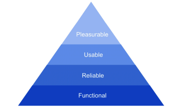
After a customer is lured in, you have to keep in mind his needs in order to gain his loyalty. These needs start with the functionality of a product, then move onto its reliability, after becoming satiated with the usability of the same, these needs are finally placated with the pleasure factor. If a product is pleasurable to the user, only then can it be deemed as a success. And you must know that pleasure and humour are the best of friends.
Humour is bound to create positive emotional stimuli in all of us. When a user experiences such a response from a web design, there is a high likelihood that he will develop a sense of trust in the same. And that is the reason why humour is important in web designs and should be implemented, but with caution. Read more about the link between decision science and web design to understand how to make design decisions.
The Subjectivity of Humour
Humour is a kind of quality that is possessed by everyone, yet everyone has a different notion of it. What may be funny to me, can be offensive for you and nobody can say that our notions about it are wrong. We just have a different perspective.
So, the web designers have to keep this in mind, you have to understand your audience before committing to any humorous elements you want in your designs.
A web developer has to first comprehend the subjectivity of humour. Yes, every joke is not going to be funny for everyone, but it can be funny for the majority of the people and that should be the ultimate aim. Your jokes need to be understood by most people visiting your site, even if you are using innuendos, they should not be indecipherable.
Zeroing in on your target audience will help a great deal in this feat. To help you catch my drift, I will tell you something that you must already know. And that is the fact that the eastern and western cultures are vastly different. So, the kind of jokes these two people find funny are also different. You can joke about celibacy in the west and people would laugh, but if you joke about celibacy in the east, where the Buddhist Monks preach it, you will not get the same reaction.
So, identifying your target audience is crucial, as it would decide whether your humour would hold a punch or not. The subjectivity, the cultural intonation and the contextual meaning of a joke are to be mastered before using it into your designs.
Here the second phrase, when used in different contexts has very different meanings, and this kind of contextual differences cannot happen in your web design. So, to answer the question: can humour be used in web design? It most definitely can be, but only as long as it is appropriate and in context.
The Categories of Humour
Humour is something that is funny, something that makes us smile, laugh and roll on the floor laughing or ROFL, if you please. I like to believe that I have a great sense of humour, I laugh at things that are not even worth laughing at and a person with that kind of humour must know everything about it, right? But that isn’t the case with me, I did not know that there were seven categories of humour. Did you? For me funniness, satire and irony all fall into the same category, being one and only one.
So, getting to know the seven varying diversifications of humour in web designs was quite enlightening for me. I hope it is the same way for you.
Comparing with comedy
Humour by comparison is the most commonly used way of making boring elements on a website become interesting and refreshing. Going through a product’s specifications becomes a chore, if you do not find something funny in the never ending description. Making comparisons that are not only funny, but also serve the purpose of highlighting what the web designer wants is a tactic that could never go wrong.
Personifying with cartoons
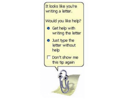
Do you remember the early 2000s? Did you use Microsoft Office then? If you did, you must remember Clippit or Clippy. It was a cartoon paper clip that served as an office assistant. I thought it was cute, funny and somewhat useful; however my belief was not very popular. The point I am trying to make here is that the addition of an animated personification can add character to your web content, giving the customer a break from the monotony of the content. A mascot is a great way to do just that.
Exaggerating with hilarity
With exaggeration, we take a normal incident, magnify it in our minds, and relay the same with a lot of more severeness than it actually had. It is like saying that you were attacked by a mammoth sized dog, when in actuality a pug barked at you. If you know something is being exaggerated, then it becomes quite hilarious.
Pun with fun
Pun is something we are all familiar with, and enjoy a great deal. So, why not use it to make your website all the more interesting. The thing about the usage of pun is that it is quite tricky. It can very easily go into the territory of offensive, if it is not used properly. So, tread lightly when using it in your web design.
Silliness with funniness
Have you ever watched the American TV show Friends? If you have, what do you think of Phoebe? Do you find her funny? I personally do, she is the kind of funny that is silly, yet hilarious. You would never be offended by her character. So, taking inspiration from Phoebe’s hilarity and silliness and implementing it into your website could be a genius stroke.
Surprise with laughs
Getting pranked is the best kind of surprise, at least to me it is. Being ambushed by a horrifying ghost in a funny video is bound to make you laugh until you cry with your heart racing at 100 km an hour. You must have experienced it sometime. Now, you tell me would an unexpected element of humour not be appreciated in a webpage that could otherwise be boring?
Jesting over the Easter Egg
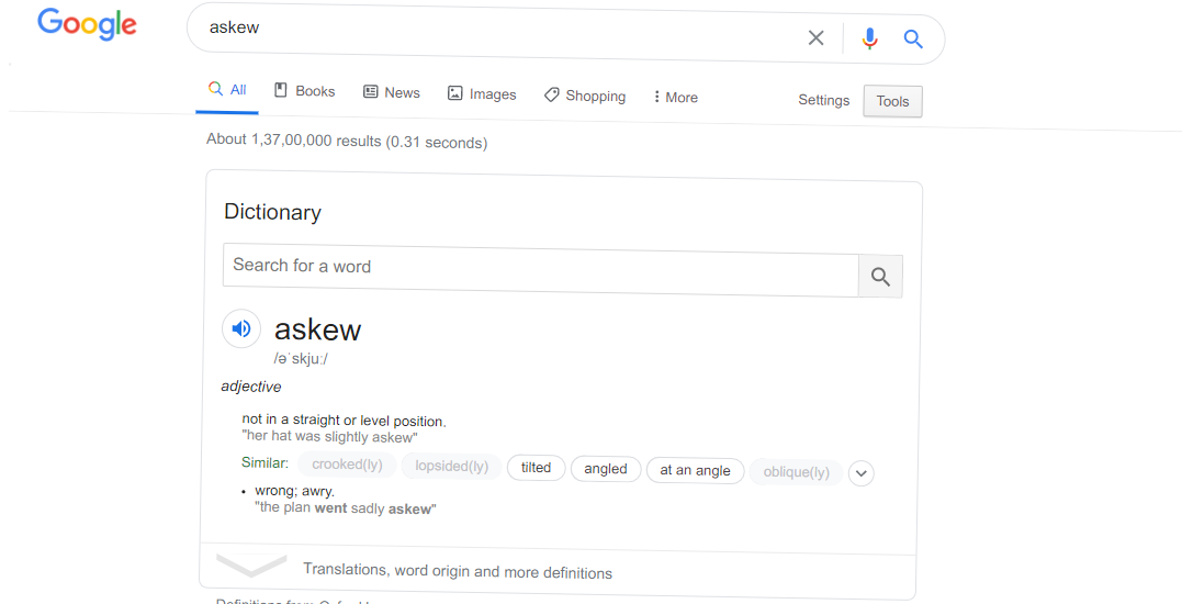
As finding the easter egg amidst bunnies is no easy task, the same way the humour denoting with the same name is also not easy to find. This one is hidden and that is why it is a gem, when you finally get it. Web developers have been increasingly making use of easter eggs as an element of humour in their web designs and the users have been appreciating the hunt. Have you ever searched the meaning of the word askew on Google? Before you get on to the meaning, you would find something that would give you a clue as to the literal meaning of the word. Your beloved Google would become skewed itself. Is this not clever?
An amalgamation of all of these with subtly can make your website’s experience a memorable one for every user to come.
The Implementation of Humour in Web Design
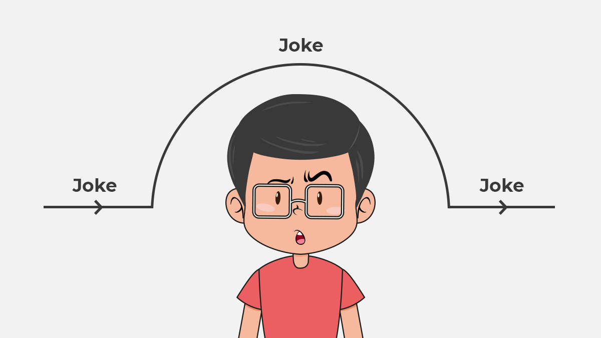
The thing to remember about humour is that if you have to force it, it is bound to lose its intensity over the audience and your joke would fall flat. Under no circumstances, do we want that. Humour has to seem spontaneous and natural, only then can we enjoy its full magnitude.
To help you do the same, I will tell you some of the insider secrets of web developers and the way they make humour work for them.
Introducing yourself with a flair
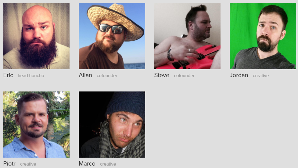
Every website is going to have an About Us page, this is one area in a website that the content creator can create any way he wants to. So, if you want the customer to remember everything about you, you have to make yourself interesting enough to be remembered and humour helps in that. You can talk about history with light heartedness, you can talk about your struggles with humour rather than seriousness, and you can present your team in a fun and refreshing way. See the following example from Lessfilms website:
Making boring, yet crucial information interesting
Webpages are supposed to have a lot of information and a lot of information can become quite boring to peruse through. Since the information has to be given to the user, what can be the solution here? The answer is simple, humour. Adding humour, in all of its categories can make your website content speak through and serve its intended purpose.
Covering up your mistakes
There are often times when your users face problems while surfing through the website. More times than not these problems are frustrating and annoying to the point that they think about going back and looking for something else entirely. Can this annoyance be overcome with humour? Let us see if it works for two of the most annoying things.
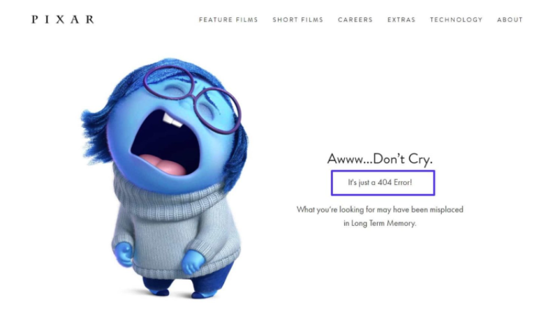
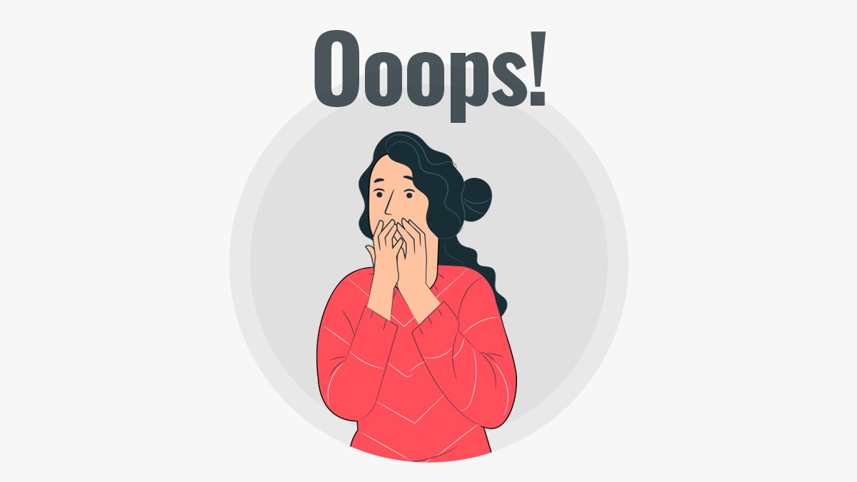
The 404 error
When you get to know a page you were looking for does not exist anymore, you will become frustrated. Here a joke is bound to alleviate some of that. Look at the picture below, did it not make you smile just a tad bit?
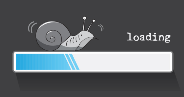
Slow loading
Apart from the page not found error, when a web page takes ages to load, that also becomes quite a nuisance for the user. There might be a genuine reason for the slow loading, but the problem would still be there, so what does the web developer do? You would use humour in a very subtle way to make the user wait a little longer and see what he had intended to.
Narrating a story
Sometimes storytelling becomes a necessary part of the web design. It is important to make your point come across in a simple, yet comprehensive manner at the same time making it relatable to the audience. Now, when you add a dose of funniness in your story, it would accentuate your point even more.
Creating a mascot
A mascot is any object, human or otherwise that is bound to bring you luck. And web developers need all the luck they can get, like most of us. So, creating a website with a funny mascot that keeps popping up in regular intervals to let the users know whatever they want is a great way to make your website’s experience a little more eccentric than dull.
Baiting with humour
You must be familiar with the term bait, it basically means to lure people in by enticing them with what you have. Have you ever read something like, “If your dog does this, here is what it means.” You might not even have a dog, but you will be inclined to know what the dog actually does. This is what bait means and it can increase the traffic on many websites.
The Avoidance of Humour
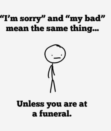
Knowing how to incorporate humour in web design is not sufficient, you should also know when to avoid it. Humour can only work its charm when it is used appropriately, incongruous use of humour can lead to devastating effects. You can’t be cracking jokes at a funeral, right? Right!
Here are three ways to avoid humour taking a toll on your website’s traffic.
Unnecessary implementation
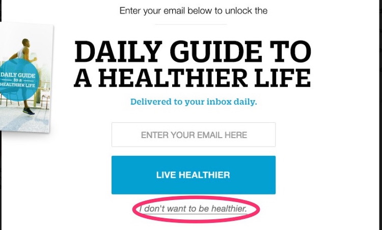
You have to assess the right place and time of using comical aspects in your web design. Using comedy in a serious situation can have serious repercussions, one of which is a brutally harsh feedback from a customer and we do not want that.
Seeing something like this on a retail website when your transaction failed and money got deducted from your account is bound to make the customer livid. So, to all web designers, do not go this route.
Confirmshaming
This one is as insulting as it is inappropriate, if you want your website to be user friendly, I would advise to stay away from confirmshaming. This is a form of humour that uses guilt to make the customer do its bidding and that is just wrong. Telling someone that they are fat and should join your 15-day detox program is not the right approach from any perspective.
Making it a distraction
Using humour in a way that it distracts the customer from what you and your website is all about is probably not the aim. So, when you use comedic elements in your design, try to ensure that it is clearly understood by all the audiences or at least your target audience and it aligns with your website’s purpose. You do not want to leave any room for misinterpretation. This is because if a product is misinterpreted and the consumer does not get what he thought he would, he is definitely going to regard you as a liar.
The Backlash of Humour
After telling you the ways to avoid humour getting in the way of your success, I want to tell you a story about the negative repercussions of the wrong kind of humour.
Pepsi is a world renowned beverage company, second most successful in the world in its arena. Pepsi is also famous for creating inspiring and unique ad campaigns. They are usually a hit, but their 2019 campaign missed its mark by a long shot. The only reason was the fact that they had taken a serious situation and made light of it.
As you can see in the video, a bottle of Pepsi was all it took to restore peace in the world. Do you also see the bizarreness in this idea? On top of this, the stark resemblance to the Black Lives Matter campaign did all the more damage to the company, the tweets are proof that. Pepsi had to retract the ad and issue a public apology.
Therefore, it is advisable to avoid making humorous content on serious topics than making it and apologise later. Although it was a video commercial, the implication will be the same for website design as well. Nobody will tolerate humour on a subject they are sensitive about. The fine between humour and offensiveness has to be made very clear before implementing humour in your designs. Otherwise the backlash is going to be too brutal to bear. Take a look at how diverse design teams can help make better design decisions.
The Bottom Line
Using humour in web design to make your website’s experience more enjoyable has indeed become a trend; however, content creators and web developers have to understand that humour can just as easily turn deleterious as easily it can turn meritorious.
Humour in web design is like a flaming ball of fire, the appropriate usage can make it as powerful as Goku’s dragon balls, and inappropriately used humour can turn your design into ashes; metaphorically speaking of course. You have to have a balance, do not go overboard and do not use it so little so that it becomes non-existent. When you attain that balance, your web design would become one to watch out for, trust me.
Subscribe
Related Blogs
UX Best Practices for Website Integrations
Website Integrations determine whether users stay engaged or abandon a site. I experienced this firsthand with a delivery…
How design thinking acts as a problem solving strategy?

The concept of design thinking is gaining popularity these days since people across different industries are using it as a…
10 major challenges that come across during an agile transformation

It’s no longer a mystery that agile was created as a response to the various concerns that the traditional waterfall…