Bootstrap is the leading choice of front-end developers. A trusted open source front-end framework, one can easily develop a modern website with features like mobile responsiveness.
In order to build an attractive and functional website, Bootstrap provides the basic structure of HTML and CSS with predefined classes which help with device responsiveness.
In the year of 2013, Bootstrap 3 was launched and then August 2017 saw Bootstrap 4 release.
Bootstrap 3 vs Bootstrap 4
1. Installing the Themes
Bootstrap 3 has only one option to install Bootstrap in a package while Bootstrap 4 has four options.
Bootstrap 3
nuget
PM> Install-Package bootstrap -Version 3.3.7
Install Bootstrap 4 with the Package Manager
There have lots of package manager available to download bootstrap 4 easily in your project
npm
Install Bootstrap in your Node.js powered apps with the npm package
$ npm install bootstrap
RubyGem
Install Bootstrap in your Ruby apps using Bundler (recommended) and RubyGems by adding the following line to your Gemfile
gem 'bootstrap', '~> 4.0.0'
a) Alternatively, if you’re not using Bundler, you can install the gem by running this command:
$ gem install bootstrap -v 4.0.0
Composer
You can also install and manage Bootstrap’s Sass and JavaScript using Composer
$ composer require twbs/bootstrap:4.0.0
NuGet
If you develop in .NET, you can also install and manage Bootstrap’s CSS or Sass and JavaScript using NuGet:
PM> Install-Package bootstrap
PM> Install-Package bootstrap.sass
2. CSS source file update from LESS to SASS
SASS is more powerful than LESS. SASS has functionality like logical operators, loops, mixing, em, rem, nested media queries, extend, and much more.
LESS was easy to learn, and it makes for a quick step-up to SASS. So, it seems like the time to get comfortable with SASS is now.
You can also read about the nine ways to write best SASS code
There are a lot of options for compiling SASS to CSS, so it is easier to use.
3. Font size update from px to rem
The best practice of typography on the web is to use the relative units of rem, em, and px. Bootstrap 4 uses rem. It will more flexible in comparison to px. With rem, you can scale elements up and down without getting stuck with a fixed size. This makes the design easier to adjust during development making the content device responsive.
Some of the features which can be used to differentiate between Bootstrap 3 and 4
|
Component |
Bootstrap 3 |
Bootstrap 4 |
|
Source CSS Files |
LESS |
SCSS |
|
Primary CSS Unit; Global Font Size |
Px | 14 px |
Rem | 16 px |
|
Media Queries Unit |
px |
px |
|
Default Fonts |
Helvetica Neue, Helvetica, Arial, sans-serif |
Uses a "native font stack" (user's system fonts), with a fallback to Helvetica Neue, Arial, and sans-serif |
|
Grid Tiers |
4 tier grid system (xs, sm, md, lg) |
5 tier grid system (xs, sm, md, lg, xl) |
|
Offsetting Columns |
Uses col-*-offset-* classes to offset columns. For example, col-md-offset-4 |
Uses offset-*-* classes to offset columns. For example, offset-md-4 |
|
Dark/inverse Tables |
Not supported |
Added dark/inverse tables with the .table-dark class |
|
Responsive Images |
Use .img-responsive class |
Use .img-fluid class. |
|
Image Alignment |
Use .pull-right, .pull-left, and .center-block helper classes. |
Uses .m-x-auto instead of .center-block to align block-level images. Can use the various .pull-*- noneclasses to disable floating. Also supports Bootstrap 3 components. |
4. Grid System Updated
Bootstrap3 has 4 grid classes (col-xs-3, col-sm-3, col-md-3, col-lg-3), while version 4 has 5 grid classes (.col-, .col-sm-3, .col-md-3, .col-lg-3, .col-xl-3).
Bootstrap 4 has removed the xs from the lowest breakpoint. While in Bootstrap 3 the lower point works with xs (.col-xs) but now in Bootstrap 4 it has been removed and used only (.col-) for a lower breakpoint.
| Grid Size |
Extra small <576px |
Small ≥576px |
Medium ≥768px |
Large ≥992px |
Extra large ≥1200px |
|
Max container width |
None (auto) |
540px |
720px |
960px |
1140px |
|
Class prefix |
.col- |
.col-sm- |
.col-md- |
.col-lg- |
.col-xl- |
5. Accessibility
The overall accessibility of any project built with Bootstrap depends in large part on the author’s markup, additional styling, and scripting they’ve included. However, provided that these have been implemented correctly, it should be perfectly possible to create websites and applications with Bootstrap.
The responsibility of complying a website with WCAG 2.0 and Section 508 comes directly on the shoulders of frontend developers.
Themes provided by Bootstrap have always been following common web standards and giving fewer headaches the developers to create sites that are accessible for all.
While Bootstrap 3 provided Skip navigation, Nested headings, and color contrast, Bootstrap 4 has improved the accessibility with its components.
Styling and layout from version 4 can be applied to a wide range of markup structures. Components such as modal dialogs, drop-down menus, and custom tooltips have been designed to work for users from touch, mouse to keyboard. And these components are also understandable and operable with assistive technologies such as screen readers.
Authors can now manually modify/extend these default colors to ensure adequate color contrast ratios.
Content that needs to be visually hidden but remains accessible to assistive technologies can now be styled using the .sr-only class.
Bootstrap 4 also includes support for the prefers-reduced-motion media feature. However, currently, the support is limited to Safari on macOS and iOS.
Bootstrap’s components are purposely designed in a way where potential accessibility concerns can be addressed.
Drupal is ensuring the web accessibility standards, read how.
6. Flexbox based Grid Added
Flexbox is one of the important and crucial features of Bootstrap 4 which make it different from Bootstrap 3. One can quickly manage the layout alignment, change the size of grid columns, components navigation and manage the formation of complex layouts with ease.
Bootstrap 3 used floats to handle the layout unlike flexbox in Bootstrap 4.
The Flexible Box Layout makes it easier to design flexible responsive layout structure without using float or positioning.
Although it has responsive features, with custom CSS the implementation has become complex with Bootstrap 4.
a) Direction
You can set the direction of the flex items in flex container with direction utilities.
Use .flex-row to set a horizontal direction and for horizontal direction from the opposite side use .flex-row-reverse.
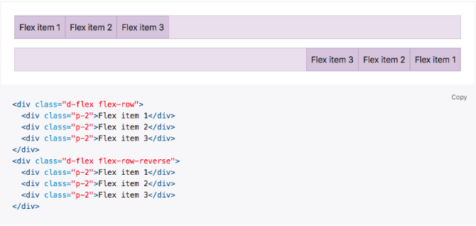
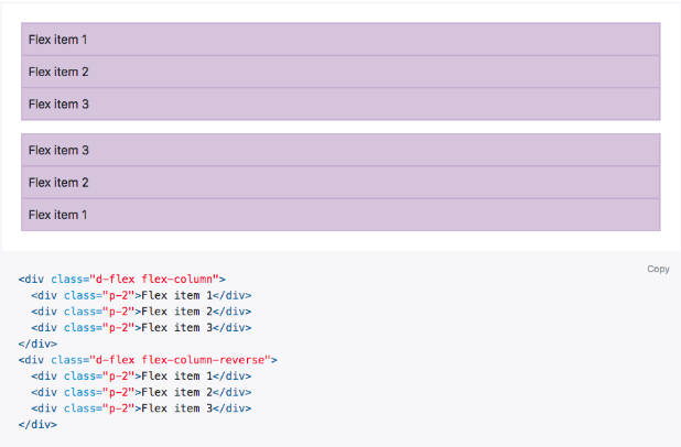
Use .flex-column to set a horizontal direction and for horizontal direction from the opposite side use .flex-column-reverse
Missed in version 3 was added only in version 4.
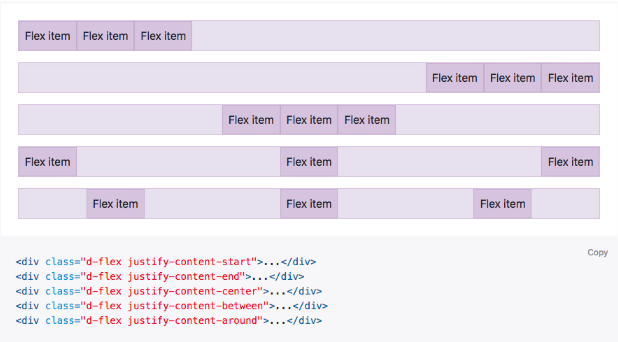
b) Justify content
You can align your item at any direction like start, end, center, between, or around with .justify-content.
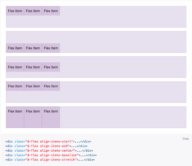
c) Align items
Align your content in flexbox containers with .align-items. Choose from the start, end, center, baseline, or stretch
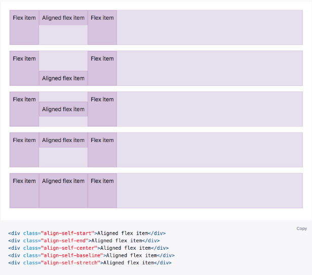
d) Align self
Use .align-self to flexbox items to individually change their alignment on the cross axis. Options as align-items: start, end, center, baseline, or stretch.
e) Auto margins
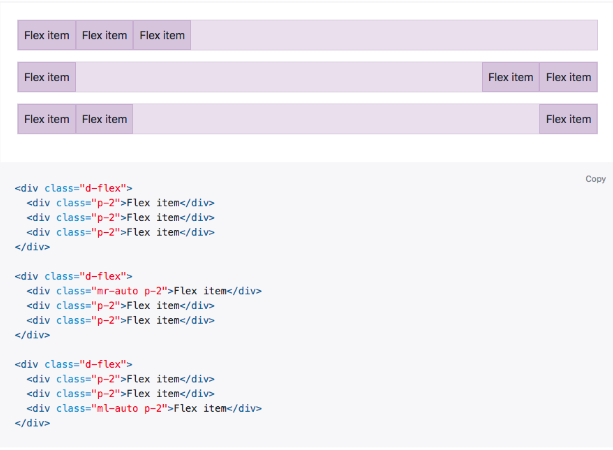
Flexbox gives you some great feature when using alignments with auto margins. these three auto margins option can be used as default (no auto margin) pushing two items to the right (.mr-auto), and pushing two items to the left (.ml-auto).
f) With align-items
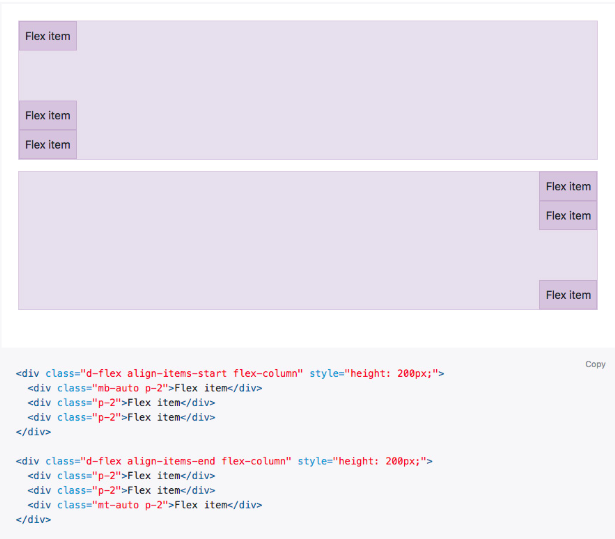
Vertically move one flex item to the top or bottom of a container by mixing align-items, flex-direction: column, and margin-top: auto or margin-bottom: auto.
g) Wrap
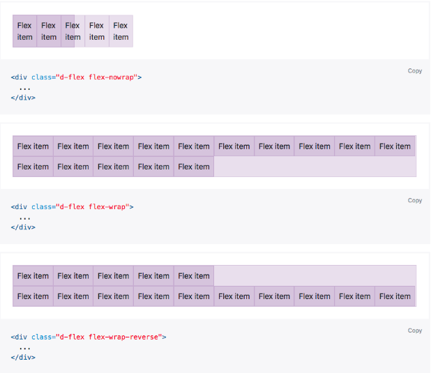
Use .flex-nowrap to wrap flex items in a flex container. with .flex-nowrap, wrapping with .flex-wrap, or reverse wrapping with .flex-wrap-reverse.
h) Order
Use order of specific flex items with a handful of .order.

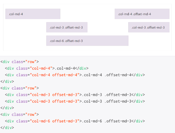
7. Offset class
Offset classes are pretty simple to use you have just action to need to be taken - like .offset for example, smallest grid size your need it apply form and above - like -md and value for the added action in number of columns like -3, for example, the whole thing pulls together results from .offset-md-3 which will offset the desired column element with 3 columns to the right from its default position on medium screen sizes and above, .offset classes always shifts its intent to the right.
8. Bootstrap Themes
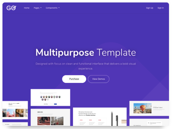
Bootstrap themes are an ultimate package of HTML, CSS, and JavaScript codes that provide awesome styling, UI components, and page layouts.
Additionally, they are pre-built website templates for you to adapt and build upon.
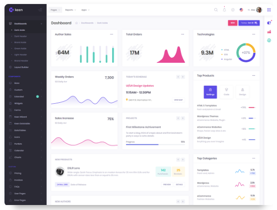
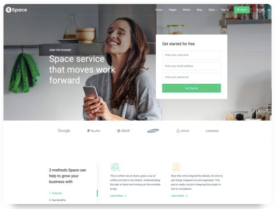
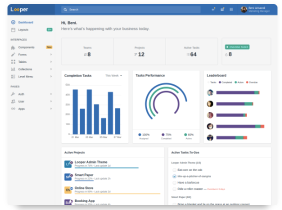
Bootstrap 4 has better and improvised options to create your website easily and quickly. With version 4 you can use a lot of themes available for your website, cPanel, dashboard, and software.
While there were no such templates from Bootstrap 3.
9. Responsive tables
Bootstrap 4 table is fully responsive to its class (table-responsive ) to allow horizontal scrolling of the tables on mobile devices, it’s comfortable with any screen size desktop, tab, or mobile.
You can decide when the table should get a scrollbar, depending on screen width:
|
Class |
Screen width |
|
.table-responsive-sm |
< 576px |
|
.table-responsive-md |
< 768px |
|
.table-responsive-lg |
< 992px |
|
.table-responsive-xl |
< 1200px |
10. Uses of popover and tooltip
Bootstrap 4 popover is similar to tooltips it is a pop-up box that appears when the user clicks on any kind of element, the difference is that popover can contain much more content to show.
<a href="#" title="Dismissible popover" data-toggle="popover" data-trigger="focus" data-content="Click anywhere in the document to close this popover">Click me</a>
11. Rename classes for image
.img-responsive has been changed to .img-fluid
.img-rounded has been changed to .rounded
.img-circle to rounded circle - can be used for other elements (box, icon, button)
12. Browser Support
Bootstrap 3 supported the IE8 and iOs 6 version and Bootstrap 4 now only supports IE9+ and iOS 7+, - while dropping the previous versions.
To Conclude
These are just some of the features which can be used to differentiate between Bootstrap 3 and 4.
Bootstrap 3 was primarily the “mobile-first” framework designed with the idea of presenting nothing but the best. With the change in time and technology, Bootstrap 4 has narrowed down the perspective while offering the best customization.
Let us know in the comments below which one do you find better. Or hit us up at [email protected].
Subscribe
Related Blogs
Trek n Tech Annual Retreat 2025: A 7-Day Workcation of OSL

OSL family came together for the Trek n Tech Annual Retreat 2025, a 7-day workcation set amidst the serene beauty of…
Exploring Drupal's Single Directory Components: A Game-Changer for Developers
Web development thrives on efficiency and organisation, and Drupal, our favourite CMS, is here to amp that up with its…
7 Quick Steps to Create API Documentation Using Postman
If you work with API , you are likely already familiar with Postman, the beloved REST Client trusted by countless…


