Syntactically Awesome StyleSheets also known as SASS is a powerful tool for the frontend developers providing an edge when working on CSS. With its many benefits among the one to write CSS with utmost ease when maintaining large projects, it also assists in writing dry CSS.
One of the most effective ways to make the code efficient is by structuring it with different components. And this is exactly where SASS helps you out.
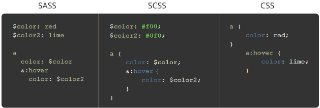
SASS can be written in two syntaxes:
- Indented syntax or SASS: It uses indentation rather than brackets and newlines.
The files use the SASS extension.

- Sassy CSS or SCSS: It is the superset of CSS3. Its files use the SCSS extension.
Every valid CSS is the valid SCSS.
In this article, we will try the nine tricks to write the best SASS code without losing much of the time. Also, I will be using SCSS.
And here we go:
- Structure your SASS Project
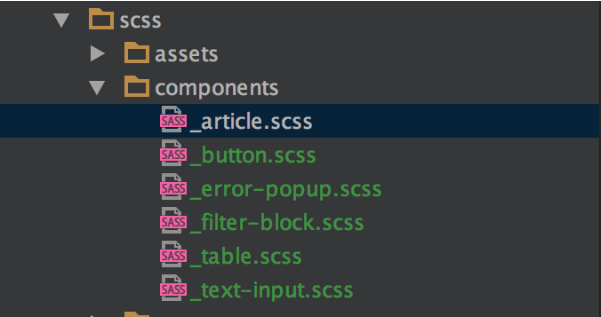
Structuring your SASS project is one of the most important parts as it decides the development process from hereon. For structuring your SCSS file you can use partials.
Break your SCSS file into small units or modules which are easier to manage and develop.
For creating a partial file write the file name starting with an underscore, for example, _button.scss and _table.scss. You can also import these partials files using @import directive.

An example: Let’s say you have files _button.scss, _table.css and base .scss.// _button.scss .button{ color: black; background:gray; border-radius: 5px; } // _table.scss td{ color: red;} //base.scss @import ‘button’ ; @import ‘table’ ; Body{ padding: 0px; font: sans-serif; }This is compiled as :
// base.css .button{ color: black; background:gray; border-radius: 5px; } td{ color: red;} Body{ padding: 0px; font: sans-serif; } -
Use Ampersand selector or parent selector (&)
It comes in handy in writing dry CSS. Dry CSS helps in maintaining the project. Normally used in nesting this can be easily explained with an example:a { Color: red; & :hover { Text-decoration: underline; } }This is compiled as
a {
 Color: red;
}

a:hover {
 Text-decoration: underline;
}
With some nesting of pages :
.page {
 &_article {
 }
 &_blog {
 }
}
This is compiled as
.page_article { } .page_blog { } -
Use % (placeholder selector) to Save Time
Placeholder selector is used when you want to reuse the code. It’s very effective in writing dry CSS as it reduces the amount of duplicate code. The placeholder can be extended using @extend directive and here CSS of extended selectors would be generated but not for base selectors.%box { border: 2px solid black; width: 200px; height: 200px; } .blue-box { @extend Box; Background: blue; } .redbox { @extend Box; Background: red; }This is compiled as :
.blue-box .redbox { border: 2px solid black; width: 200px; height: 200px; } .blue-box { Background: blue; } .redbox { Background: red; } -
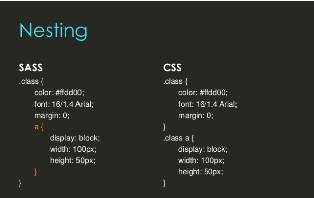
Nest your Code
Nesting is an easy and efficient way of organizing your SASS since it follows same hierarchy as HTML. Also, it is very easy to understand.

.Dairy {
 .Milk {
   Color: white;
 }
 .chocolate {
   color: brown;
 }
}
This is compiled as :
.Dairy .Milk { Color: white; } .Dairy .chocolate { color: brown; } -
Mixins are Important
Mixins can be reused without providing septic classes or values. A mixin is defined by using @mixin directive. Although it is an important practice, it is optional. Use @include followed by the name of the mixin.
For example :@mixin circle($arc) { Border-radius: $arc; -moz-border-radius: $arc; } .roll { @include circle(50px); }Complied as:
.roll{ Border-radius: 50px; -moz-border-radius: 50px; } -
Use Media queries in SASS
Best and convenient way to write media queries in SASS is using the variable :
For example :$mobile-phone: "only screen and (max-width : 767px)"; .box{ Color: green; @media #($mobile-phone){ Color: red; } }Compiled as
.box{ color: green; } @media only screen and (max-width : 767px){ .box{Color: red;} } -
Use Functions for Calculations
A function is a named section that performs a specific task. In SASS, functions can be used to perform calculations which will be used to manage throughout the site.
A function can be used to manage width of the element in SASS.@function calculate-width($col-span) { @return 100% / $col-span } .span-two{ Width: calculate-width(2) }Span 2 columns , width = 50
-
Efficiently utilizing @debug, @error, & @warn
@debug
These are the set of a directive which you can use to debug your code. It is used to print the value of the expression to the console. It is very similar to the console.log() in Javascript i.e it will not stop you from executing the code and it will notify or print value by printing value in the console.
Code://variable $brand-color: blue; // @debug @debug $brand-color ;Output:
_color.scss:52 DEBUG : blue@warn
This also prints the value of the expression to the compiler with the file where a warning message is located and with a specific line, like @debug. It will let you continue to work and it was a great choice for giving notification about deprecated code and mixin usage mistakes. You can turn the notification off using – quiet command line option.// Function using @warn directive @function wall($height) { @if unit($height) ! = px { @warn ‘Please use pixel value only’ } @else { @return ($height) * 1rem}; } element{ Height : wall(20rem); }Output:
WARNING: Please use pixel value only
Backtrace:
 src/scss/_tools/_functions.scss:9 , in function ‘wall()’ function.
src/scss/_tools/_functions.scss: 25
Element {
Height : wall(20rem);
}
@error
It prints the value of expression as a fatal error and will stop the SASS compiler. It is useful for validating arguments to mixins and functions. It is a good choice when you want to correct the mistake immediately.@function color-grabber($color){ @if has-key($color-palette, $color){ @return map-get($color-palette , $color); } @error “Invalid color”; -
Smartly Use the Control Directives and Expressions
SASS supports basic control directives like @if, @while, @for etc. Here, we will discuss @if, @for and @while. these are normally used with mixins where if want some styling only under certain conditions
@if
It takes a value and uses the styling below it if it returns values other than false or null.div { @if 2+2 == 4 { border : 1px solid white ;} } @if 1> 2 { border : 3px solid white ;} @if null { border : 3px solid white ;} }This is compiled to:
div{
 Border : 1px solid white;
}
@for
If you want the same set of styles over and over again then you should use @for directive.
Here, for each repetition, the counter variable is set to get the desired output. This directive has two types:@for $var from <start> through <end> Here compiled sass will include the <end> value @for $k from 1 through 4 { .grid-#{$k} { width: 3em * $i; } }is compiled to:
.grid-1 {
  width: 3em; }
.grid-2 {
  Width: 6em; }
.grid-3 {
  width: 9em; }
.grid-4 {
  width: 12em; }
@for $var from <start> to <end>
Here compiled sass will not include the <end> value@for $k from 1 to 4 { .grid-#{$k} { width: 3em * $i; } }is compiled to:
.grid-1 {
  width: 3em; }
.grid-2 {
  Width: 6em; }
.grid-3 {
  width: 9em; }
@while
@while directive takes a value and repeatedly outputs the set of styling based on a given boolean condition
For example:$i: 3; @while $i > 0 { .block-#{$i} { width: 2em * $i; } $i: $i - 1; }is compiled to:
block-3 {
  width: 6em; }

.block-2 {
  width: 4em; }

.block-1 {
  width: 2em; }
One crucial point here is to keep your code and practices simple and consistent. That should suffice. Let me know in case I missed something, let me know in the comments below.
Subscribe
Related Blogs
AI Fairness: A Deep Dive Into Microsoft's Fairlearn Toolkit

Artificial intelligence (AI) has changed the game across industries, especially in financial services. From automating…
API Documentation Tool: 10 Best Tools For 2025

A Google search for ‘Best API Documentation Tool’ will show many results. The growing number of API documentation tools…
Debunking 6 Common Software Testing Myths

A flawless product delivery requires a perfect combination of both development and testing efforts. Testing plays a vital…


