Emphasizing the relevance of internet search is tough. Search is even older than the internet. The long existence of search itself implies how important it is to manage and be able to provide the best experience possible.
A nicely designed search benefits both you and your users. It improves lower bounce prices, customer experience, and conversions. Microcopy is an important part of the search and the role it plays in user experience needs to be understood by the UX designers. Microcopy is often overlooked, but it is a dynamic part of UX writing.
Microcopy: Tiny yet crucial
Microcopy, as the name signifies, is a tiny part of the internet but plays a very important role in huge successes. It is the mini informative text on pop-ups, forms, search prompts, buttons, etc. These tiny buttons tell a user what to do, help them with their issues, and tell them the story of your brand.
These small words might look unimportant in comparison to the design part of the webpage or the app. But they tend to influence your brand’s image, conversions, and everything that will make your brand better.
Words help in building trust and promote relationships. All you need to do is add the right words at the right place and at the right time. That’s the mantra to marvelous microcopies.
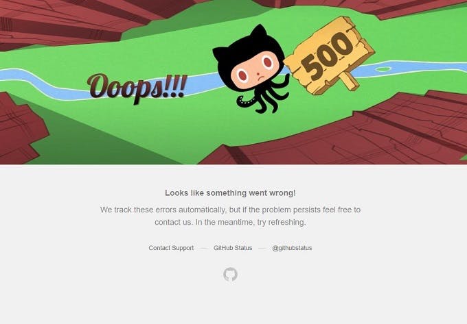
Microcopy encourages before the action, guides through the actions, and reassures after the action. GitHub uses microcopy to take users forward, by telling them to refresh the page or to contact their support.

Microcopy, if written badly, can ruin the user experience and even the brand itself. There is nothing better than a writer who is able to write clear and concise copies along with designing part of the microcopy that does not deter the quality of its functionality.
Implementing Microcopy
Let’s look at some ways how microcopy can be used to engage users.
Empathize
Adding emotions to the copy is one of the best ways to engage and create a relationship with the users. People have been seen to love brands that give them a personalized message and make them feel good about themselves.

It is easy to engage the users in this way, but never try to trick the users by hiding the no result page with a cute error message. Every time a user finds an error message when he tries to search something, he loses interest from your website.
Be Informative
Ensuring that the users know what they will be getting in the search results is an important step. Unsplash clearly mentions the kind of image results it will provide.

While designing a search bar, the first thing that comes to your mind is a rectangular box that says ‘search’ or a rectangular box alongside a search button. You can add attractive placeholder text with a search box next to it.
Make yourself familiar with the kind of users that visit your website. This will make personalizing the placeholder text and search label easier.
Show related and recent searches
Showing related searches when a user searches something is a great way of keeping them engaged. This can be done by adding related and clickable keywords. Images and suggestions like ‘other users also searched for’ adds social proof in the user’s search experience.
Autosuggestions are another way of making search more valuable. This reduces the mental efforts of the user and makes their experience a happy one. These suggestions could start showing up when the user types in the search bar, or even before, according to the search history or the interests if mentioned by the user.
Also, showing recent search history can come handy. Saving the searches done by users in the past makes it easier for them to reduce the memory load.
Show clarity
It is important to have clarity in the microcopies. If it is not taken care of, you might end up losing subscriptions or in the worst case, people might stop using your products. Asking too many personal questions on the forms, showing useless messages and information, providing less or no information about the product, not being clear about how orders could be cancelled can put your brand in trouble.

Make sure that the user knows where they are heading. While updating or installing a product, the microcopy should be able to instruct the user what to do and be clear about what the next step would be.
While writing a clear microcopy, you do not need to write long paragraphs. While staying precise and short is always a better way, staying in context is also an important part of microcopy. It gives the users assurance and gives them an insight into what’s coming on their next click.
Be Transparent
When you ask users for their information, users should know where and how that information will be used. Privacy is a major concern when it comes to digital payments. Your microcopy should be able to build trust and ensure that the users feel secure and don’t just abandon their purchase.
Staying authentic is the most important step. Your microcopy shouldn’t be deteriorating the experience of the user and misleading them. As reiterated from the beginning of this article, your users should know where their clicks take them. Do not create copies that confuse and scare the users in making a purchase.
Where does poor microcopy lead you to?
Microcopy that is unclear and confusing will lead to the destruction of a brand’s loyalty with its users. The goal of UX designers should be to create effective microcopies. Here are some things we need to take care of while writing and designing microcopy:
- The microcopy should be clear and should not confuse the users.
- It should not misguide the users. Instead, it should be engaging and should be able to provide what the user is looking for
- Do not be wordy. Be concise.
Mistakes in microcopy are easier to make and harder to identify. So you have to stop the mistakes in advance rather than not being able to identify them later. It is important to treat every moment like it’s a branding moment, even though it’s not.
Conclusion
Writing good microcopies will help your brand reach higher. Small words have a great impact and microcopies have now made their way into the core part of the UX design system. They make a great difference in the UX of your site and the overall usability. Do not underestimate the power of words!
Subscribe
Related Blogs
UX Best Practices for Website Integrations

Website Integrations determine whether users stay engaged or abandon a site. I experienced this firsthand with a delivery…
How design thinking acts as a problem solving strategy?

The concept of design thinking is gaining popularity these days since people across different industries are using it as a…
10 major challenges that come across during an agile transformation

It’s no longer a mystery that agile was created as a response to the various concerns that the traditional waterfall…


