Although establishing the difference between good and bad design can be difficult to put on paper, designing isn’t a homogeneous concept. This is primarily because something like design derives different reactions from all the people experiencing it, making the subject of its feedback extremely diverse. For this very reason, fields of design also acknowledge the importance of analysing UX (User Experience) in the process taking a more human centred, feelings based approach to product development.
The principles of good UX design
There can, of course, never be a set of objective guidelines on how to achieve good design. For in that case, everyone would simply be following those, and bad designs wouldn't exist. However even in the subjective world there can be certain principles that are said to make your work stand out and appeal to the users.
-
Designing in Context
Good design acts as a guide, it eliminates the way you seek what you are looking for, telling you exactly where you stand in your path, and exactly where you need to go. It gives you the entire context of the reason for you being there in the first place, and doesn't make you feel misplaced or wandering in the wrong direction.
-
Lucid Navigation
The design should be easy to navigate and in no way be overwhelming to the user, or overly complex. The primary goal is to attract the audience and try not to irritate them even in the remotest possible way. Nothing is as distressing and loss provoking as bad designs - imagine a person successfully navigating to your landing page and just not knowing where to contact you from, due to misplaced CTAs (Call To Action). A UX Designer shall account for all these things.
-
Less mechanical
The very reason that UX design has been on the rise in the recent few years is because marketing has transitioned from being more mechanical and automated to expressing more reliance on experiences and human emotions. Hence, it is imperative for a good design to be less mechanical and more human.
-
Being straightforward
The whole point of creating a picture is to speak a thousand words in one go, isn't it? So the best way to go about creating a good design is to be simple, direct and to the point not leaving much space for imagination or for falteration from the chief motive.
-
Flexibility
A good designer will always take into account both novice and experienced users, not assuming much while planning the layouts. There should always be a certain flexibility in the design, so that it can be tailored for certain audience groups.
These principles are also voiced in Nielsen Norman group's list of heuristics for interface design and are often used as a reference piece while creating design experiences. In addition to these, Don Norman in his book The Design of Everyday Things also talks about pre-alpha error prevention being a part of design, stating that UX should dive to such great depths while researching that the scope for error is minimised. He also asserts on an aesthetic and minimalist design displaying only necessary information. Norman also says that designers while identifying attention grabbing interface designs should also not stray too far away from the agenda, or try to reinvent the wheel. Consistent and conventional design focuses on the ability of the users to recall and relate, and hence would prove to be a safer bet.
Creating Attention Grabbing Design

When we talk specifically of designing for human attention, certain factors come into play.
The research
Research, obviously, is the most important and primary segment of UX designing. This is the initial phase where one is required to investigate every nook and corner of the user they are looking to serve hence collecting all the collaterals for the UX design process. Sufficient specific conclusions should be drawn from the research - telling the designers about what is working for the users, what things need to be altered, etc. Evaluating how successful a product will come to be can be done by the process of usability testing, ie, testing out the product on actual users , receiving their feedback and then growing on the inputs.
Stepping into the User Persona
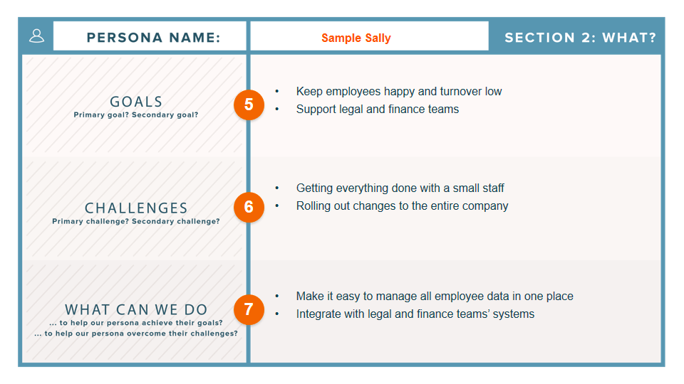
A good designer not only creates a user persona but also steps into it while designing the suitable product for the said user. Not only the commercial roles of a person but also their personal choices should be taken into account - for example, their regional surroundings, their responses to certain behaviours, the problems faced by them, and also the potential designs solutions to those problems. Hubspot demonstrates in one of its examples how a user persona should look like.

Walking the talk
Creating user personas usually takes into account a person's history and traces the decisions they have so far made. However it should also include their potential journey from here on. Meaning, user persona should also consist of hypothetical questions, potential life choices and future outcomes resulting from these choices, and all of these things also need to be considered and for stepping into design and problem solving. Learn more on how to create user personas using inclusive design tool here.
Prototyping
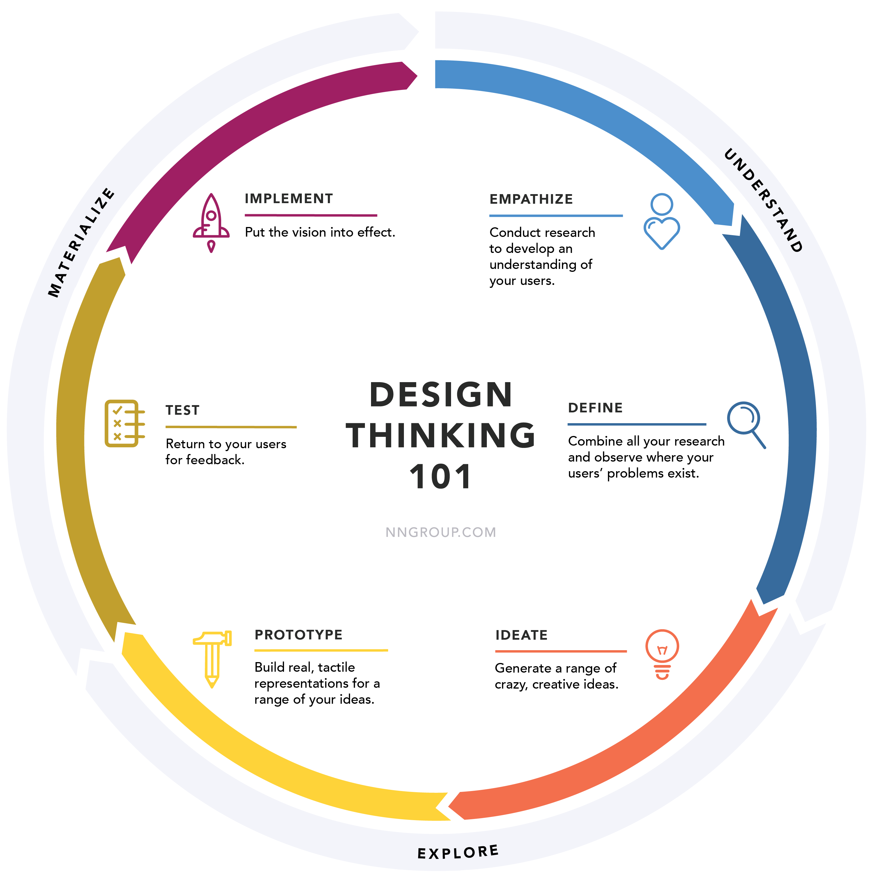
Now that user journeys have been mapped on paper, it is time to create the product with website wireframes and prototypes synchronised with the ideas you have so far collected. Wireframes in the digital world work exactly like they do in real life, they lay out the skeleton of the product without the visual details. The planned layout will then back each proposed prototype and iteration. It is recommended to evaluate your product's functionality and intended user behaviour at this stage as it can help you find potential problems or features that might be missing.
Competitor Assessment
A part of the overall research also has to be dedicated to the competitors in the present market. not just their presence to assess the strengths and weaknesses of your competitors and create a separate strategy to tackle them. Try to analyse and document their pitfalls and missed opportunities as well, so that you can take advantage of these later on.
Designs that solve the problem
The role of empathy in UX Design is paramount. While the audience groups are diverse and different, it is the job of the designer to not try to alter, change or offend any of their beliefs and expectations, but to instead accommodate all of those within the under construction product seamlessly.
“In the end, design is all about empathy. It leads to creativity, inspiration and
breakthrough solutions to problems”
– Leon Segal, Innovation Psychologist
When we talk of User experience, the said 'user' can be anybody across the globe, and their experience should not be dependent on regional or ethnic factors. Learn more by going through the significance of diversity and inclusion in tech industry, the need for gender-inclusive web design, how diverse design teams encourage innovation, and how to build an inclusive team with agile techniques.
Interaction Design

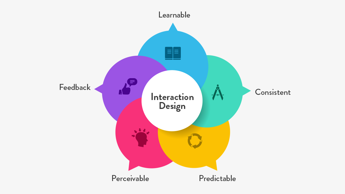
Mastering the art of attention in interaction design is all about emotions, feelings and psychology. All of these elements that are an essential part of the bigger picture cannot be brought to life without the basic tenet of interaction. The kind of attention that is initiated by something that can talk back to you, or something that realises your preferences and personalizes your experience is quite unparalleled. This is what creating interactive design is - omitting laid-back forms of design and creating one that actively participates in the user journey, till the very last transaction.
Repercussions of irresponsible design
If your design doesn't speak for itself, the users will. A bad design that is a mismatch for the overall persona of your business's brand image damages your credibility, and will send across a non professional message.
Content that is not being updated regularly like SEO or social media integration is going to result in direct loss of customers. Users might also perceive you to be outdated if the website consists of broken links or complex navigation. This is not only clumsy but also dangerous, because it not only drives users away from your website but also towards your competitors' channels. A good design adds the extra mile in reaching out to your customers, and this chance must be taken and utilised well.
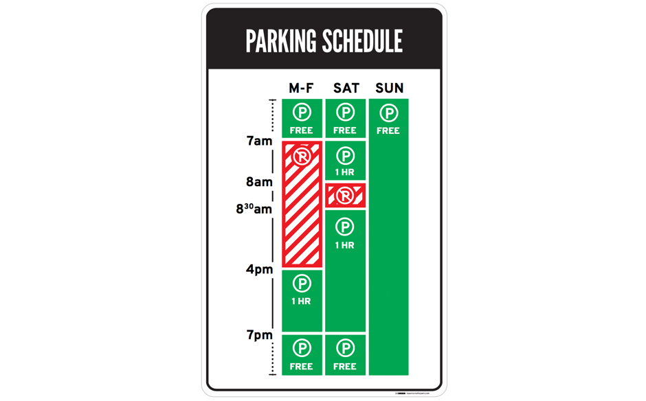
Talking of UX, even the simplest things can evoke a positive or a negative emotion in you depending on how they are designed. For example, a parking sign somewhere in LA confuses more than it answers the user queries on whether they can park on the spot.

A better example of a parking sign would be the one mentioned below, with a clear and simple navigation and colour palette. This was made by Brooklyn designer Nikki Sylianteng, and the sign was eventually rolled out to be used in parking spots in LA.

Doesn't it seem almost impossible that both of these signs are trying to convey the same thing? This is how fluid and customisable design is!
For a complete guide on web design, read this.
Conclusion
Designing is at an odd junction where it is both intricately complicated and incredibly simple at the same time. While cluttered and messy designs hold the potential to reduce your user base, a good design can be the very 'click' that you've been looking for to strike with your clientele. While working towards attracting the optimum amount of attention in interaction design interfaces of your product is imperative to stand out in the crowd, it is even more important to mobilise the right kind of attention!
Subscribe
Related Blogs
UX Best Practices for Website Integrations

Website Integrations determine whether users stay engaged or abandon a site. I experienced this firsthand with a delivery…
How design thinking acts as a problem solving strategy?

The concept of design thinking is gaining popularity these days since people across different industries are using it as a…
10 major challenges that come across during an agile transformation

It’s no longer a mystery that agile was created as a response to the various concerns that the traditional waterfall…


