How to Improve the UX of Your Website Content
User Experience, or simply UX, is defined as the process of improving the usability and accessibility of a digital product such as a website to increase user satisfaction. While many people think that UX is mostly about fancy graphics and interactive content, in most cases the best experience simply means delivering the right kind of information in the right place.

In this article, let’s focus on the “right kind of information” and talk about how to improve the UX of your website’s content. We’ll discuss how to write texts, create visuals, and present them to your visitors in a way that increases the engagement and makes it easier for them to get the information they’re looking for.
By the time you’re done reading this article, you’ll know how to improve the user experience and give your 24/7 salesman and a business card - that’s your website - the best chance for increasing the conversion rate and achieving other goals.
What do website visitors want?
There are many reasons why people browse the internet. If you understand their intentions and motivations, you’ll be able to improve the quality of your content as well as its presentation. For example, listen to this:
- Retail Drive states that 87 percent of online shoppers begin product research online
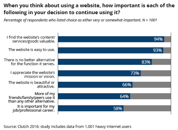
- A 2016 User Experience Consumer Survey by Clutch states that 93 percent of Internet users will continue browsing a website only if “it’s easy to use”

Even though 66 percent of the surveyed in the 2016 User Experience Consumer Survey has also said that the attractiveness of a website plays a role in their decision as well, content value and user-friendliness were the priorities of the overwhelming majority.
Tips to improve the user experience of your website
The findings that we showed in the previous section make the following tips very useful for improving the ability of your website to meet the needs of the visitors:
1. Write Quality Content, Especially on the Home Page
If you read Steps to a Google-Friendly Website guide from Google, you’ll see that one of the top tips is this one:
Provide high-quality content on your pages, especially your homepage. This is the single most important thing to do. If your pages contain useful information, their content will attract many visitors and entice webmasters to link to your site. In creating a helpful, information-rich site, write pages that clearly and accurately describe your topic. Think about the words users would type to find your pages and include those words on your site.
“Providing high-quality content” on your website, and especially the home page, is “the single most important thing to do,” according to Google. This makes perfect sense UX-wise, too, and can also help to make your website more attractive in the eyes of search engines.
Let’s talk about the home page tips first.
To make sure that both Google and the visitors are satisfied with your home page, you need to make the content short and to-the-point. This means:
- Placing the most relevant content about your business above the fold
- Writing concise and fluff-free content
- Optimizing the content for keywords (this technique applies to almost everything and requires a lot of consideration: for example, read how to optimize products descriptions)
- Make sure that the content links to other website pages in a relevant manner.
Let’s look at an example that has all of this done beautifully. Below you’ll find the home page of OpenSense Labs.

Here:
- the most important information about the company is above the fold so the visitors don’t need to scroll to know what the company does
- the content is fluff-free, concise and describes only the services provided by the company
- the content on the page is optimized for keywords and links to other parts naturally.
Simple and user-centered, just like the visitors want.
Now, let’s move on to the written content on the rest of your website. Writing for UX is something that becomes increasingly popular every day, as crafting good texts continues to play a huge role in the website design process.
Here are some of the best UX writing tips to remember.
Avoid Long Blocks of Text
Who wants to read something and feel like doing work? People visiting your website typically want to quickly scan the content of your blog article and find the information they’ve come there for.
This task becomes more difficult if the content is written in large chunks, so they are likely to leave pretty soon after landing on your website (unless what you’re writing about is incredibly important for them).
So, make sure to chunk your content into scannable, short sections to help people find the information quickly.
Avoid Jargon Where Possible
Since simplicity is one of the core goals of UX writing, you need to be as clear as possible. This means writing in a simple language that minimizes the use of industry-specific vocabulary and other words that an average reader may not understand right away.
For example:
Bad: Authentication error
Good: You entered an incorrect password, try again
Active Voice and Present Tense
Any experienced writer will tell you that overusing the passive voice and future tense is some of the biggest mistakes that reduce the quality of user experience. Let’s consider a couple of examples.
Present Tense:
Bad: Your email has been added to the list of subscribers
Good: The subscription is successful
Active Voice:
Bad: The Fast Delivery service should be activated when you proceed to the Checkout page (makes you yawn a bit, right?)
Good: Activate the Fast Delivery service on the Checkout page.
If you follow these tips, you’ll increase the chance that more visitors will find your content useful and complete the actions you’d like them to take - subscribing to a newsletter, converting, etc.
Write Headlines that Communicate Value
If you take one more look at the headline at OpenSense Lab’s homepage one more time, you’ll notice that it quickly communicates the value of using the company, which is getting Drupal projects done in a unique manner for each client. This is a great example of UX writing because it approaches the topic from the perspective of a customer without adding any fluff words.
“Always keep in mind that a headline should establish a connection with the viewer by giving them value,” says Aaron Heed, a senior writer from RatedByStudents. “This also means using keywords that the viewers utilize to find your website, too.”
2. Include High-Quality Visuals
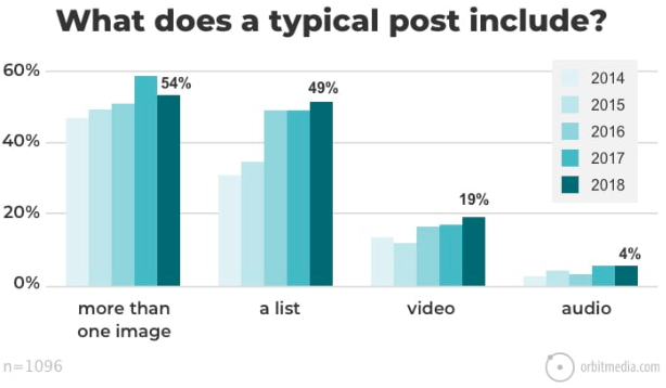
Here, “high-quality” also means relevant and valuable to the visitors of your website. Images and other visuals are great tools for increasing the engagement of internet users, and content creators realize that. For example, the latest blogger survey from OrbitMedia found that 54 percent of bloggers include more than two images in a typical article.

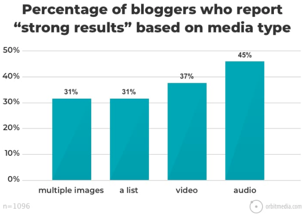
In addition to images, a lot of them also include lists and videos. This technique is proven to be quite effective, the same survey suggests, as a lot of the surveyed also reported generating “strong results” thanks to the use of the visuals.

To make your visuals as effective as possible, considering doing the following:
- Compress them to minimize their effect on your website’s loading speed with a tool like Image Compressor and Compressor.io
- Invest in original images, as stock, free photos have been reused numerous times by other businesses
- Provide good context. According to Google’s image best practices guide, you should insert images relevantly to provide maximum value for viewers.
3. Design Content-First
The layout of your website greatly affects the way the visitors use it, so creating the design with content implications in mind is a good way to highlight your text and visuals. It’s quite common to see the design team placing them at the end of the design process, which often results in poor content that doesn’t capture the context of the design.
As a result, the ability of your website to capture the attention of users suffers.
On the other hand, considering the content before choosing the technology can give you a lot of benefits. For example, if your website will have to be translated into multiple languages to represent your business on the international market, choosing Drupal would be a good choice. It allows translating the site interfaces and content and showing the right language to a specific visitor based on their geographical location.
To avoid that, try writing a sample content structure that may appear on your website and start the brainstorming process from there. Use the data from customer surveys and other sources to help with making the best choice. For that, feel free to consult the websites of your competitors, too, as they can be a great help with coming up with new content structure ideas.
Let’s consider a quick example. If you’re designing a website for an eCommerce store, you can think about what your customers want to see first - customer surveys and competitors' websites will also be useful here - and design several prototypes to choose from at the next stage of the design process. On the other hand, if you rely solely on your intuition, you’re increasing the chances that the website’s content won’t strike a chord with many of your potential customers.
Wrapping up
Delivering the right information in the right place sounds like a simple undertaking, but achieving that requires you to do a lot of work (check out these 50 tips for improving user experience to know more). Indeed, you may be surprised at the effort it takes to maximize the UX of your website’s content (that includes following the tips I’ve just described).
However, you’ll see that it’s totally worth it, as an easy-to-use, accessible, and user-centered website gives you the best chance to achieve your goals.
Subscribe
Related Blogs
UX Best Practices for Website Integrations

Website Integrations determine whether users stay engaged or abandon a site. I experienced this firsthand with a delivery…
How design thinking acts as a problem solving strategy?

The concept of design thinking is gaining popularity these days since people across different industries are using it as a…
10 major challenges that come across during an agile transformation

It’s no longer a mystery that agile was created as a response to the various concerns that the traditional waterfall…


