You might have to scratch your head to reminisce about the worst things transpired in your life as you try to keep them at bay. Few corking good moments spent with your best friend will be indelible for the rest of your life. A good experience stays with you for a long time. It is much the same way with the websites. A great user experience with the website not only makes it alluring to the online visitors but establishes the camaraderie between them. Drupal can be a wonderful platform for you to provide an amazing digital user experience.

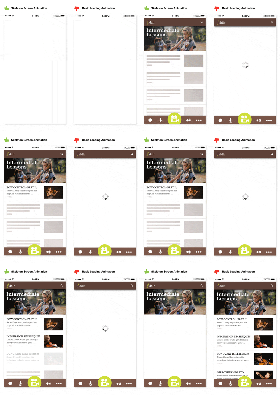
Let’s dive into an example case straight away to see how a website can influence user experience. Skeleton screen is a blank version of a page where information is incrementally loaded. To keep your online visitors engrossed during slower load times, skeleton screen animation can be really useful.

Understanding the user experience
A good experience stays with you for a long time
How to explain user experience design to a layman? User experience stresses on establishing a deep understanding of users, their needs, what they value, and their limitations.
We often stumble upon the usage of words UI and UX almost happening interchangeably but other than the ‘I’ and the ‘X’ at the end, there is a major difference.
In short, UI is how things look whereas UX is how things work. Also, UX is a process and UI is a deliverable. Difference between the UX design and UI design can be summarised as depicted in the illustration below:

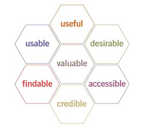
User Experience Honeycomb represents the qualities that should be at the heart of your UX design ensuring that users find value in what you are offering to them.
The qualities or facets of the user experience shown in the hexagonal depiction given here can be explained as follows:

- The website should be able to deliver value to the users. For instance, the UX should advance the mission for non-profits and contribute to the bottomline and alleviate user satisfaction.
- We must ask ourselves whether our products and services are useful.
- Usability is of paramount importance even though the interface-centered methods and perspectives of interaction between human and computer do not address every aspect of website design.
- Our brand identity should get more desirable in our pursuit towards building a robust online presence
- We should emphasise on building a navigable website with findable objects to help users find what they need.
- Making our website more accessible to differently-abled people which is the ethical thing to do.
- There must be credibility in what we offer to users and they should be able to trust and believe in our offerings.
Important tips to improve user experience
To create a good User Experience, a well-planned methodology is required. You would have to think of every possible way a user can interact with your website so that you can strive to improve that interaction.
To create a good User Experience, a well-planned methodology is required.
With the rapidly changing digital marketing landscape, your website might seem to be in need of redesign and look outmoded. Some of the simplistic ways to improve your website in order to keep up with pace of changing UX needs are laid down below:
- Using white space makes your content more legible and helps the online visitors to focus on the elements surrounding the text. White space around the text and the titles enhances user attention by 20 percent.
- Page speed hugely influences UX. Sluggish page load can prove to be an interrupting experience for the users and frustrate them to the core. Most often than not, users just do not have time to wait. Even if the page loading time has a 2-second delay, the website abandonment rate can reach up to 87 percent.
- Using attractive calls-to-action (CTA) that are marked with an action word enables the easy navigation on your site and the users can easily get to where they want. More than 90% of the users, who read your headline, would also check out CTA.
- Using hyperlinks on your page is extremely helpful to grab the attention of the reader. Visual cues like underlined text and different coloured text makes it easy to identify.
- Using bullets helps the users to get all the information they want quickly and precisely. They will be able to quickly understand benefits, how you solve their problem, and the key features of a product or service.
- Wise usage of images on your website to support the content can allow a visual break for the users from the text. You need to make sure that they are relevant. Like using an actual image conveying your brand and its services instead of a stock photography can create a connection between the user and the brand.
- Including well-designed and written headings based on what your potential customers are seeking can be useful. For instance, including keywords in your title can help in targeting your message and getting the attention of right audience.
- Maintaining website consistency is tantamount to a great UX. Heading sizes, colouring, button styles, design elements, font choices, illustration styles, photo choices etc. should be should themed in a way that your website design is coherent between pages and on the same page.
- Optimising your site to handle error 404 (page not found) can prove fruitful. Error 404 can frustrate a user and make him rethink spending time browsing your site.
- Making your site fully responsive should be of top priority. Mobile responsive and mobile-friendly site makes it easy to navigate and works well across platforms from desktops to handheld devices. 57% of users won’t recommend a business which does not have a mobile responsive website.
Take away 50+ User Experience Tips and make sure the user has the best experience on your website
How is Drupal 8 great for an amazing user experience?
Drupal 8 has been a leading CMS when it comes to a powerful and an astounding user experience. Let us look at what makes Drupal 8 so spectacular for designing a compelling user experience for your website.
Responsive web design
Responsive websites are a must-haves nowadays to work well on any screen size. Drupal 8 helps in building websites with responsive web design approach out-of-the-box with some help of contributed modules. Also, there are several Drupal themes that help in creating a responsive design.
Web personalisation
Personalising the content on your website helps in making users to view the content in which they are interested. Web personalisation can be done on the basis of demographics of the user, login time and date of the user, gender, device details of the user etc.
Acquia Lift Connector, Drupal module, offers integration with the Acquia Lift service with an improved user experience for personalisation, testing and targeting the frontend of website directly.
Performance optimisation
A fast-loading speedy website significantly contributes towards the betterment of user experience, usability and engagement. Drupal 8 is one of the most efficient CMS for enabling enhanced page speed.
Caching is an important feature that you can configure for enhancing your website speed. Drupal modules like Internal page cache, Dynamic page cache, BigPipe, Redis, Varnish, and Memcache API and Integration offers different sorts of caching methods to meet the requirements of your website.
Page speed can also be accentuated by disabling unwanted modules or those which are seldom used. Drupal 8 also helps in optimising images for better performance.
Multilingual capabilities
Drupal 8 core comes engrained with multilingual capabilities. It lets you translate content, site interfaces, language, and configuration out-of-the-box. For instance, you can translate the content of your website into a particular language on the basis of user’s geographical location.
Social media
Connecting with friends in one of the biggest pluses of social media elements. Social media can also be a powerful marketing tool. Incorporating social media elements into your website allows users to share the experience, that they had with your website, to the world.
Drupal offers a suite of modules to help you. Easy social, a Drupal module, lets you add share buttons to your nodes.
Another Drupal module, OneAll Social Login, allows you to register and login to the Drupal website using existing accounts on social networks.
A/B testing
A/B results help in determining how well is your website performing and how can you improve it further. Drupal 8 offers modules to carry out A/B testing.
For instance, A/B Test JS module lets you perform A/B and multivariate testing via JavaScript and exposes a UI for creating tests.
Webform A/B Testing module helps in setting up A/B tests consisting of various webforms for determining the most effective one. It tracks how many times a webform has been shown to users and also how many users have responded by completing the form.
How is Drupal Community striving hard to improve the admin UX?
With a highly active bunch of Drupal enthusiasts in the Drupal Community, the objective of making Drupal more and more better for everyone is an everlasting thing. While Drupal is great for improving user experience for online visitors, site administrators are not to be left out. The Admin UX User Study group in the Drupal Community has come up with great insights in a research done on further improving admin UX.
Being new to Drupal may prove to be an arduous task for the content editors to get along with the administrative interface that the platform has to offer. The Admin UX User Study strives to make betterments to the Drupal admin UI with the objective of making it an amazing platform for site administrators.
Findings of Admin UX study
Key focus of the research was on content editors who are responsible for putting great content on the site. Survey was conducted to understand what content editors love about Drupal and where do they find it challenging.
Most of the respondents in the survey said that Drupal is flexible, customisable and lets them have control over their content.
When asked about the challenges, the survey gave some interesting insights. Many content editors opined that a lot of intricacies are due to the UI provided by the paragraphs and panels.
More hurdles were centred around searching for documentation, content editing UI, understanding jargon and technical terminologies, and media management. There was also a mention of complexities with content editing interface while adding content translation to the mix.
Efforts to improve Admin UX
With a highly active bunch of Drupal enthusiasts in the Drupal Community, the objective of making Drupal more and more better for everyone is an everlasting thing.
 Interestingly, among the things that Drupal Community is trying to achieve, the responses made by the content editors were already being worked upon. For instance, Drupal Gutenberg project aims to revolutionise publishing experience through a modern UI which is based on Wordpress’s Gutenberg project.
Also, configuration changes like minimising the user permissions for editors, offering access to an admin menu with limited set of options, and customisation of some of the default widget settings are being worked upon. That is, configuring a role for content authors out-of-the-box and altering some of the Drupal’s default configurations can offer a wonderful content editing experience.
Success story
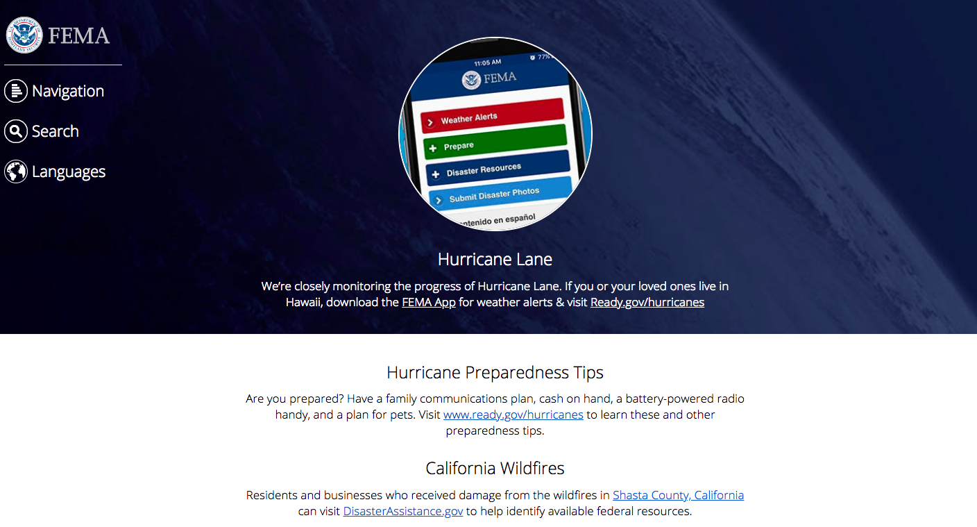
Federal Emergency Management Agency (FEMA), which helps people to cope with natural and man-made disasters, chose Drupal for delivering a powerful user experience. The new digital platform was designed for dependability during critical times.

Federal Emergency Management Agency (FEMA) provides up-to-the-minute details on several important facts during emergencies. The old version of FEMA.gov was not a dependable site with outmoded navigation features and slow page load speed that made it difficult to be accessed during critical events when traffic spikes.
Knowing the significance of delivering a reliable digital experience for users, FEMA wanted a user-friendly and highly resilient site with the provision of more meaningful communication. It also had to cope with traffic spikes and also be scalable at the same time.

Project challenges
Primary concern for the design team was creation of a friendly and functional design and user interface. By holding a series of user focus groups, they got the much needed feedback which indicated that the existing site was too convoluted, it was difficult to find information, and some of the content were outmoded. The site also did not support smartphones and tablets.
The existing system did not support swift and efficacious communication. Most often than not, the site experienced overloads and very slow page load times especially during emergencies when it is most needed. It was not resilient and was not able to consistently deliver a high performing experience. In addition to these issues , there was difficulties with content editing.
Project outcome
To address these challenges, FEMA chose Drupal as the their preferred content management system. To handle the large-scale rebuilding of the site where thousands of pages had to be reviewed, updated and migrated to the new site, development and testing was done in iterative process. This helped in easily scaling the project and making adjustments and reorientations.
The website of FEMA.gov turned mobile friendly and could be accessed from devices ranging from desktop to mobile devices. It also paid special attention to accessibility for those users requiring assistive technologies. The new site architecture minimised the number of clicks that was needed for accessing information thereby making navigation and retrieval faster and simpler. Technical design solutions were implemented that were in accordance with Section 508 compliance standards.
After the launch of the new site, not only it proved cost-effective but provided value to the users. It offered better access to critical disaster-assistance details, higher interactivity and accessibility, cross-platform compatibility and the ability to rapidly and dependably disseminate key content in multiple languages.
Being open source, Drupal-based architecture assisted with the improvement of performance and enabled FEMA to provide the public with swift access to data that could be modified in real-time, if needed. With the mobile-optimised version of FEMA.gov, that has enabled enormous amount of information on-the-go, user experience and the over user satisfaction has improved as well.
Conclusion
Offering the best digital user experience is the goal of every digitised firm. With right means of implementation and Drupal’s amazing features, building a site with a great UX should be cutting through a piece of cake.
Talk to our Drupal experts for developing a Drupal-powered website with best website design implementation for your business. To improve your website’s user experience, contact us at [email protected]
Subscribe
Related Blogs
Transform Your Website with Drupal AI Module in 2025

Drupal is quickly progressing in Artificial Intelligence with the creation of the Drupal AI Module and the upcoming Drupal…
Gin Admin Theme: Replacing Claro In Drupal CMS

Drupal’s default admin theme, Claro, is one of the factors that make a visual comparison between Drupal 7 and Drupal 10 so…
SDC: Integrating Storybook & Single Directory Component

Today, we will talk about about Drupal Single Directory Components or SDC and Storybook. Single Directory Components in…


