How to implement component based design systems
When you think about building a robust website or application, you think of two important sets of people who make it possible, that is designers and developers. Both of them are responsible for creating user-friendly experiences, but they do it differently.
The job description of designers and that of developers are not the same, not by any means. In simple terms, one of them designs and the other one executes it through code.
They are not synonymous with each other.
Can their work become synonymous?
Can it be interchangeable?
Can one perform the job of the other?
Yes, that is possible. And the answer is through component-based design systems, where designers don’t have to be dependent on developers to create new landing pages as they already have components to work with.
How does the component based design approach work?
Design systems are the new way of creating web designs and products through a shared medium between designers and developers. Using ready-made components that act as building blocks for the entire site, websites and applications can be envisioned to be more modular with reusable elements.
Component-based design systems have brought with them a transition in the creation of digital products that are composed, arranged and assembled in any way you want or as many ways you want them to be.
These components will also include what your page wants to portray. It could be a text block, a contact form, a CTA button, an entire banner of photographs. Content or graphics, the choice is yours.
Now coming to the initial question I asked and answering it.
As the components are already programmed segments of a page, it becomes extremely easy for the designers to get an understanding of delivering a smooth user experience all by themselves. They get the things that’ll work and build the final product with clear rationale that the design requires.
Component based design systems have the ability to create consistent designs that align with the brand. They not just empower designers, but also pave the way for more scalable products. More on component based design systems here.
The Beneficial Saga of Component based Design
Like I said, component based design is bringing more to the world of digital designs. Let’s get a better understanding of what more entails.
Brings Consistency
Redundancy in designs;
Hard to track changes;
Outdated styles;
Forgotten functionalities;
All of these are problems faced by designers, developers and content editors when they are to maintain consistency in the brand voice across the website.
What if brand identity and style guides are ingrained into each component of each page? Wouldn’t it drastically improve consistency everywhere? In each style, each function, each design and the entire brand?
It certainly would.
Component based design systems do just that. They make room for intentional and pre-designed structures and processes that ensure the correct components are used. They act as references for styles and functions that go across the site. Thus, bringing consistency, irrespective of how many designers or developers are involved in the build.
Simplifies Management
A component based website will be solely composed of components, meaning each segment on that site is a component and the possibility of it having been reused is high.
So, when you maintain your website, you are essentially maintaining those individual components.
You can manage changes by making miniscule edits or drastic upgrades to the designs. And you can do all of that using a single source file of the same components. The fact that each component has multiple use cases on multiple pages, a single change, irrespective of how big or small it is, would be made to the entire application.
Enables Efficiency and Scalability
When building a design system, you have to know that you would be working with existing components in the future. Every component, when built, has a long shelf life because it along with its variations are going to be reused.
This fact about component based designs makes them efficient. Why?
Because developers would not need to reimplement a change in the future. The design system is always going to be broader than its current implementation. Its evaluation and build is what makes it concise to the application.
Considering this, component based design systems also promote scalability.
You can very easily extend existing components or simply assemble new segments. Working with a system that is extremely well defined makes scaling convenient as you can build on top of it.
Another way to understand this is that you will have a component library that would keep growing with your site. These clearly comprehensible, reusable and flexible components will make your platform’s expansion convenient.
Elevates Modularity
Each component in a design system is always going to be built from scratch.
This eases the development process because every component can have variations built-in. They are not going to simply be adorned on a single page and become obsolete for anywhere else.
Components, by their nature, are more adaptable and less rigid, if at all. They can be used for any content area, be it a specific campaign or permanent display. With these, you can test iterations of your layout on the fly, all the while maintaining consistency of the brand voice.
Promotes Cross-functional Collaboration
Component based design systems have become the epitome of collaboration. Based on what I have written so far, it’s pretty obvious.
Your organisation wouldn’t have operational silos, if you have design systems in place. Content, design and development can work together and that too cohesively. The approach of design systems towards design and execution makes it possible as it becomes unified.
Breaking Apart the Design System
The next phase of design systems is to understand what is encompassed by them. Of course, there are going to be the design principles. That's a given because consistency does need a set of rules.
These principles are exactly, rules and values that help design teams take their designs forward. They could be something as simple as;
Making the user experience easy;
Focusing on telling stories;
Building a multi-device layout.
There are no standard sets of design principles that go with these systems. It’s your brand that would decipher them based on its needs.
Now, let’s come down to the more specific part.
Style Guide
Colours;
Typography;
Logos;
Tone of voice;
And specific front-end styles;
All of these sum up a style guide. They also differentiate a brand, give it an identity and set it apart from its counterparts.
Style guides achieve the same through setting guidelines for branding, content and interactive elements on the site. The design deliverables become consistent because of style guides and the specific implementation methodology they set.
They can also come as part of a component library so that each element therein has relevant guidance and context to take forth.
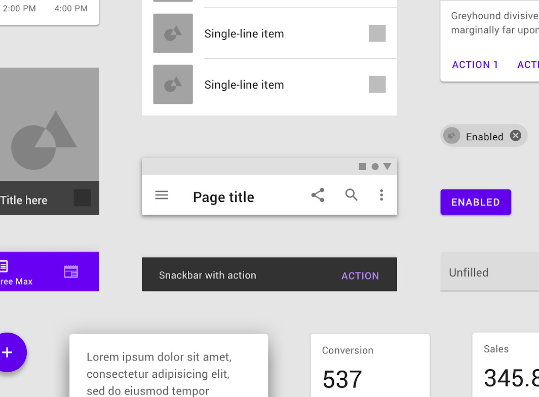
Component Library
You can call it a component library or you can call it a design library, whatever you do it’ll always be a designer and developer’s shop.
Component libraries enable the development and design team to comprehend and implement UI elements easily. They are thorough because every component that has been developed for the system would be in them with predetermined and reusable functionality.
It’s obvious that a component library would include the visual illustrations of every single component. What is not obvious is that it is much more organised and comprehensive than that.
- Component name with uniqueness for each component;
- Description with a concise explanation of the components and their usage;
- Attributes for future customisations with the range of variable and adjustments that can be made;
- Component state to recommend default changes;
- Code excerpts of each component;
- And finally, the frontend and backend frameworks for library implementation.
A component library is quite diverse and versatile to that that it can also help developers avoid painful and redundant debugging.
Pattern Library
Content structures;
Layouts;
Design templates;
These are the gist of a pattern library, which is different from a component library as we discussed in the previous sub-heading. So, the common misconception that both of them are the same needs to be forgotten.
Instead of individual UI components of a component library, a pattern library boasts collections of element groups and layouts. Apart from that they are similar, in the sense that both of them are robust and can be adapted and reused for their components and patterns. More on the implementation of pattern libraries here.
Assembly of a Design System
Based on the previous section, you must have gotten a basic understanding of how a component based design system is assembled.
You would need to build;
A style guide;
A component library;
And a pattern library for your system.
So, when we talk about the assembly, we’ll not be discussing these, but the bigger picture that transcends the individual builds.
Here it is.
Assess the current visual state
As in any development process, you ought to begin with an assessment of the current state of affairs. In this case, it is the visual design and you need to audit it thoroughly.
What you need to do is;
- Analyse your product to have a review on all its front-end design components;
- Create a catalogue of the components that you would be keeping;
- Identify the inconsistencies in design and remember to overcome them later;
- And be mindful of the CSS used along with the visual qualities of the components.
Once you have done that, you are ready for the next step.
Evaluate the build time
Knowing what you are going to build doesn’t necessarily mean that you start building it. There are a lot of other parameters that you have to think ahead of the build.
So, ask yourself;
What are the places a component is going to be used?
Will there be a difference between the same component used in two different places?
What are the kinds of functionalities a component will have?
Would two more components be interlinked or dependent for functionality?
Once you have an answer to these questions, you will have a better understanding of the build time per-component. This also helps in avoiding rewrites and wastage of time and resources because you are simply not focusing on the visuals.
What’s more is you would have an overview of the kind of complexity and features all the components will offer, both combined and individually. Understand that design systems are not a repository, they are much more than that. So use them in a way that you get the best from them.
Define priority elements
What are the components that are the most important?
What are the components that are needed first?
What are the components that will give a foundation for other components?
These questions help you define priorities of each component build and let you apply them throughout the development process.
There are a couple of ways you can go about building your design systems.
- The first one is to develop the fundamental components first. By fundamental, I mean the most basic components. These could be buttons, colours, icons or even headings. Once that is out of the way, you can start working on more complex components.
- The alternative approach could be building global elements first. These could be navigation and page layouts. This is advised because once a page layout is set, you have done the groundwork and the only thing left is to build up then.
After deciding on the first elements to build, the rest can be worked out using the Eisenhower Box principle. This tells us to prioritise on the basis of importance and the kind of urgency a component has. Evaluating it would somewhat depend on the features the said component is bringing to the table.
Adhere to documentation
The development process of a design system involves a lot of steps and a lot of people to accomplish those steps. Thinking merely designers can build an entire design system is completely irrational.
Designers
Developers
Content Editors
Each person has a significant role to play. Considering developers, there are frontend and backend developers, who have entirely separate responsibilities.
So, when you are planning the development of a design system, you need to think about the relationship between all the players involved in the build and how to make it effective, think about how the handoffs would happen and think about how you would divide responsibilities.
The answer to all of these would be clear and concise documentation. Documenting and standardising have helped design systems remain as efficient as they boast to be.
Special Mention for Brad Frost’s Atomic Design
When component based design is mentioned, our mind definitely wanders off to Atomic Design, a concept of design system proposed by Brad Frost.
Brad conceptualised his methodology based on the principles of chemistry. It may sound strange, but it is very effective.
Let’s figure it out.
As we know that everything that is matter is composed of atoms, which bond together to form molecules that combine to become organisms. And organisms are what make the universe.
Taking the same concept to web design, the complete UI is broken down into fundamental pieces and they are then built back up.
Creating design systems with atomic design has five levels.
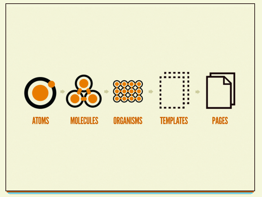
- Atoms that encompass HTML tags, like form labels and buttons;
- Molecules that are bonded atoms, like a form label and button together;
- Organisms that are grouped molecules to form a complex and distinct section on a layout like a product grid;
- Templates that are formed by organisms and make a page layout possible.
- Pages that are the culmination of the previous for and test the effectiveness of the work done thus far.
Atomic designs are clear in their methodology and enable teams to see their envisioned goal in better detail. They boast consistency and scalability and are the paradigm of component based design systems today. Read this guide on atomic design methodology to know more.
Easing Component-based Designs
You know almost everything about design systems now, what you need to know now is what design systems you can leverage to ease the build of component based designs on your own.
Yes, there is always the option of creating your own design systems, and many brands, Atlassian being one name, have conceptualised their own systems. However, for smaller brands and organisations, who do not have the resources to go on their own, there are plenty of options in the market.
Here are the top five picks for you.
Storybook
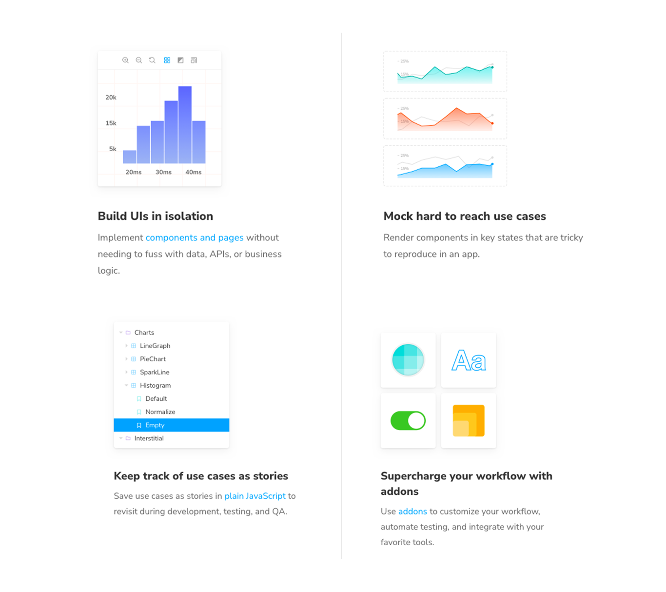
Storybook, an open source tool meant to design and develop UI components, personifies ease in the creation of a component based design.
- You can preview components as you build them;
- You can inspect individual components once you have built them;
- You can look and analyse the different states the built components would function in;
- And you can also import components into Storybook.
With support from a dozen JavaScript libraries and plain HTML, Storybook is easy to use and amplifies the build process.
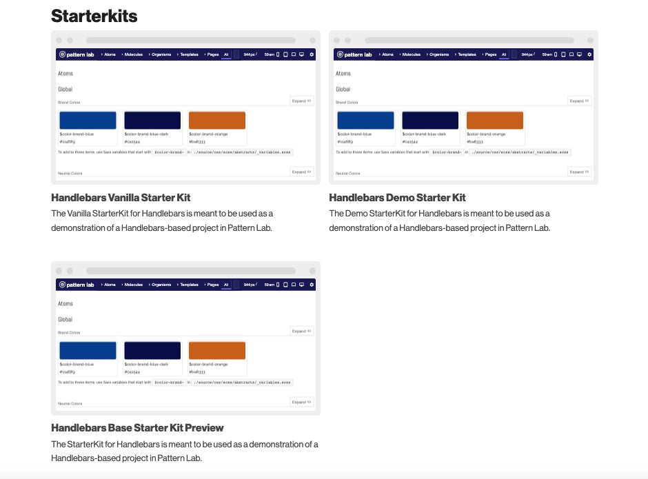
Pattern Lab
Build, view, test and demonstrate your UI components rapidly with Pattern Lab. It allows you to prototype at massive speed with interactivity, instead of simply providing flat designs.
With cross-browser and multi-device testing, Pattern Lab helps to efficiently implement modification with minimal to no involvement in the code base.
A node-powered static site generator, it can deliver everything you would need for setting up your component based UI;
- Nested patterns
- Designs empowered with dynamic data
- Atomic design language
- Starter Kits (refer image below) and more
Pattern Lab is faster, achieves a greater degree of consistency and gives you the real value for your money.
Material Design
Android;
iOS;
Or the web;
Material Design by Google is the design system that always creates high-quality digital experiences everywhere.
It tries to keep things simple, clear and concise for everyone to follow. With three main parts at its core, Principles, Components and Theming, it helps design teams get a better grip on understanding building and customising designs.
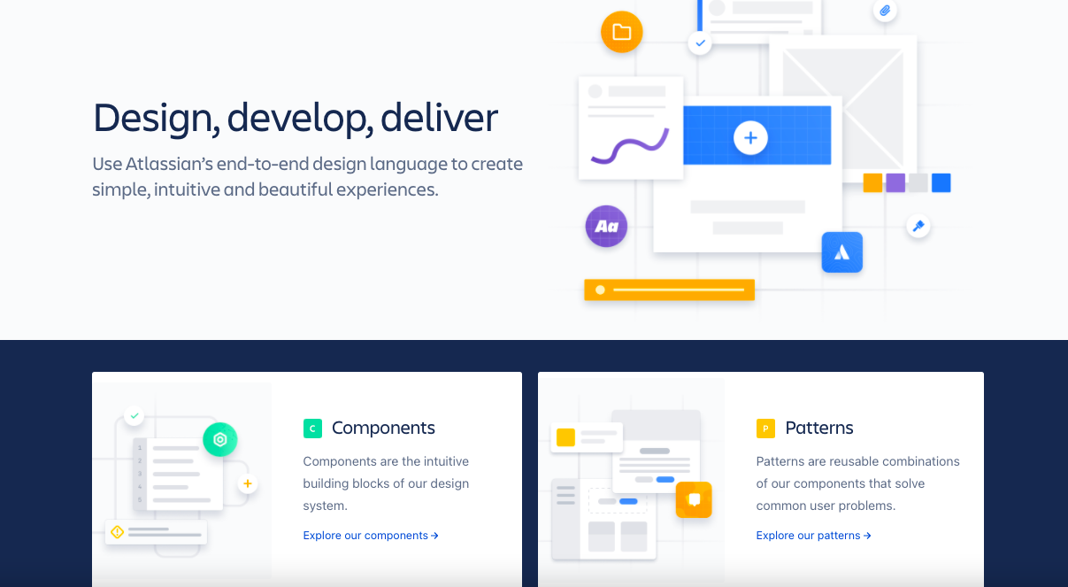
Atlassian Design System
Referred to as the end-to-end design language, the Atlassian Design System helps in creating simple, intuitive and functional digital experiences
Its USP is being a holistic design system that provides the design team everything they need, from components to pattern libraries and comprehensive insights on the brand itself, its stylistic foundations and even content.
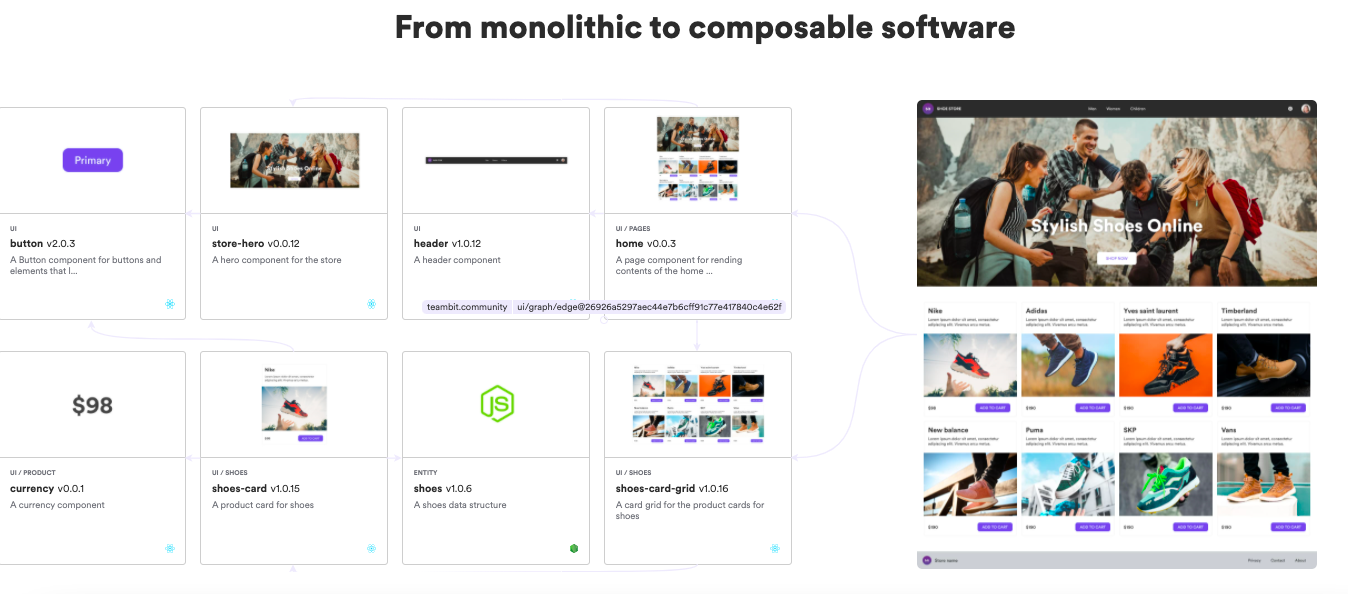
Bit
Another open-source design tool, Bit drives component based development that are founded on composable software to create consistent and reusable platforms.
- It promotes autonomy and standards with distributed code and teams;
- It facilitates cross team collaboration to scale;
- It also enables a composable that scales with the platforms and never repeats itself.
In simple terms, Bit makes component based development easy, distributed, consistent, reusable and efficiently manageable.
OpenSense Labs Connection with Component-based Designs
OpenSense Labs has a long history with component based designs. We love working with components and they have served us well so far, enabling us to create some of our best work.
Here is a component based design tale for you.
Edredo: Our very own edtech platform

Last year, Edredo was rebranded from Techtud. The rebranding meant an overhaul of the design on the entire site and application. It would have been a massive undertaking had it not been for component based design.
Edredo, previously Techtud, was partly built on the concept of component based design. This helped our design team, led by Sahil Sharma, to drive changes and make them more consistent.
Making changes to global elements was a walk in the park. A modification in universal headers just meant changing the parent component and designs became consistent as a result.
We could simply design a header and present that component’s design for approval before coding. Once the component’s design is approved, it was coded and design work on the next component began.
This process was repeated until all the pieces were finished and “pages” could be assembled. It was especially useful when a different designer took over designing, followed by a different developer doing the coding of the component, as they can work in tandem for high efficiency.
“As a designer, I personally feel that component based designing has improved consistency in design tremendously. Smallest changes like colour or font can be updated on the entire product across devices within seconds. It has made design more flexible for all future updates.” - Sahil Sharma, UI/UX Designer, OpenSense Labs
The Final Word
“Component based development increases code reusability, reduces time duration and budget for the project and it is much easier to implement globally.” - Pritish Kumar, Technical Lead, OpenSense Labs
Reusability of design matters today, component based design systems make that possible. Breaking down components into smaller chunks, building from there is far more efficient than traditional design methodology. So, component based designs are for the win, for developers, for designers and for content editors too.

Join Our Newsletter
Love open-source tech? Stay updated with projects that make a difference.