What is the first screen that pops up when your device starts? Maybe it shows an animation screen displaying the branding or a welcome screen of some sort. This screen depends on what the manufacturer has coded the machine to do when it boots up or referring to the topic, strapped to the boot of the device. So, generally speaking, the first program that runs without user interaction when a device boots up is known as bootstrap.
In the web, Bootstrap is a fundamental structure or a skeletal support which is better known as a framework that is dynamic, responsive, mobile-first front-end framework used for faster and easier web development. It is a bunch of pre-written CSS and JS that can be immediately incorporated into any website to get automatic styling elements such as headings, paragraphs, buttons, image styles etc. and functionality such as alerts, carousels, drop-down menus etc. to name a few.
Why use Bootstrap?
A product without any benefits is a failed product. So, let's evaluate as to why one should be using Bootstrap.
1. Faster and Easier Development:
Bootstrap framework really makes for faster and easier development of the web because of its ready to deploy nature.
2. Dynamic & Responsive:
It is dynamic in the sense that the website using bootstrap can adapt to any devices be it pads, phones, laptops or desktops.
3. Mobile-first front-end:
People mostly use mobile devices to browse the web and therefore, the website's compatibility to adapt to mobile screens is a very important aspect nowadays. Bootstrap has been designed prioritising mobile devices.
4. Error-free Implementation:
The implementation would have a very minimal chance of any errors creeping in because of the pre-written CSS and JavaScripts.
5. Modular:
Users can opt to use all or just the ones required by them. A user can choose to load only a part or all of its parts at a time such as loading only bootstrap.min.css or bootstrap.bundle.js or loading both at the same time.
How does Bootstrap work?
To align and layout, the Bootstrap grid system uses a series of containers, rows, and columns. This grid system supports a max value of 12 columns. Anything after the 12th column will be shifted to a new line.

.Bootstrap classifies screen sizes ranging from extra small to extra large on the basis of pixels. A table of the various screen sizes has been displayed below.
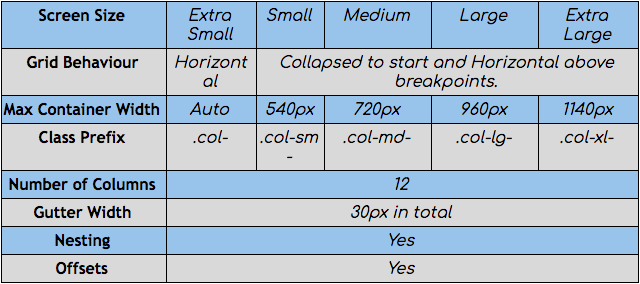
The transition between the various screen sizes is known as breakpoints. An important point to note here is that Bootstrap follows a mobile-first strategy and therefore if breakpoints are provided for extra small screens and for extra large, then the layout of the content would only change once the extra large screen size is achieved.
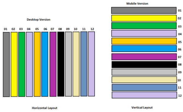
To understand how bootstrap grid system works, we need to take a look at some of the elements in bootstrap.
1. Container:
This element provides the width constraints and the padding such that content automatically adjusts to the width of the screen and also doesn't touch the edge of the screen. Containers can be divided into two types viz.
Fixed: Changes abruptly once the set breakpoints is met.
Fluid: No abrupt changes. Transitions are seamless.
2. Row:
Rows refer to the horizontal division of the screen. Rows in bootstrap have a negative margin of 15x on each side.
3. Column:
Columns are the vertical division on a screen. A 15x padding on columns helps in keeping contents inside the columns where they are supposed to be.
4. Nesting:
Nesting is when we put elements inside elements. Both rows and columns can be nested such as rows inside rows and columns inside columns.
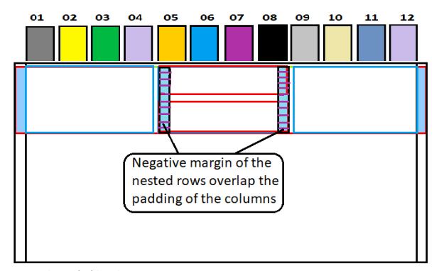
Note: Child rows or columns would be allowed values relative to their parent rows or columns even if no explicit changes are being made to the children.
5. Offsets:
They are used to add extra spacing between the container and the contents. Offsets would behave differently for the first and the second column because of the negative margins present in the rows.
6. Push/Pull:
Push/Pull flips elements from left to right which is one of the key aspects of a responsive website.
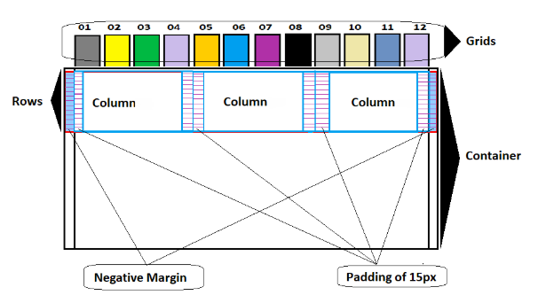
The Shift
The container has a padding of 15x on each side such that contents do not touch the edges of the container. When a user creates rows, they come with a margin of negative 15 px such that they touch the edges of the container and are not pushed inside by the padding of the container. Contents wouldn't get affected by this nature of the rows because of the 15px padding of the columns which would keep them 15 px away from the edges of the container. And therefore when the container shrinks in size, all these above-mentioned variables come into play and instead of the contents getting cropped, they get adjusted to the screen size.
The bootstrap grid system is one of the most innovative systems to build a responsive site. It is quite easy to implement and also since almost all the elements that would be required to build the same are pre-coded, it's quite hassle-free. Click to download Bootstrap and enjoy the benefits.
Subscribe
Related Blogs
AI Fairness: A Deep Dive Into Microsoft's Fairlearn Toolkit
Artificial intelligence (AI) has changed the game across industries, especially in financial services. From automating…
API Documentation Tool: 10 Best Tools For 2025
A Google search for ‘Best API Documentation Tool’ will show many results. The growing number of API documentation tools…
Debunking 6 Common Software Testing Myths

A flawless product delivery requires a perfect combination of both development and testing efforts. Testing plays a vital…


