7 Elements to create a high converting SaaS website
SaaS (Software as a service) is a method of software distribution in which software is licensed on a subscription basis. Website is essential to capture your audience’s attention when selling software as a service. Sites are particularly crucial for SaaS companies as it can help them generate new leads and also educate the users about their software.

The competition in the market is fierce, and establishing a firm market position for SaaS businesses can be a daunting task. However, your website is like a representative that can help you hold to your audiences. Impactful web design will help generate new business.
In this article, we will talk about the necessary elements to create a high converting SaaS website. We’ll tell you how you should highlight your product and how you can easily convert visitors into customers.
Following are some of the critical elements that you should need to create an effective SaaS homepage:
1. Web-page structure
The structure is vital for both users as well as Google. What details you add depends on your company’s business needs. However, you should only add valuable information both on the homepage and landing page. It is crucial to understand that the visitor will not scroll down the page without a good reason. Therefore, it is essential to prioritize and put only valuable information on these pages.
Following are some of the must-have elements that you should add on your page:
- Headline: The headline should be clear, catchy, and engaging. It should communicate about your product and should be clear enough to create a compelling value proposition.
- CTA (Call to action): CTA is a crucial element that will compel your visitors to take action. Pay attention to CTA’s text, color, size, and placement. Try to make it short but effective.
- Demo: Product demonstration can make a lot of difference. It is essential for the sale as it provides necessary proof about the abilities of the product.
- Testimonials: Testimonials act as social proof and will help you establish credibility. They can be useful in creating your brand as well as persuading the prospects to choose your brand. Include testimonials along with client’s photo to make it more effective. You can also add links to customer stories and awards that your company has received as a form of social proof.
- Appealing Images: Add visually appealing images to your blog posts and make it more engaging. High-resolution images can slow down the website’s page speed. So, try to maintain a balance for that.
2. Make hero section more engaging
The hero section is an image, text, slider, or similar element that is prominently placed on the top of the homepage. In general, it is a predominant image that covers the full width of the web-page. It can be static or dynamic. It is a crucial element of your design, and you should pay attention to it. Make sure you include a high-resolution hero image. It should help you engage with your site’s visitors and entice them to convert or use the CTA button.
Many brands are experimenting with the hero section these days. Some are adding static images, whereas some are creating animation and videos to attract the visitor’s attention.
Try to present your product creatively and connect with a larger number of audiences.
3. Videos
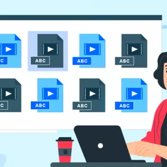
The video will support your product and will do things that words and static images cannot. A well-produced video will help customers understand about the functioning of your product and will also enhance the user experience. Make a short video. Try to make it as short as a 30-second long video. Include elements that can help in making your video more engaging and effective.
For example, Slack features a video at the top of their homepage. In their video, they are explaining the product and its capabilities. You can also make effective use of video and show it to your audience how your software works.
4. Easy to find contact information
The best practice would be to highlight contact details and information. If a visitor cannot find contact details easily, they would go back and leave your website. Therefore, it is crucial to highlight all the information, address, phone number, and other necessary details.
Generally, contact details are mentioned either at the top or bottom of the page.
Wherever you specify, make sure it is clear and visible. You can also add live chat and inquiry form on the website.
5. Avoid adding distractions
Always remember that simplicity is the key. Keep it clean and straightforward and avoid adding distractions on your site. A weak image, long paragraphs, majorly anything can distract a visitor and turn their attention. Try to keep your design minimal, clean, and simple. Remove things which are unnecessary and may take away visitor’s attention.
Below are certain things that you should avoid:
- Long paragraphs
- Weak images (Low-resolution images)
- Unnecessary images (images that are not related to your brand or services)
- Images that may overpower the text
- Too many CTA options
- Weak testimonials
6. Clean and effective design
A great design will attract more people and will create more opportunities for conversions. It is essential to have a clean and effective design that can entice the customers and makes it easier for them to navigate. A clean layout will also help you build professionalism for your brand.
Following are the few essential elements that you should keep in mind while designing your website:
- Typefaces and Fonts: Keep it simple and do not use fonts with a decorative finish.
- Colors: Too many colors can be confusing. Make a balance between your brand colors and try to effectively use the white space as a part of your design.
- Images and graphics: High-quality images and graphics add to the overall look and design of the website. Use good-quality photos, videos, and graphics.
7. Balance the number of categories and sub-categories
Try to spend as much time as you can on visualizing the website structure. Planning is as crucial as creating a website is. Therefore, you should make a plan on what all categories should be there according to the types of content you’d be publishing.
Try to balance between the number of categories and sub-categories. It may not be an ideal approach for all businesses. However, you should try to keep it as minimal as possible to make it look cleaner and more effective.
Make sure that every category name you are choosing is different and stands out from others and each sub-category too should be related to the main category. Try not to add more than seven main menu items as it may look uncluttered. To avoid distraction, add a navigation bar. A navigation bar is useful for both the homepage as well as the landing page.
Conclusion
Above mentioned are the elements that you must include on the homepage as well as the landing page. The eye-catching graphics, strong value proposition, social proof, and compelling call to action are some of the staple elements of the SaaS website designs. If you’re looking to develop your SaaS website, make sure that all the aspects mentioned-above work seamlessly together. There is no rule. Keep experimenting with the above elements and see what works for you.
Subscribe
Related Blogs
Workforce Management Tool: Features, Benefits & Complete Guide

“Simply Manage is a workforce management tool designed to streamline workflows across teams, making time tracking, resource…
Trek n Tech Annual Retreat 2025: A 7-Day Workcation of OSL

OSL family came together for the Trek n Tech Annual Retreat 2025, a 7-day workcation set amidst the serene beauty of…
Exploring Drupal's Single Directory Components: A Game-Changer for Developers

Web development thrives on efficiency and organisation, and Drupal, our favourite CMS, is here to amp that up with its…


