
When we enter a library, it's not very difficult to find the book we want to read. It is because libraries catalog and organize their collection in various ways. Such as subjects, genre etc.
Similarly, a design system is a classification of components and helps a company to build a superior user experience and strengthen their brand. The main idea of a design system is to help a company to have a well-maintained library and save their time for the upcoming projects.
Design systems are a collection of principles, constraints, and rules, that are implemented in design and code. They serve distinct functions and provide coherent and systemic order in systems from a button to single-page applications. The business value of user experience is widely recognized and valued.
Visual guidelines vs Design system
One should not confuse a design system with visual guidelines. A design system is a little complex whereas visual guidelines are easy to build and also sufficient enough to support development of a small team. It is important to be familiar with the culture, business direction, target audience and fundamental architecture, for both, building a design system or visual guidelines.
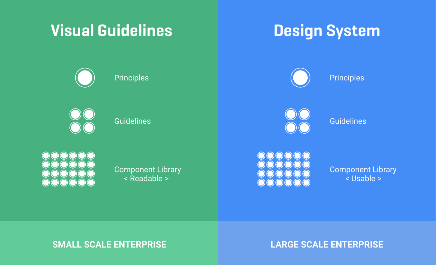
One of the great examples of a design system is Atlassian. It creates straightforward and beautiful experiences by providing an end to end design language. The foundation of its branding include, personality, writing style, and type. Another good example is Carbon. It is IBM’s open source design system. The system has design tools, working codes, and resources and a vibrant community of contributors.
Structure of a design system
Design system is a process, not the result. The design system needs to be balanced, scalable and consistent. Team productivity increases when both designers and developers use the same available components.
The structure of a design system speeds up the designing process and makes it easier too. It's like a rulebook for the design system and is broken down into three catagories:
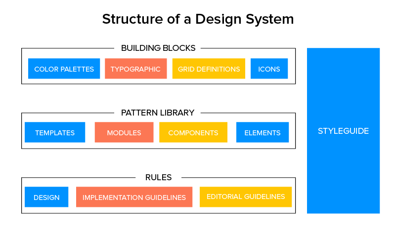
Building Blocks: The building blocks of a design system include color palettes, typographic, grid definitions, and icons. These are the basic building blocks of a design system.
Pattern Library: It is the sub component of the design system. These are the parts of a design system that can be reused and repeated.
Rules: They help to design consistently and in a way that helps solve the challenges faced in the process.
The Need For Design Systems
“Design systems provide a convenient, centralized, and evolving map of a brand’s known product territories with directional pointers to help you explore new regions.”
- Chris Messina
A design system provides a shared platform to share, collaborate and create a deliberate outcome. Design systems allow for predictable and consistent user experience, while also evolving with a product as new technologies and platforms are interwoven.
So now that we are aware of the significance of a design system, let’s take a look at some benefits of a design system:
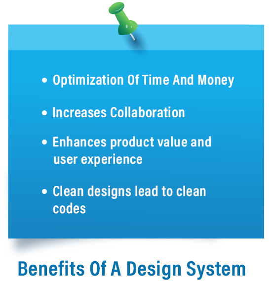
As a design system builds a product faster, the developers and the designers save a lot of time which they can invest in other areas. Companies should try to invest more time in understanding the user's needs. Also, it saves both time and money in the long run.
It is easier for the teams to collaborate and share knowledge with access to a shared system. The onboarding process of the new employees also becomes easier with a balanced design system.
The product value grows with a better user experience. Also, a design system plays an important role in increasing the brand awareness.
When time is invested in creating great designs and maintaining the system, it results in clean codes and easy to manage design assets.
Strategy to build design system at scale
There are a few steps that are necessary to be taken when designing your system at scale.
Plan Ahead
When building a design system, it becomes obvious to have a game plan. A design system, if not planned in advance can get you into trouble. Hence, it becomes important to define a set of goals to build your design system. Every company has its own industry- specific challenge, so evaluating the situation and exploring the opportunities becomes necessary. The main motive should be to build a scalable and consistent design system.
Spread Awareness
It is important for you to make sure that everyone in your company understands the value of a design system. So, teach your team what a design system is and what value it holds for the company and user experience.
Now that you have decided to build a design system, you can also involve someone who has already worked in this field, in the idea of building a design system.
Host UI/UX Audits
By conducting a UI/UX audit, you will get a clear understanding of who and what you are working with. This process can be a bit time consuming but it will help you discover why the retention rates and conversations might be low and how to improve onboarding.
Keep It Simple
The design system should be simple and easy to understand. It allows everyone associated with the product and project to have a better understanding and speak the same language quickly. It also helps in shaping the future of the design system depending on the needs of the product teams.
Work Together
A design system ought to create an environment where anybody can contribute easily. It needs to make sure that the brands highest standards are empowering the designers and developers. A design system shouldn’t be considered a policing tool.
Documentation
Documentation allows the users to make consistent and quick decisions which makes it a must have for a design system of any scale. Real life examples, Do’s and Don’ts, alternative solutions, best and bad practices, related topics, are some of the things you can add to your documentation.
Case Study
A large scale design system was built for the US government. Let's have a look on the challenges and outcomes of the design system.
Initially, they tried to understand the problems that were being faced by the users. The problem came out to be inconsistent user experiences across government websites.
So, they decided to create a shared set of tools to provide effective, consistent and easy to use government websites. Twenty designers and developers from different places gathered to work on the problem. They started with categorizing components across government websites as well as tried to understand what components those websites had in common.

The user experience team members researched, tested components and created wireframes.
They wanted the user experience to be both modern and approachable at the same time. They looked at three styles: Modern American, clean and classic, Inspiring and empowering.
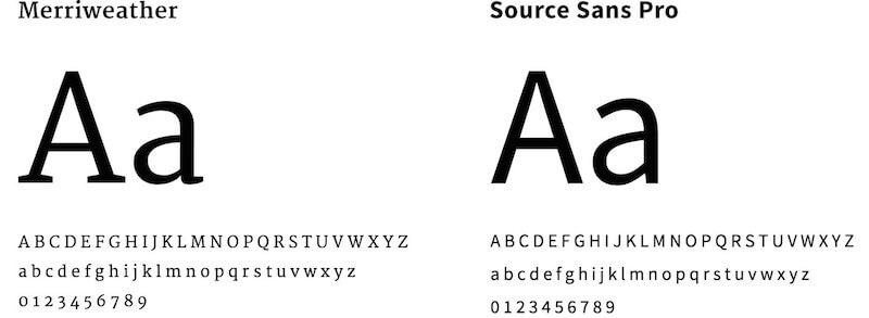
After the style was defined, the users started to explore what the typography should be like. The fonts that were chosen were: Source Sans Pro and Merri Weather.
For the next step, they were to decide the colors. Because government websites must be accessible to anyone with a disability, it was essential to maintain enough contrast between text and its background color.
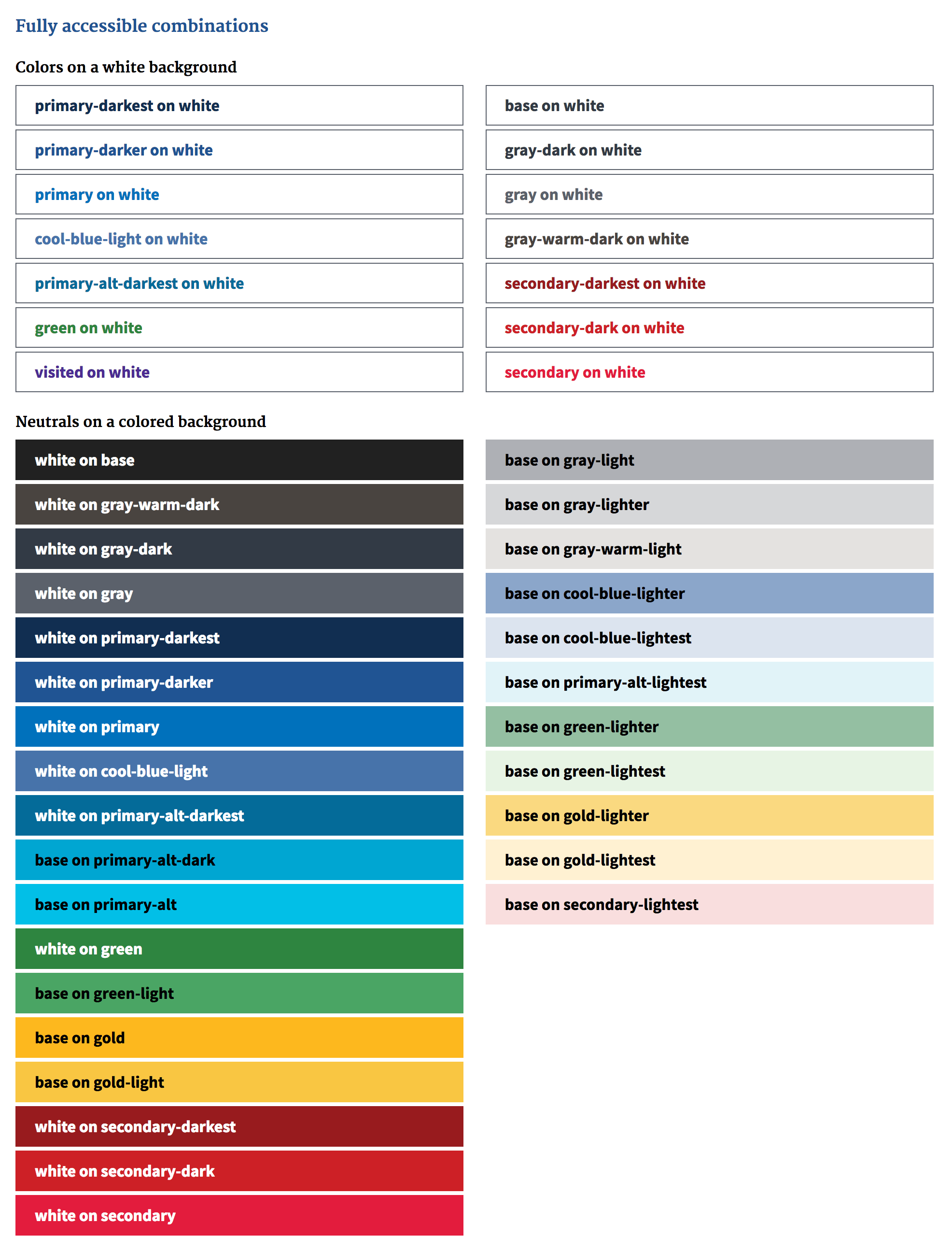
The last piece to complete the whole process was how these elements would flow in space and provide a structure. Typography, space and colors are essential parts of the design system, which are used to build components like buttons, navigation and forms.
The U.S. Web Design Standards was launched as a visual style guide and UI component library with the goal of bringing a common design language for government websites all at one place.
Conclusion
A healthy design system makes it easier to scale design components patterns and with a growing design team. So, if your brand is running without a design system for a long time, now is the time to build one. And we are sure that it will definitely pay off in the long run!
Subscribe
Related Blogs
UX Best Practices for Website Integrations

Website Integrations determine whether users stay engaged or abandon a site. I experienced this firsthand with a delivery…
How design thinking acts as a problem solving strategy?

The concept of design thinking is gaining popularity these days since people across different industries are using it as a…
10 major challenges that come across during an agile transformation

It’s no longer a mystery that agile was created as a response to the various concerns that the traditional waterfall…


