A web page or a website is of no use if the people visiting it are not able to access it properly. By accessing we mean the appropriate navigation through the website and other related actions. This may be possible due to their inability to understand the website which makes a webpage purposeless for such users.
The statistics from the World Bank show that there are 1 billion people with disabilities around the world, which makes 15% of the world’s population. Also, severe disabilities have been seen in-between 110 to 190 million people in the world. Socially, the notion of no-discrimination is practiced in order to make these people inclusive in society. The same can be done around a web network too.

So what would be the consequences if the website is inaccessible to these 1 billion people? Why web accessibility is vital? Or what can you do to make your website or web page accessible to such specially-abled users? Will web inclusivity emerge as help?
This article is going to answer all such questions. Let’s start by defining inclusive web design first.
What is Inclusive Web Design?
“An approach to validate product or services for whole human diversity”
Inclusivity has become one of the most trending concepts for 2019. It has marked its effect on everything, ranging from business practices to political policies to digital designs. At its base, inclusive design can be defined as a methodology of designing products and services so that they are easily accessible and discreetly available to a diverse number of people.
Microsoft Inclusive Toolkit Manual defines inclusive design as, a design strategy that counts-in a range of people in order to have a better understanding of the different user perspectives. So that, as an outcome, a full-grown every-user-type product or service is designed. Such designing is done keeping the differently-abled people in mind. Whether the dysfunction is situational or otherwise, the process of inclusive design includes ideation, planning, building and completion as its basic steps.
Components of Inclusive Web Design
Three things need to be considered while taking a leap forward with inclusive design.
- Capability to perform general web tasks: Cognitive and physical disabilities are taken into consideration to check whether the user is able to perform basic web tasks or not. For instance, people with hearing and visual impairment are not capable of performing the visual and audio tasks on a website.
- Attitude says it all: This makes a note of the user’s perception while he or she is accessing a web page. For instance, due to the lack of web exposure and information, elderly people from third world countries tend to disclose important sensitive information around the web.
- Aptitude to dart forward: This tracks how well a user is aware of the web or how much experience a user has in accessing a website or a webpage? Are they a newbie or a frequent web assessor.
The earlier mentioned components quantify various user's traits and personas which channelizes fruitful designing of a system or a web that is accessible and usable to every other person around the world.
Age, gender, sore points, culture, language, computer skills, internet connectivity, goals, and motivations are the factors that need to be considered while moving ahead with the earlier mentioned inclusive design components, also called as user personas.
Inclusive design is majorly focused on acquiring web accessibility. The next section will give oversight about web accessibility.
What is Web Accessibility?
Web Accessibility Initiative (WAI) defines web accessibility as, the designing and development of a website in such a way so that it is easily approachable, usable, understandable to the users. And is seamless in terms of navigation to the users having physical and mental disabilities or impairments of any kind.
For instance, while viewing a video, the subtitles on the video will be an aid for people with permanent auditory disabilities. Making a website accessible to everyone will benefit individuals, society, and businesses as a whole.
How to make websites accessible to everyone?
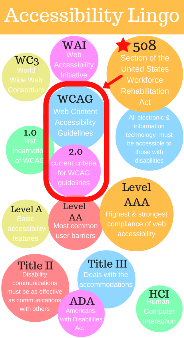
For the purpose of implementing the web accessibility guidelines and principles, a wide range of recommendations has been made by Web Content Accessibility Guidelines (WCAG) 2.0, for the people suffering from low vision, hearing loss, learning disabilities, cognitive limitations, limited movement, speech disabilities, photosensitivity, and combinations of these. Following are the three levels in compliance with WCAG guidelines:
- Level A - Fulfilling the basic accessibility requirements
- Level AA - Assuring the medium-scale accessibility requirements
- Level AAA- Need for accessing the high-volume is assured
The diagram below shows the vocabulary for web accessibility.
Inclusive Web Design Principles
The following are the 10 inclusive web design principles that should be considered to make the amalgamation of innovation and imagination flourish.
- Don't discriminate: Be fair and impartial: Being equitable is on the roots of inclusive web design. Instead of making a website look the same and work on every device, the focus should be on to offer distinct user experiences with equally valuable outcomes. To achieve it fully, real-world users, specially-abled or not, should be allowed to work on the research and the testing phase.
- Keeping the flexibility intact: Build with who, how, why, what, where, and when people will be using the website. One size never fits all and that is why development should be done for different outcomes.
- No to ambiguity: Adding value to the design rather than adding the complexity should be the major focus. The website should be simple in design and spontaneous so that it provides all the answers to its users.
- Different people different perceptions: No two people have the same perception for a single thing. Some understand it by reading, others prefer visual learning, contextualization and a few need the combination of all three.
- Proper instructions delivery should be a top priority: The set of instructions leading to an objective is worth saving a thousand bucks. Being informative in inclusive web design means offering a kind of self-governance to the users. This will allow them to interact appropriately with the website.
- Prevention is better than cure: For the purpose of minimizing the errors in a website, additional but relevant information should be offered to the users interacting with the website. For example, clear guidelines should be placed for the registration, log-in procedure on the website. These types of interactive messages help in easy navigation and are measures for building the trust of the users.
- Build user confidence with tolerance: You cannot apply breaks to the errors, they will happen eventually and users will do it again and again. The major objective of tolerance is to build user confidence.
- Be effortless: Less effort is the spark to usability. Fewer restrictions, unnecessary demands will smoothen the user’s visit to the website. It will also pave a path for them to reach their major goal of visiting the website, making the user more effective and efficient.
- Ensuring adaptability: A properly formatted website with a clearly written information structure, navigation and interactions will make an easy stay for the users and also will be a great push for repetitive website visiting. For example, stuffing content on the web page will make a website look more crowded, eventually inconvenient to use.
- Be consistent: Matching with the current industry trends, guidelines and best practices for designing a website will do a favor to, both, an enterprise and a user. But it is always recommended to have a clear vision of when to use a conventional rule and when to not.
Considerations to Achieve Inclusive Web Design
For the purpose of making an inclusive web design successful, following things are recommended:
#1 No to Messy Design and Yes to Clear Visual Hierarchy
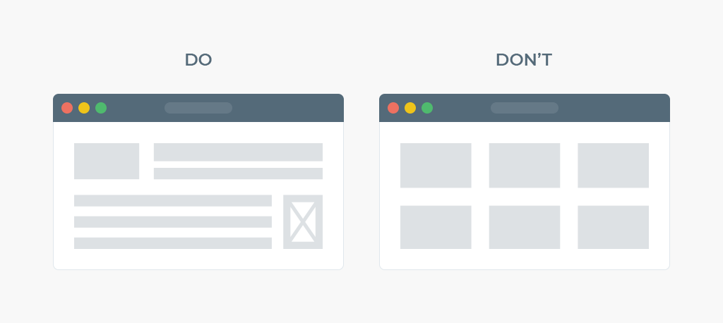
No user likes an overcrowded screen or a layout that is full of many non-logical navigational signs. A clear visual hierarchy will make the user easily navigate through the website content. Prior planning is recommended for the organization and presentation of the website content so that the design is accessible to all. Gestalt principles for UI design offer a set of guidelines for the same.
#2 Test the Keyboard Navigation
The movement of keyboard keys with respect to the web page needs to be checked while forming a web-design prototype. For instance, keys movement from left to right, up and down, working of Tab and Enter keys. Also, complete navigation of the website through the keyboard should be checked.
#3 Make the Web Elements Understandable and Interactive
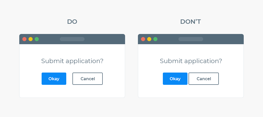
When we consider user interaction on a website, click-enabled buttons, links are the major source for the user’s association with the website. You must have come across an anchor text referring to the text links such as ‘read here’, ‘click here’ , ‘navigate from here’ etc. It is suggested to provide a clear, concise and understandable anchor text for the screen readers.
Moreover, designing of the web-elements should be done with utmost care. Standardize padding and spacing should be given to the elements (tables, call-to-action-buttons, images) present on the screen. Along with this size should be kept in such a way that these are easily approachable by the users of the small screens.
#4 Use Large Fonts and High Contrast Color Combination
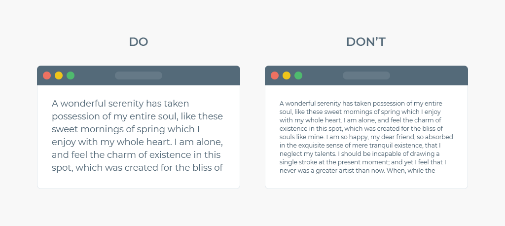
Good contrast and font size help in the proper organization of the design and establishment of a clear hierarchy among users and the website designers. For example, a light grey content on a white background will make it quite tough for the users to read the content. A contrast color combination differentiates one website element from the other and also is helpful to design for users with color-blindness and other visual imparities.
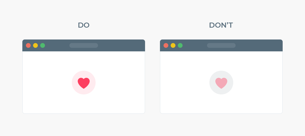
W3 accessibility guidelines can be referred for standard contrasting values, which recommends a minimum of 4:5:1 contrast in larger elements, and 7:1 in regular ones. It is recommended to set a font size of at least 16px, and ideally, 20px for body text. Many online tools are available for checking the contrast. In our further sections, we will discuss more such tools.
#5 Use Default HTML and ARIA Tags
If you want to make a web page accessible for every user, do not play with HTML tags. It is quite mute to use an additional javascript event to make anchor tags to work the same as buttons. It is recommended to use buttons for buttons, anchors for links, “table, tbody, td, th” for tables, “h1, h2, h3, …” for titles and so on.
ARIA (Accessible Rich Internet Applications) on the other hand offers special accessibility HTML attributes that can be added to any markup but is more preferred for HTML. ARIA facilitates states (active or disabled) for the objects, description for a form or the width of a progress bar, etc.
#6 Provide Video Captions and Audio Transcripts
Subtitles or captions are a great helping hand for the users accessing the website in a foreign language. Having subtitles is a boon for the users having a hearing disability. Additionally, it is suggested not to keep the video on autoplay mode.
While talking about audio content, make sure to provide transcripts for each and every pre-recorded audio content. A properly aligned full-size version or a short summary is recommended for the same. It makes the content more accessible for auditory impaired users.
Inclusive Web Design Tools
Many online tools are available for the purpose of validating web accessibility for every user, below is the list of few such tools that helps in checking the website’s compliance to accessibility:
- A11Y Compliance Platform by Bureau of Internet Accessibility
- Accessibility Checklist by Elsevier
- Accessibility Developer Tools by Google Accessibility
- ColorTester by Alfasado Inc
- Contrast-Finder by Tanaguru
- DYNO Mapper by Indigo Design Company LLC
- WAVE by WebAIM
Check out the complete list of important accessibility tools here
Takeaway
Special tactics and principles need to be followed while ensuring web accessibility for all types of users. Many strategic initiatives and creative implementations have shaped up a base for better website user interaction.
What do you think of Inclusive web design or web accessibility? Share your views on our social media channels: Facebook, LinkedIn, and Twitter.
Connect with us at [email protected] to make the world a better place for the specially-abled people.
Subscribe
Related Blogs
UX Best Practices for Website Integrations
Website Integrations determine whether users stay engaged or abandon a site. I experienced this firsthand with a delivery…
How design thinking acts as a problem solving strategy?

The concept of design thinking is gaining popularity these days since people across different industries are using it as a…
10 major challenges that come across during an agile transformation

It’s no longer a mystery that agile was created as a response to the various concerns that the traditional waterfall…


