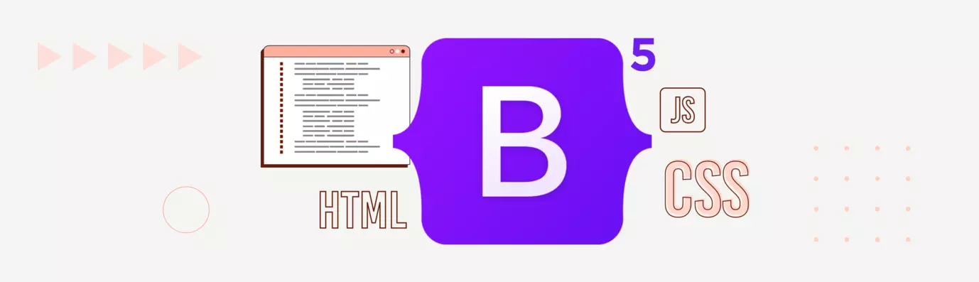
Create your frontend applications like pro with Bootstrap 5

Pravesh Poonia
Articles
Published on 13 Mar, 2023
6 min read
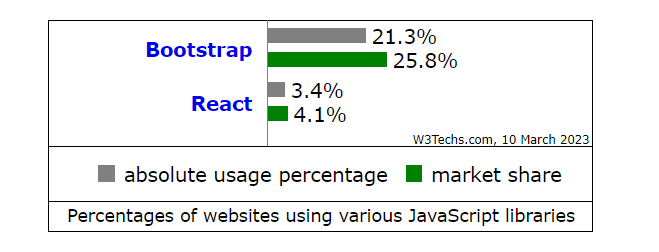
Bootstrap is the leading choice of front-end developers. According to the recent W3Techs.com statistics, it is used by 21.3% of all Javascript websites, with a total javascript library share of 25.8% globally.
With its pre-defined HTML and CSS classes, Bootstrap offers a basic and robust structure for building visually appealing and responsive websites. This blog gives an overview of the latest Bootstrap 5, its features, and the installation process.
Everything about Bootstrap 5
Bootstrap 5 is built on Bootstrap 4 with major upgrades. Released in December 2020, Bootstrap 5 is the latest version and has been designed to create responsive websites and applications faster. With improved performance, design systems, and enhanced features, it assists developers in quickly building modern websites and applications.
Against its previous release, Bootstrap 5 offers a better flexbox grid system, improved media query support, enhanced utility classes, and more. With these new features, it is easier to create responsive websites with minimal effort.
The new version also provides better support for web accessibility standards so that all users can access the content on your website or application regardless of their device or browser.
Bootstrap 5 Features
Bootstrap 5 includes a range of features and improvements over its previous version, Bootstrap 4. Some of the key features of Bootstrap 5 are:
- Enhanced Grid System
Bootstrap’s grid system now provides all six default breakpoints including the new addition of making extra extra large components.
- Extra small (xs)
- Small (sm)
- Medium (md)
- Large (lg)
- Extra large (xl)
- Extra extra large (XXL)
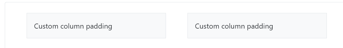
- Gutter Classes
Gutters are the padding between the columns. This is used for responsive space and to align content in the Bootstrap grid system.
In Bootstrap 4, the gutter width (space between columns) can be adjusted based on the screen size by using breakpoint-specific padding and negative margin utility classes.
For example, you can use .px-* and .ml-* classes to add or remove horizontal padding and margin respectively
However, in Bootstrap 5, the gutter classes have been replaced with new .g* utilities, which function similarly to the margin and padding utilities. The .g* utilities allow you to add custom gutters between columns or elements, giving you greater control over the layout of your page.
- Redesigned Form Controls
In Bootstrap 4, the form controls such as input fields, text areas, and select elements, are given a standardized look and feel using the global styling of Bootstrap. These elements, when given the class of .form-control, will have a width of 100% and be styled consistently across all screen sizes and devices. This helps to create a unified look for webforms, making it easier to design and develop them.
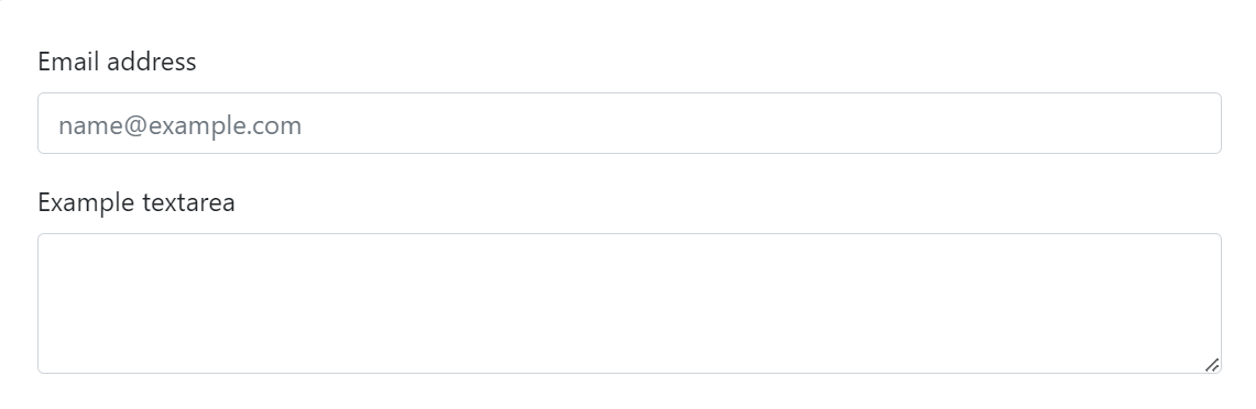
With Bootstrap 5, the grid system took the role of the form-group class. As a result, customized rendering will be easier to achieve and more consistent across browsers and devices.
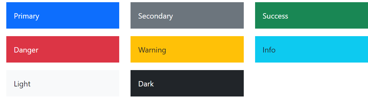
- Expanded Color Palette
With Bootstrap 4, you can use custom CSS, SaSS variables, SaSS maps, and a basic set of color palettes to customize your project, allowing you to add gradients, shadows, and other effects.
With an extended color system built-in to Bootstrap 5, the bootstrap development theme enlarged the color pallet. The style and feel of your app may now be easily customized without leaving the codebase.
- JavaScript Support
The requirement on jQuery has been removed from the current version of Bootstrap, and vanilla JavaScript has taken its place.
Bootstrap 4 vs Bootstrap 5
Bootstrap 4 or 5, which one is better? Let’s quickly compare both versions and understand what’s new.
|
Features |
Bootstrap 4 |
Bootstrap 5 |
|
Grid System |
5 default responsive grid tiers are used to define the breakpoints for different screen sizes named as xs, sm, md, lg,xl. |
6 default responsive grid tiers are used to define the breakpoints for different screen sizes named as xs, sm, md, lg, xl, xxl. |
|
JavaScript/jQuery |
Uses jQuery first because it depends on it before utilizing bootstrap |
Discontinued use of jQuery library and utilizes default vanilla JavaScript |
|
Color |
Limited color supports. |
Displays .gutter with px-sized font |
|
Font |
No preset responsive font size offered |
Has responsive default font size that enables text responsive scaling across all viewports and devices |
|
Gutter |
Displays .gutter with the px-sized font. Standard: 30 px |
It has .g* with font size in rem introduced. With additional control over gutter width, the default is 2rem. |
|
Column Positioning |
Column Positioning |
Relative by default is no longer supported. |
|
Bootstrap Icon |
Doesn’t provide an icon for the bootstrap library. |
Gives its own icon library. Uses SVG icons |
|
Card Desks |
Provides a card deck (creates a grid of cards with equal height and width). |
It no longer supports card decks as a grid in Bootstrap 5 and provides more responsive control as compared to Bootstrap 4. |
|
Form-row |
Offers form-row classes with a narrow gutter. |
Lacks form-row classes and relies on gutter classes for spacing support. |
|
CSS Custom Properties and Variable |
Does not offer any unique customization options for its components or layout configurations like table components. |
Offers a choice of CSS custom properties for components and layout options. |
How to install Bootstrap 5
Like all javascript libraries, Bootstrap 5 can be installed in multiple ways depending on the development setup and preference.
One can either download the source code and compile it or include it directly in a project using a package manager such as npm or yarn.
- Source file: Download Bootstrap 5 Source files
You can download files from GitHub.
Once you have downloaded the zip file, you need to extract its contents to access the individual files and folders within it. To set up the index.html file, follow these steps:
- Locate the extracted folder and open the "css" directory.
- Copy the bootstrap.min.css file and paste it into your project's "css" directory.
- Open the "js" directory in the extracted folder and copy the bootstrap.min.js file.
- Paste the bootstrap.min.js file into your project's "js" directory.
- NPM: Start Bootstrap 5 with the Starter kit
Install the bootstrap 5 templates via npm.
npm i [email protected]
or clone bootstrap 5 staters.
git clone https://github.com/StartBootstrap/startbootstrap-bare.git
or you can download the starter
- CDN: Setup Bootstrap 5 with CDN
If the project has a small scope and does not require extensive customization, using the Content Delivery Network (CDN) is a preferred option.
CDN allows ease to add the framework to the website by adding a link to the CSS and JavaScript files in the head of the HTML file.
This saves the hassle of downloading and hosting the files on the server, making the process convenient & faster. Additionally, CDN allows quick bug fixes and easier access to new features without manual file updates.
Conclusion
To summarize, Bootstrap 5 got it all to make a perfect union by combining the best of both the bootstrap 3 and 4 versions. New features and functionality has made version 5 the primary choice of front-end developers. Being lightweight and less code intensive makes Bootstrap 5 a developer-friendly framework.
It is also more customizable and flexible. It is easy to implement the design patterns, easy to alter the layouts, and even easier to extend. These features make bootstrap 5 more suited to be used in any development project.
OpenSense Lab is an expert at designing responsive and dynamic websites. Get your website built by leading Drupal experts with 90% success in delivering the project within the budget. Learn more about how OpenSenseLabs transform websites and provide a better digital experience with the most skilled and innovative minds. Contact us at [email protected] to know more.
Subscribe
Related Blogs
Workforce Management Tool: Features, Benefits & Complete Guide

“Simply Manage is a workforce management tool designed to streamline workflows across teams, making time tracking, resource…
Trek n Tech Annual Retreat 2025: A 7-Day Workcation of OSL

OSL family came together for the Trek n Tech Annual Retreat 2025, a 7-day workcation set amidst the serene beauty of…
Exploring Drupal's Single Directory Components: A Game-Changer for Developers

Web development thrives on efficiency and organisation, and Drupal, our favourite CMS, is here to amp that up with its…