
With Ant Design, Create React Components Like a Pro

Aruna Dhyani
Technology
Published on 30 Jan, 2023
6 min read
Most enterprise-grade solutions depend on the React stack to create a robust platform for improved delivery and performance. React is one of the leading tech-stack behind the interactive user interface of Facebook, Netflix, Instagram, and Whatsapp.
To develop such advanced solutions quickly and easily, UI libraries are available to give pre-built UI components. Ant design is one such sophisticated component-based library that speeds up the react-based development process.
If you're looking to take your React development skills to the next level, look no further than Ant Design. This powerful library provides everything you need to create professional-grade UI components. With Ant Design, you'll be able to build components that look and perform great, no matter what project you're working on. Ant design aims to avoid complicated, messy designs and focuses on ensuring user certainty with consistent appearances. It has over 50+ customizable components which can be easily used to develop useful applications.
If you're looking for a complete design solution for your next React project, Ant Design can be a great option. With a wide variety of ready-to-use components and extensive documentation, you can create amazing React components like a pro.
Let’s dig deeper and understand Ant design, its features, and its components in length.
Ant Design Explained
Ant Design is a React UI library that includes easy-to-use components that are useful for building interactive user interfaces. One can easily use and integrate it. In fact, it’s one of the best options to design web applications using react. It offers high-quality components that can be used very simply.
Ant Design is a React UI library that includes easy-to-use components useful for building interactive user interfaces
It focuses to be clear, concise, and natural in the presentation of material. It basically depends on natural user cognition and natural user behavior to command where elements are probably to be seen and how to allow users to identify quickly what kind of information they are being shown.
It is designed in such a way that it helps in the growth of the website as the company or business grows with it. It aims at developer certainty, instead of depending on what component to use. It in fact guides the developer to user-specific components for a task.
What are its features
Let’s look at the features of Ant Design.
- Prebuilt Components: Provides a wide range of pre-built components that can be used to quickly create an interface with minimal effort.
- Customizable Design: Offers customization options so that you can easily create designs that match your specific branding.
- Theme Support: Supports custom themes, so you can create and switch between different themes with ease.
- Responsive Design: Supports responsive design, so your interface will look great across multiple devices and resolutions.
- Internationalization: Supports internationalization, so you can easily create an interface that is localized for different languages.
- TypeScript Support: Supports TypeScript, so you can use TypeScript to create type-safe React components.
Develop React application using ANT Components
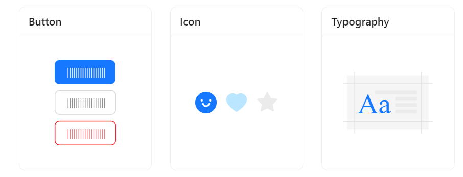
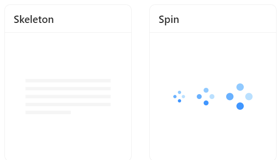
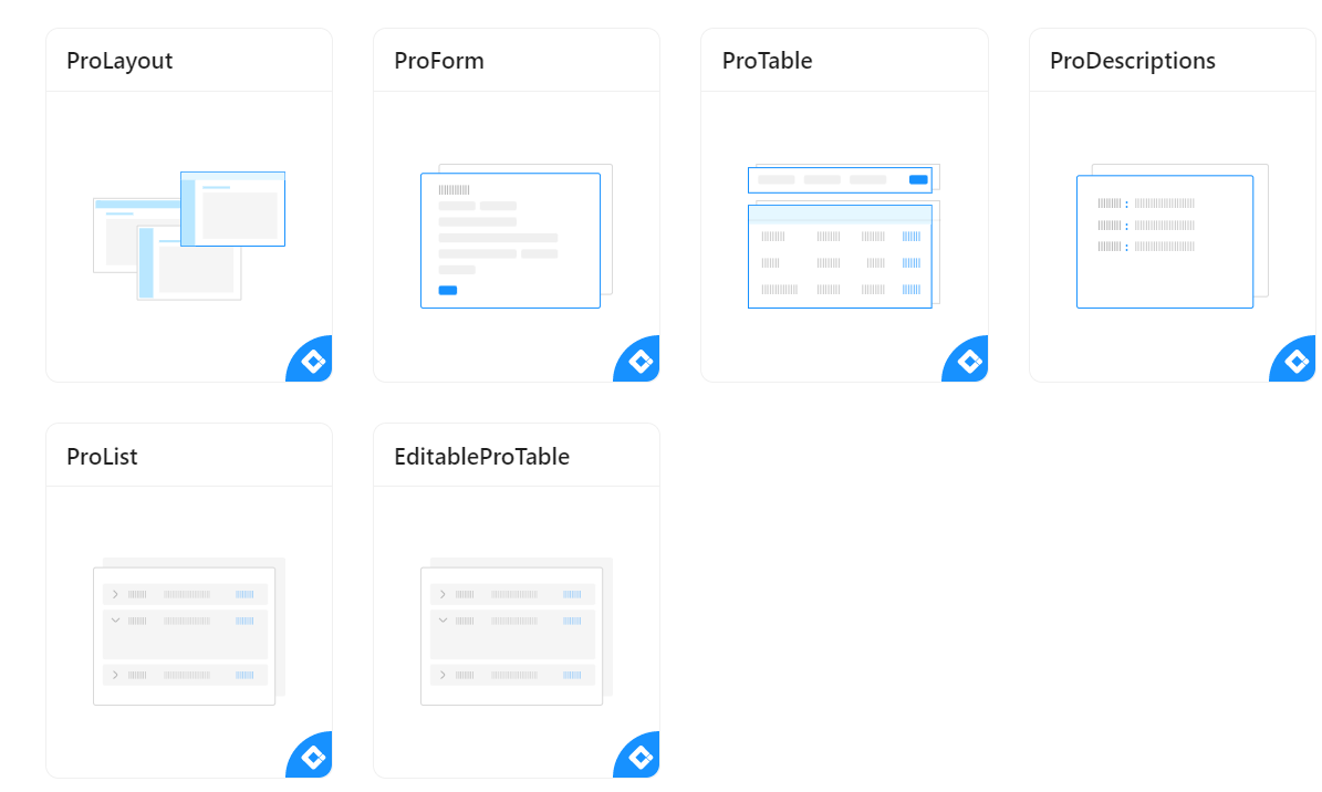
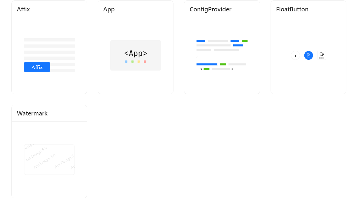
There are many useful components provided by ANT Design. Let’s have a look at some of the very basic components that can be used to build a system with React and ANT.
- General: Mostly used components which are very general in all the Ant Designs and Themes.
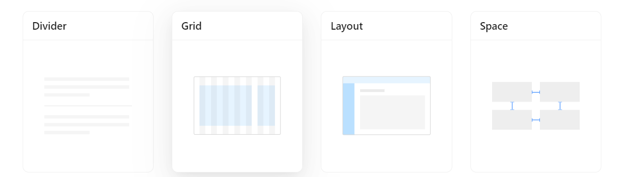
- Layout: The layout is a wrapper, that includes Header, Footer, Sider, Content, and layout itself. We can modify various things for layout.
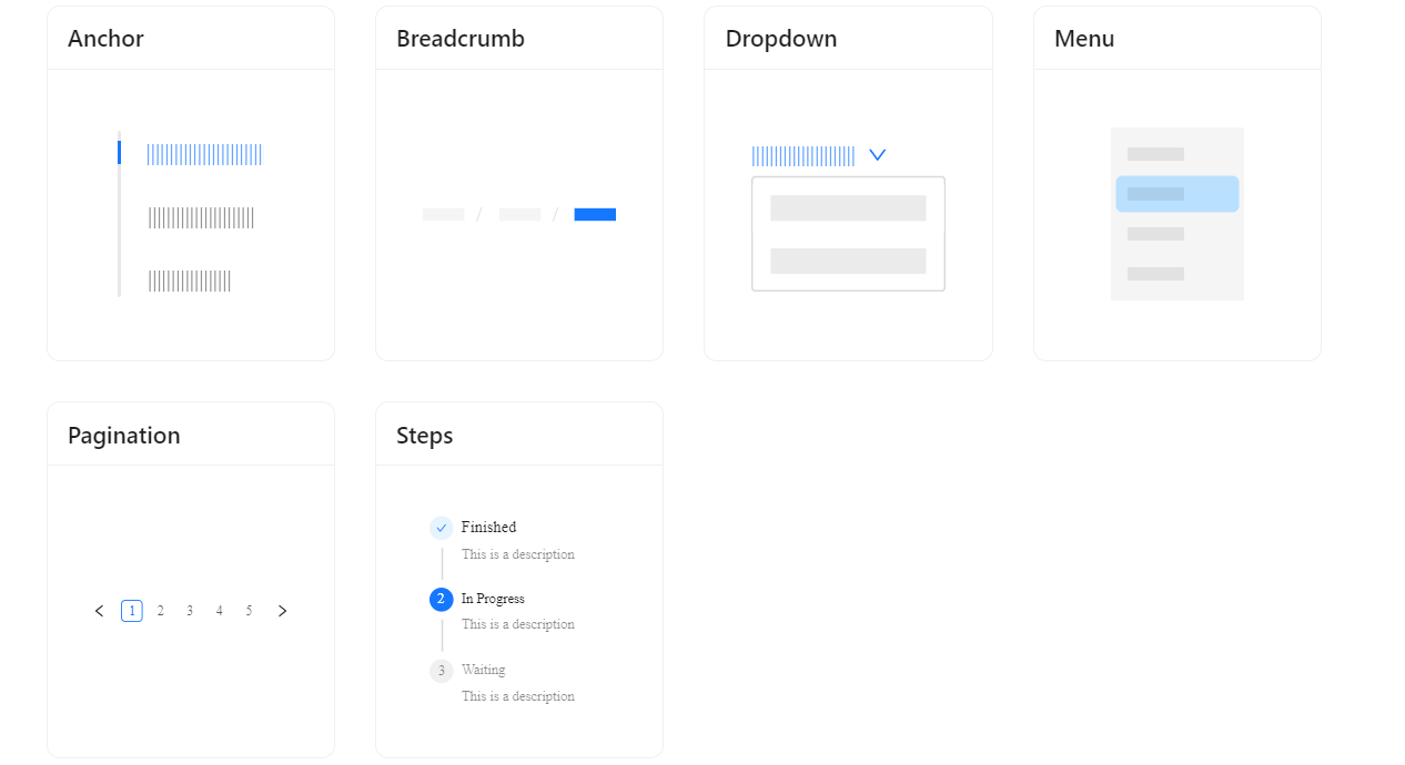
- Navigation: The Navigational Components help user to add routes and ways to traverse throughout the website/Application.
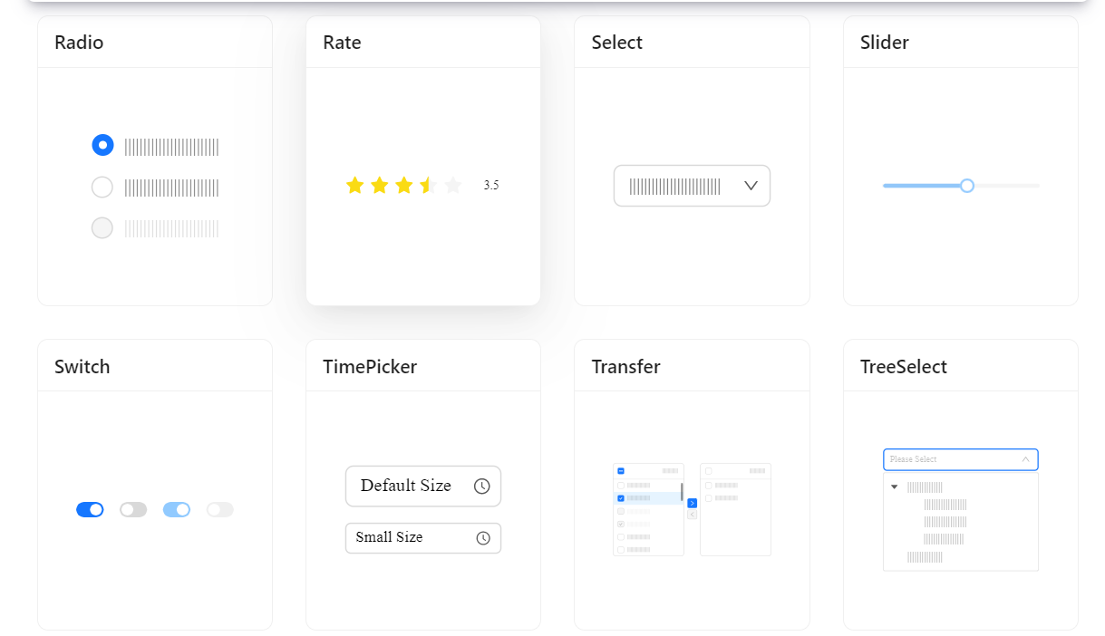
- DataEntry: The to and fro motion between web app and users is the most important part of any website. For this, we need a bunch of Data entry fields for dedicated works. Ant Design has numerous data entry fields in its library.
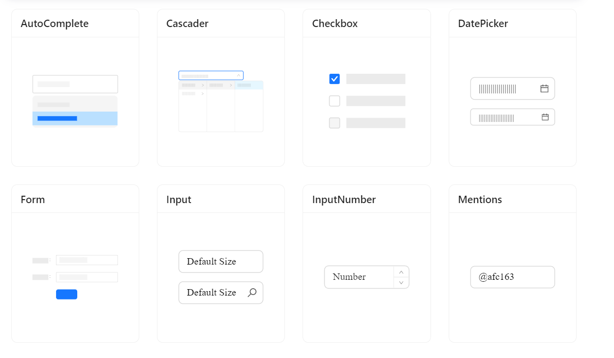
- Data Display: Ant design also provide numerous ways of outputting the data so that it could be more interactive to its users.
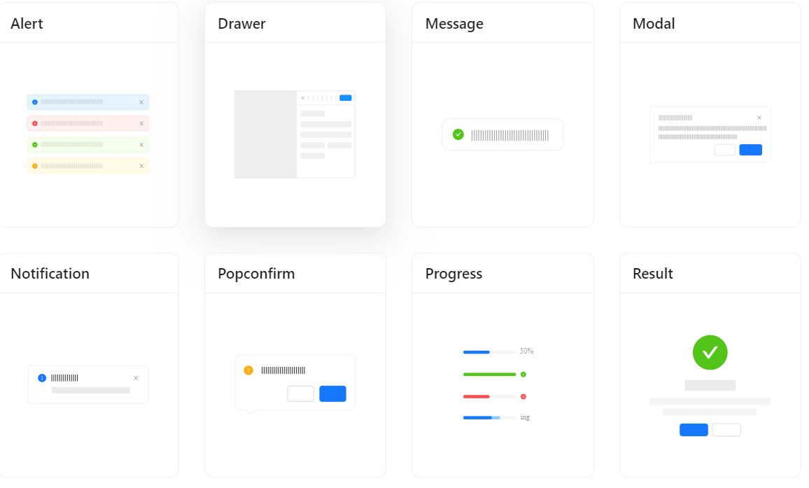
- Feedback: There are always some important messages to be displayed while the user is interacting with the page. For this Ant design provide customizable feedbacks components such as
- Others: There are some other optional components that can add some functionality to our webpage.
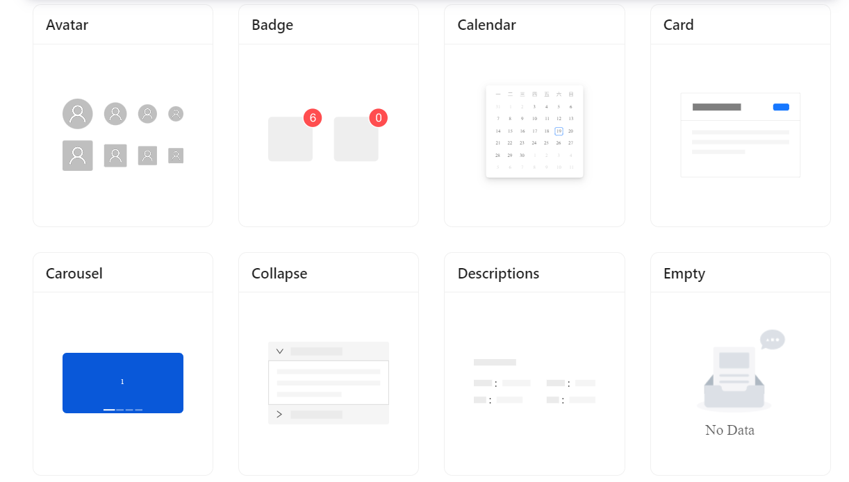
Extensive component support
- Text Input
- Checkbox
- Radio Buttons
- Slider
- Card
- Carousel
- Buttons
- New Add-on Features
There is a new approach to customizing themes in version 5.0. With CSS-in-JS, the ability of theming has also been improved in contrast to the fewer CSS variables of the 4.x version, including but not limited to:
- Switching themes dynamically
- Multiple themes
- Customizing theme variables for a certain component
Pros and Cons of Ant Design
Pros
- User-Friendly Ui that has Been polished.
- Forms are Simple to integrate and modify.
- Designing web, ios, and android applications is supported.
- Components With Lovely Animation and p Pace that releases quickly.
- Support for typescript and Es6.
- Support both Chinese and English.
Cons
- Comparative lack of comprehensive documentation to comparable frameworks
- Fewer themes are available
- Inadequate accessibility support
- Enormous file size
- Installation
Using npm or yarn#
It is recommended to use npm or yarn to install, it not only makes development easier but also allows you to take advantage of the rich ecosystem of Javascript packages and tooling.
$ npm install antd
$ yarn add antd

Usage#

Import{ DatePicker } from 'antd';
ReactDOM.render(<DatePicker />, mountNode);

And import stylesheets manually:

Import'antd/dist/antd.css'; // or 'antd/dist/antd.less'
Iconography & typography
Icons and typography are also fully supported internally by Ant Design, and they are similarly rather simple to add to the project. For instance, all that is required to use the supplied icons in your project is:
npm install --save @ant-design/icons

to install the icon pack:

import { HomeOutlined } from '@ant-design/icons'
ReactDOM.render(<div><HomeOutlined /></div>, mountNode);
Layout support
For UI item layout and to keep a responsive and fluid user interface, Ant Design offers its own CSS Flexbox alternatives. Ant Design offers row and column components that can be used as an alternative to identical divs with flex-direction row and column, respectively, for the same purpose. It accepts a span prop for controlling size, just like Bootstrap:
<Row>
  <Col span={12}>col-12</Col>
  <Col span={12}>col-12</Col>
</Row>
When to Choose Ant Design
- If you have a tight budget or are looking for a less expensive framework solution, Ant Design should be your top choice.
- If you want to design an application for both iOS and Android, Ant Design is a better choice.
- Because it is so easy to use, Ant Design is a great option for novices.
- If your software needs distinctive branding, Ant Design is an excellent choice because it gives you more room for it.
Conclusion
To sum up, Ant Design is a comprehensive UI component library that helps developers create user interfaces for web applications. It provides an extensive set of components and tools that enable developers to create designs quickly, efficiently, and with ease. Ant Design is based on the React.js library and provides developers with a wide range of components such as navigation menus, form elements, icons, grids, tables, and buttons.
With its intuitive design system and responsive layout engine, developers can easily customize their designs to fit their needs. Additionally, Ant Design offers detailed documentation and tutorials to help users get started quickly. With its wide range of features and tools, Ant Design is the perfect choice for creating modern user interfaces for web applications.
With emerging technological trends you need a partner that ensures your website is innovative. At OpenSense Labs, we help enterprises provide a better digital experience with new technologies.
Contact us at [email protected] and let our experts help you out with robust web development services.
This article is written with the help of Junaid Nayeem.
Subscribe
Related Blogs
AI Fairness: A Deep Dive Into Microsoft's Fairlearn Toolkit
Artificial intelligence (AI) has changed the game across industries, especially in financial services. From automating…
API Documentation Tool: 10 Best Tools For 2025
A Google search for ‘Best API Documentation Tool’ will show many results. The growing number of API documentation tools…
Debunking 6 Common Software Testing Myths

A flawless product delivery requires a perfect combination of both development and testing efforts. Testing plays a vital…