
Boost developer productivity with Chakra UI

Vidya Roy
Technology
Published on 16 Jan, 2023
5 min read
React component libraries are helpful tools in creating stunning interfaces for react-based applications. Though each website component can be coded from the scratch, component libraries make the development process easier and faster to complete. It allows you to use the exact component in your design without going back to the drawing board. As a result, an efficient application can be developed in less time and cost.
Chakra UI is a modern component-based library for building interfaces. It provides an accessible and reusable component-based architecture that makes it easy to create complex, responsive web applications.
With its intuitive design system, Chakra UI helps react developers quickly build user interfaces that are accessible, responsive, and visually appealing.
In this blog, we’ll learn the essentials of Chakra UI, and its importance in React web development, installation, and uses.
What Is Chakra?
Developers and business owners are always looking for ways to develop quickly and efficiently and a great experience for our clients, and Chakra is a tool helping developers to achieve that.
Chakra UI is a simple, modular and accessible component library that gives building blocks to build React application
According to their official website, Chakra UI is a simple, modular and accessible component library that gives you the building blocks you need to build your React applications.
This component-based library helps build React apps with speed and boosts developer productivity.
Why Use Chakra?
Chakra is a modern and powerful component library for React that was designed and developed by Segun Adebayo a UX Engineer for developing front-end applications. It provides more components, improved styling API, and accessibility and easy-to-understand documentation that gives us guidelines on how to build reusable components and save time.
It provides improved styling API with easy-to-understand documentation to build reusable components and save time
Chakra UI is customizable and reusable we can easily adjust it with our designs. It is very simple to use if you know how to use react components and this also supports ReactJs, along with some other libraries too.
Its components' names and the prop's names are easy to understand. It provides dark and light mode compatibility for developers to overcome contrast challenges.
Chakra components
Chakra has a lot of prebuilt composable and reusable components. Its components are dark and light mode compatible so we can also create our own dark and light mode experience across our application with a little bit of configuration.
Let's take a look at some components of Chakra UI.
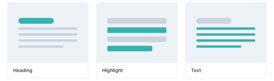
- Typography
Typography is the method of arranging font sizes, line spacing, letter spacing, line height, typeface, and other elements of text formatting to improve readability. It’s an important aspect of digital design and can greatly impact how readers engage with and understand written content.
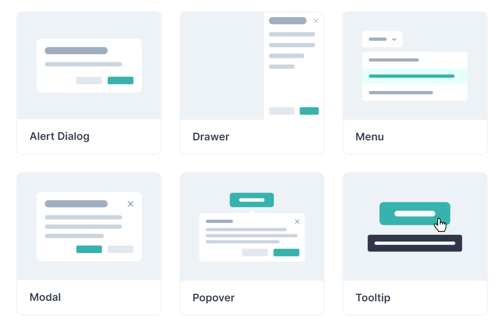
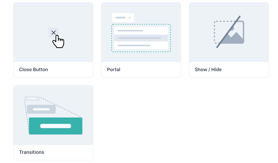
- Overlay
An overlay is a method to put something on top of such as an image or video, or text on top of another so that what is in the lower position can still be seen.
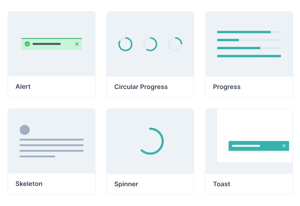
- Feedback
Feedback refers to giving information about something that anyone has done which tells how good or bad it is.
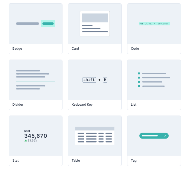
- Data Display
Data display is a method to represent the data in a visual format, such as a chart, graph, or map, and make information easy to understand.
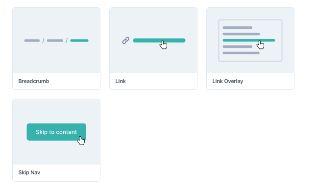
- Navigation
Navigation refers to moving through a website or application, finding the information you need, and getting to the pages you want to visit.
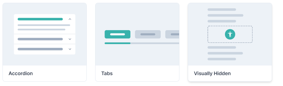
- Disclosure
The act of revealing or making known information that was previously hidden, or making something known.
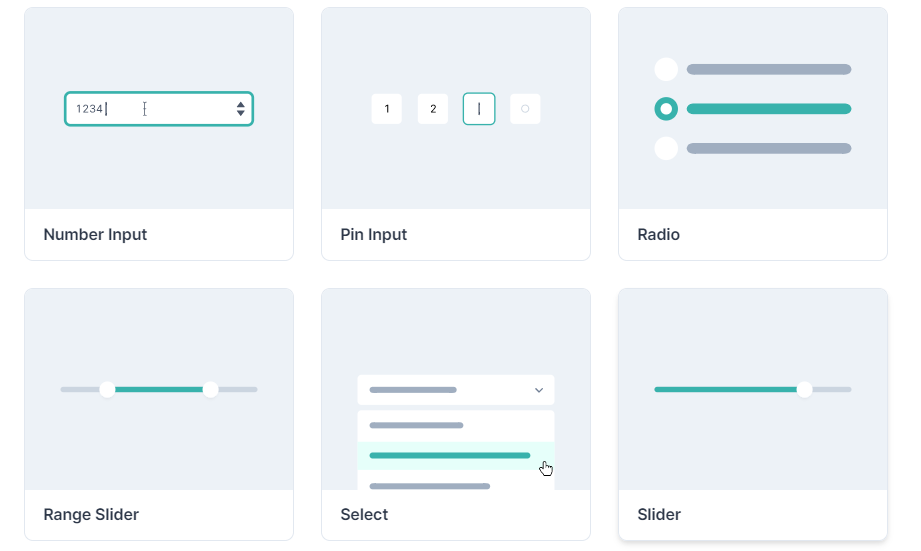
- Form
A form is a document that contains spaces for users to input information It can be used for a variety of purposes, such as collecting contact information, applying for jobs or loans, and more.
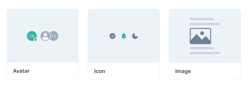
- Media & Icon
Media refers to various forms of content such as images, text, audio, and video that can be used to carry, entertain or inform.
Icon refers to the representation of the content this is small graphic images or symbols that are used to represent a specific function, feature, or content on a computer or mobile device.
- Others
Uses of Chakra components
If we want to add default components of Chakra UI to the project we just have to copy its code and paste it into our project and we can see our effect on the browser. If we want to use some components we just have to import them from ‘@chakra-ui/react’.
import {
  Alert,
  AlertIcon,
  AlertTitle,
  AlertDescription,
} from '@chakra-ui/react'.

<Alert status='error'>
  <AlertIcon />
  <AlertTitle>Your browser is outdated!</AlertTitle>
  <AlertDescription>Your Chakra experience may be degraded.</AlertDescription>
</Alert>
Import like this and create the structure you want to make it very easy to use.
Chakra Installation
We can use npm, yarn, and pnpm for the installation of chakra and its dependencies.
After setting up our react projects we have to run this command.
npm
npm i @chakra-ui/react @emotion/react @emotion/styled framer-motion

//or
yarn
yarn add @chakra-ui/react @emotion/react @emotion/styled framer-motion

//or
pnpm
pnpm add @chakra-ui/react @emotion/react @emotion/styled framer-motion
After installation to get initialized, we need to set Chakra provider at the root of our application. This can be our index.js or App.js depending on the framework we use.
For React:
import React from "react"
// 1. import `ChakraProvider` component
import { ChakraProvider } from "@chakra-ui/react"

function App({ Component }) {
 // 2. Use at the root of your app
 return (
   <ChakraProvider>
     <Component />
   </ChakraProvider>
 )
}
Conclusion
React component libraries are helpful tools in creating stunning interfaces for react-based applications. With its intuitive design system, Chakra UI helps react developers quickly build user interfaces that are accessible, responsive, and visually appealing.
With emerging technological trends you need a partner that ensures your website is innovative. At OpenSenseLabs, we help enterprises provide a better digital experience with new technologies.
Contact us at [email protected] and let our experts help you out.
Subscribe
Related Blogs
AI Fairness: A Deep Dive Into Microsoft's Fairlearn Toolkit

Artificial intelligence (AI) has changed the game across industries, especially in financial services. From automating…
API Documentation Tool: 10 Best Tools For 2025

A Google search for ‘Best API Documentation Tool’ will show many results. The growing number of API documentation tools…
Debunking 6 Common Software Testing Myths

A flawless product delivery requires a perfect combination of both development and testing efforts. Testing plays a vital…