Accessibility in UX design
Accessibility is oriented towards making things more and more understandable and usable by people of diverse physical characteristics. Not everyone is born with the same set of visuals or set of active fingers, people do lack on some sections and technology is supposed to be accessed by many. This is not meant to include individuals who have visual, motor, auditory, speech, or cognitive disabilities.
Some statistics to give you the chills
There are nearly 1-1.3 billion people with disabilities in the world, as per a report published by the United Nations itself. This is so enthralling. That's nearly the population of China - 1.39 billion and nearly quadruple times the population of the United States of America. In fact, persons with disabilities are the largest minority in the world.
As per Interactive Design Foundation, disabilities can develop from birth, aging or accidental or health-related incidents. On average, people who are 70 years old or older will spend eight years as individuals with disabilities. As the Baby Boomers who were born in the years following the Second World War – approximately between the years 1946 and 1964 – have been aging, we have been seeing an increasing need for accessible digital solutions.
Coming to, how can you improve accessibility in UX design?
You have to segregate personas in order to think about all round accessibility. User Personas are prime elements of any small to large scale accessibility design work. Personas are fundamental for UX design projects. If we want to build accessibility design thinking into the UX process, then one of the best methods is to have a persona with a disability.
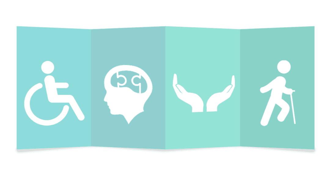
According to the Centers for Disease Control and Prevention (CDC), which is the leading national public health institute of the United States, a person with a disability may have difficulty with the following:
- Vision Impairment - A 50 year old retired woman with vision loss caused by diabetes—the woman’s disability is illness-/age-related.
- Movement - Movement might be a big deal for some elderly people, even for some young people.
- Thinking - Cognitive and tactical thinking is a blessing not available to some.
- Remembering - Forgetfulness is a concern widespread across different regions of the world.
- Learning - Quick or On-the-go learning is also a blessing in disguise and it is not enjoyed by every person. Some suffer with the inability to grasp in time.
- Communicating - Not being able to communicate properly is a concern as well.
- Hearing - Aids are on a roll in every market but they don’t provide the accurate listening experience.
- Mental health - People suffer with borderline depression, concentration issues and various mental health issues which are not so well discussed by the society.
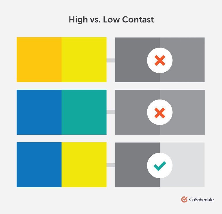
Add enough color contrast
According to the World Wide Web Consortium (W3C), the ideal contrast ratio between texts and their background should at least be from 4.5 to 1 as it complies with the level AA conformance. AS you increase the font size- make it bigger or fatter- The ratios get better as those fonts are easier to read on the eyes given their averagely contrasting backgrounds. Considerably, your type is at least 16-18 pts or 13pt bold, the contrast ratio then drops staggeringly.
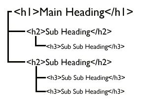
Always use header tags in a logical order
Don't look at the different sections of the landing pages separately because they are not separate entities, they are more contextually bound and they work together as a whole. Instead of randomly assigning header tags just after paragraph ends, think the content through, does it deserve to be a header, is it equally more worthy as the rest of the headers. Header tags if not used properly can cause a lot of damage to you the contextuality and the readership afterall. This will also take a toll on your accessibility if a basic standard is not met.
Always try to keep CTAs self explanatory and understandable without a text within
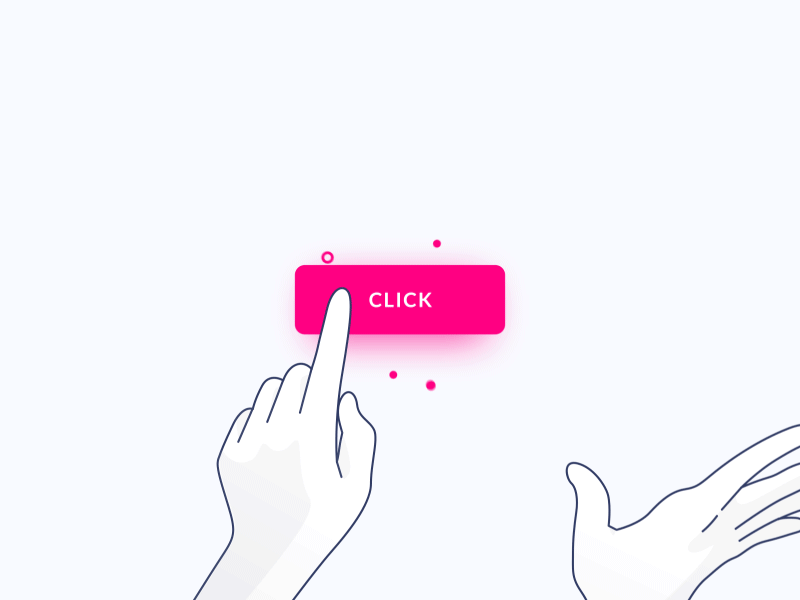
- One basic screen reader function is to read through all of the links on a page. If a page uses the same copy for links that do different things, e.g. ‘click here’, it can be incredibly difficult to navigate.
- Always try to keep CTAs more loud and not contrastingly weird from the background. The issue is that you have to make it super loud to get a good result on your click through rates but you also have to make it more accessible sound and not just loud.
- They should be easily recognisable from the other one.
- They should be responsive enough on hovering, tapping or clicking for that matter on the particular landing page since these actions are particular on any sort of landing page.
- The color of your buttons should not be very contrasting, like red is associated with anger or it known to be a repulsive color. It should also contrast well with the color in the background.
Supposedly there are 3 links or CTAs on a page, so try to give them some sort of uniformity in terms of color, or shape or size and also use the same font across all your CTAs to make them more accessible. One example of a bad CTA copy is 3 CTAs which do inherently different things are using the same text within them, not saying that they have to be visually very different, just the copy of the text can be very different.
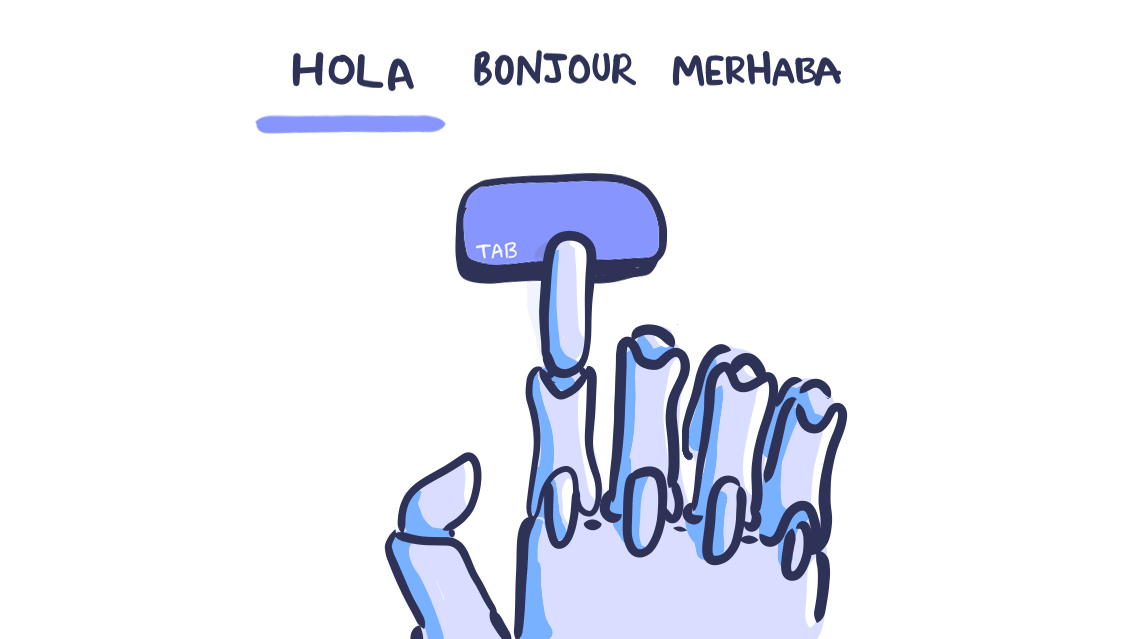
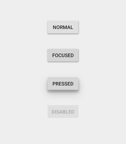
Design Usable Focus States
The elements that should be focusable are links, form fields, widgets, buttons, and menu items. They need to have a focus indicator that makes them look different from the elements around them. The changing states between elements and other things need to be realised and addressed accordingly. Just like the example of changing states between buttons below:
The text size and color ratios should produce accessible combinations
One of the easiest ways to align your designs with the WCAG is to use strong color contrast. The WebAim Color Contrast checker is one of my favorite tools to achieve this. It’s great if you’re building a color palette from scratch, or if you’re working with an existing palette and need to create a complementary web-accessible color set.
Make it a practise to provide alt text for images
Alt text should be provided for images, so that screen reader users can understand the message conveyed by the use of images on the page. This is especially important for informative images such as infographics.
Active Images, Decorative Images and Information-heavy images are all the image types we deal with in every form of content, let's talk about them.
Here are some best alt text practices for alt texts:
Every image should have an alt image included, the image which does not have any alt text included will ruin your accessibility practise if missed.
The alt text should be describe the item or information being displayed in the picture not the picture’s color or other elements.
- Active images - Images that are actively participating in the context, for example an image of a person or some activity being represented in the image, you should provide descriptive alt text for such images, an alt text which conveys everything being done in the image.
- Decorative Images - State in the alt text that the image is used for decorative purposes only and does not provide any additional helpful information; this is to make sure the users don’t feel that they are missing out on a lot of information due to their underlying inability to access content best.
- Information Heavy Images : For such images, please provide a concise summary, not as an alt text obviously as it would cross the character limit, just add the precise summary which render the information from the infographic to textual characters and can be easily accessed and read by people with disabilities.
The Key Takeaways
As designers, you need to plan and design for accessibility in UX projects. We have the responsibilities, not only to our profession but also to our users and society, to design accessible digital solutions.

Join Our Newsletter
Love open-source tech? Stay updated with projects that make a difference.