Accessibility as a means is a way to ensure equal access for people with disabilities(physical and virtual) as others. Non-disabled people do not face the same hurdles and challenges that a disabled person does in day-to-day life and thus, many ignore the trivial needs when addressing or working in public sector development. From the construction of ramps at sidewalk crossings to adding raised surfaces near the rails on metro and subway platforms, physical improvements in and around the world are like the basic needs for people with disabilities. Similarly, in the digital world, web or mobile accessibility refers to adopting similar practices for a more inclusive environment online.
As designers of websites, it is an important job to keep in mind the needs of people with disability given their reliance on technology for tasks including communication and information. Before we set forth to unleash the accessibility tool, let’s define what exactly is accessibility for mobile app design and how it helps mobile apps? What roles can it play in the success of a mobile app? What are the guiding principles in terms of methods to make the app UI more accessible? And most importantly, what is the target audience?
‘Web accessibility refers to adopting similar practices for a more inclusive environment online.’

Accessibility as an approach is not limited to blind users. Hence, while considering design for mobile users, the following are to be kept in mind too:
- Partially sighted
- Colour blindness
- Dyslexia and similar cognitive issues that can affect readability
- Arthritic and finger joint movability issues
- A combination of disability issues that can increase the level of difficulty

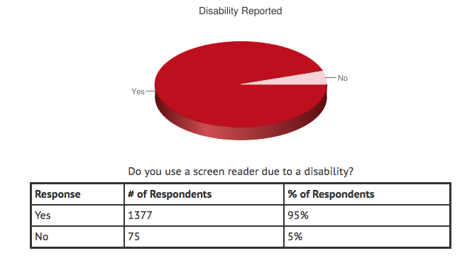
According to the above statistics by WebAIM, 95% of the respondents said that they use screen reader due to a disability and the proficiency of respondents is said to increase in each successive survey. Only 5% of them do not use screen-reader and further, 3% of people with disabilities considered their proficiency to be at the ‘’Beginner’’ level when compared to 33% of those without a disability.
Accessibility For Mobile UI
There’s a vast majority of web traffic that has now been transferred to mobile devices in the recent past and accessibility of content and features for the end-user has become an issue. Allowing ease of access for all users means delivering an easy-to-use app irrespective of accounting for disability. Thus, accessibility, a simple function of access, is an approach that allows effortless access to the content a user may need. When designing an app, making the accessibility feature as one of the priorities enables catering to every type of user in the market.
Many countries following the World Wide Web Consortium (W3C) adopted some accessibility standards which are simple and straightforward. The basic principle of making the UI design accessible is to make the app useful in real-life situations which can be the original idea behind it. Great user experience is the key component of quality UX design, which is achievable with an accessible UI design. Basic features of mobile accessibility can include voice-enabled actions, gestures detection and so on.
Why Accessibility in Design is Important?
‘Many countries have made designing for accessibility a legal obligation to be followed for the convenience of uniformity.’
More than 1 billion people worldwide suffer from some sort of disability and in the US alone, almost one in every five persons is disabled. Moreover, about one thousand lawsuits have been filed in 2017 about accessibility and related issues. These statistics clearly state the need for making the web and apps accessible for everyone and removing the barriers that hinder both, the usage and the growth of the application. Even for the non-disabled users, accessibility as an added feature in the app comes handy in multitasking.
Thus, the usability and usefulness of an app should be the top concern for UI/UX developers irrespective of the context or situation at hand. As the need to embrace accessibility has become a necessity and no longer a choice for the designers, a steady rise in the graph of success has been noticed. Keeping the trend up, many countries have made designing for accessibility a legal obligation to be followed for the convenience of uniformity.

Issues with Mobile Accessibility
Accessibility as a feature is to allow people with diverse abilities and methods to access and effectively use your interface. Let’s have a deeper understanding of each feature that can pose a problem when it comes to making an app accessible.
Keyboard
Mobile devices have the capability to display a different touchscreen keyboard depending on the data. Between the two types of elements, interactive and non-interactive, the developers must focus on the activatable elements and non-interactive elements must not be focusable in the device. Following are a few recommendations for the same:
- Use standard HTML elements to get keyboard access automatically
- Appropriate ARIA roles should be assigned for non-standard controls, such as buttons, links, or checkboxes.
- Use <input type=tel, number, email, etc.> to make typing on mobile devices easier when including form input fields within your mobile application
- Display a more usable and simplified keyboard for the data types you’re requesting with HTML5 input types
Zoomed in Sections
The font on the web can reflect quite differently when accessed on mobile browsers or apps due to the screen size. Therefore, the mobile application must have a resizing option for fonts of the content up to at least twice the standard font size. Also, the zoom should be allowed for all HTML content in the browser and for embedded HTML content in native apps. This gives access to the content for people with short-sightedness and similar disabilities.
Content Structure
The coding of the content is a crucial aspect when it comes to providing for accessibility. The content must be coded in order to help keyboard-only users, voice input users and screen reader users in accessing all the content and not missing out on anything. A heading must uniquely identify each page or screen in a logical and hierarchical structure. This gives the user a sense of chronological order and helps in easy content search while going back and forth with the web pages.
When ARIA landmarks roles are assigned to containers, which should be used to structure the content, they help in understanding the content flow. It further helps assistive technologies such as screen readers for people who cannot see the visual layout. For instance, grouping all the navigational elements in one container and assigning the landmark role as ‘navigation’ can help the screen reader users to swiftly navigate within a page or screen.
Colour Contrast
For users with color blindness, color deficiencies, visual impairments, and cognitive impairments, the good color contrast ratio is an essential element in technology. It affects people with poor visibility and dyslexia as they use color as a differentiator for elements and content on the screen. Tools like Color Contrast Checker come handy in making the device accessible for users with color disabilities.
According to the Web Content Accessibility Guidelines (WCAG), developers should choose colors that provide enough contrast between content and the background of the page. This checks the needs of anyone with low-vision impairments and color deficiencies to perceive the content easily. WCAG 2.0 level AA needs a contrast ratio of 4.5:1 for normal text and 3:1 for large text given that large text is easier to read by virtue of its size. Bottom line, the text used against the text background in mobile web and app designs should meet the WCAG 2.0 level AA color contrast requirements.
Touch Targets
Many a time, the touch of the mobile screens can hinder the access. When an action is triggered by touching a screen or swiping/pressing a key, it may go haywire. Thus, the action must be triggered only for a particular type of user interaction and be initiated when the user finishes activation. In other words, when the finger is lifted from the actionable elements, only then the activation of the action should start. The gap between the initiation and activation allows the users a time frame to change their mind and users with disabilities to locate the precise elements without triggering unintentional actions.
Scrolling
The scrolling down of content as an accessibility feature is often overlooked feature by the developers. To avoid the content cut-off issues when shifting from desktop to mobile, developers should ensure the relative size units usage for content and containers. Further, there should be a secondary method for drag and drop. It is required to change the page size since the drag and drop functionality can cause mobile browsers to disable zoom.
Audio or Video
Automatic play of audio and video can emerge as an issue with screen reader users and be disturbing at times. Also, users with cognitive or sensory sensitivities can get distressed too. There should be an option for users to set their preferences for autoplaying or not autoplaying the content which will make the design accessible for all kinds of users.
Once taking these factors into consideration and successfully implementing them, the next step is testing(manual or automated) and verifying if the content complies with the inputs.
Guidelines Of Accessibility Design
While ensuring accessibility, user interface went through many approaches to be in compliance with the best of practices. There are few guiding principles that stood out and recently, the World Wide Web Consortium prescribed some effective accessibility standards to be kept in mind when designing the user interface. The guidelines are divided into two - ATAG 2.0 and WCAG 2.0.
Drupal CMS does adhere to both the guidelines along with addressing some of the best accessibility features:
- Design: This principle states that the design should allow consuming contents in different ways and as per the varying abilities of the users.
- Operable: The app should be able to allow interactions without any complexity and confusion.
- Understandability: This principle states that the user must understand how the app works and how they can find contents and use the app.
- Assistive: Finally, the app should allow several assistive devices such as screen readers for users with some kind of disabilities.
Drupal 8 and Accessibility
According to the latest Comscore global mobile report 2018, more than 80% of mobile minutes in all markets are spent on apps. Given the demand and need of the hour, Drupal 8 has upgraded its modules with significant improvements around accessibility that can ensure a strong foundation for your site. Let’s have a look:
Alt Text
Alternative(Alt) text is a simple description of the image in words which has to be provided for the users with a disability. It is utilized by the tools like screen readers but does not reflect in the display of the page. Though Alt text is a default requirement in Drupal 8, it calls for a proper training process for the content creators to ensure that the text is an appropriate description of the image in account with an intended purpose and not just a random explanation in few words.
Semantic Elements
Use of semantic elements allows for “nav” to replace div or span, where divs and spans are generic HTML tags that define the elements on a page. Semantic elements allow developers to assign a name that fits the purpose of a particular element in HTML5. Thus, using this to their advantage, Drupal 8 provides a common element name for users and machines to know what to expect when presented. However, this can lead to an overlap of SEO and accessibility as the same name elements are used by search engine crawlers to understand the pages.
WAI-ARIA
A technical specification published by the World Wide Web Consortium (W3C), WAI-ARIA (Web Accessibility Initiative – Accessible Rich Internet Applications) deals with making certain types of content available and specifies how to increase the accessibility of content on web pages. For instance, drag and drop functionality. For a more understandable and assistive usage, Drupal 8 follows and incorporates the WAI-ARIA guidance.
Aural Alerts
The basics of a screen reader are to only ‘look’ at one part of the page at a time. So, when a change takes place on the page, the reader is typically unaware of it unless indicated by the screen reader. Thus, a javascript method in Drupal 8 allows the screen reader to be read aloud to the users with a string as it is in compliance with the ARIA. This allows the user to be aware of the changes happening on the page via a screen reader.
Tabbing
A tabbing manager is another feature of javascript in Drupal 8 that allows the user to move around the website’s page with a key tab on their keyboard instead of a mouse. This functionality controls how and where the user can tab into the context of the overlay on the page.
Form Errors
When it comes to the display of form errors, Drupal 8 provides an option to turn on a feature to improve the accessibility. The form errors are presented by default after submission at the top of the form with fields that failed validation and are highlighted in red. However, color-blind users can miss the highlighting of any specific field. Thus, designers should use better form validation error verbiage to help them with it.
CSS Display
The most challenging and time-consuming part of mobile accessibility testing is screen reader testing, but it also highlights bad practices and bugs on both desktop and mobile. Sometimes, the content is hidden for accordions and the user accessing the web page with a screen reader would have no way of knowing about the content. To address this issue, Drupal 8 has adopted four display classes where each has a specific behavior that hides an element visually as well as from screen readers.
- Hidden
- Visually-hidden
- Visually-hidden, focusable
- Invisible
Using Drupal 8 in your next or current project can provide you with a way to build a site that benefits users of all kinds equally. With the precision and diligence that it requires, the missteps can be reduced in context to accessibility when you are at the starting point.
Summing Up
With mobile app usage growing 6% year-on-year showing the growth of apps in categories like e-commerce, mobile accessibility is no less than a mandate for developers and designers of apps, according to State of mobile app usage report 2018 by Flurry mobile.
We hope that this has given you a better understanding of how accessibility works in the web world and how useful it proves to be for users with disabilities. It can be a part of your agenda in the next project or module that you start developing.
It is a commonly known fact that mobile testing for accessibility is not a big task and is very similar to the process of desktop testing. Smart and systematic planning can easily cover the accessibility tests that are effective through a broad functional testing approach. Keeping the question of accessibility open at the table and voicing the importance should be a part of the process for the organizations when designing a web page.
OpenSense Labs prioritize the accessibility requirements of enterprises and make sure to deliver the best of services to their clients. Get in touch at [email protected].
Subscribe
Related Blogs
What is HTMX & How it Works for Server-Driven Web Interfaces?

“HTML was designed to explain user interactions. HTMX pushes that behavior back where it started, the markup itself." This…
DrupalCon Chicago: Key Product & AI Updates

“The DrupalCon Chicago keynote looks back at Drupal’s 25-year journey while outlining how the platform is evolving. It…
DrupalCamp Delhi Returns After 6 Years: Here’s What to Expect

“After the COVID period, this marks the first time the camp is returning to Delhi. Over the years, the camp and the local…


