
Drupal 8 is Mobile Responsive. But What Is In Store For You?

Shubham
Drupal
Published on 12 Feb, 2018
5 min read
Internet is on the verge of being dominated by smartphones & we need to be prepared
According to the statistics released by State counter, mobile-based site visits account for 52.64% of total traffic and is increasing at an exponential rate. Quantitatively, it is almost half the traffic on the world-wide-web giving us a clear incentive to build more responsive websites. So Drupal, with its new & powerful upgrade namely Drupal 8, has focused on making websites mobile first. For Drupalers, Drupal 8 is the brand new experience as the new upgrade has mobile-friendly development for content management system (CMS) and Open source software (OSS) industries.
Drupal 8’s key focus areas include responsive admin interface, dynamic and adaptable menus, self-adjusting images which is a huge timesaver from handheld devices perspective.
As compared to version 7, Drupal 8 has added a new and improved theme engine which is simultaneously fast and secure. It further boasts responsive images which can resize automatically. WYSIWYG - a text editor and many more useful features rendering it to be a deserving candidate for the best CMS platform in use currently.
Drupal 8 Features - Out-of-the-box
This newest version of Drupal has an advantage of 200 new and advanced features over its predecessor. A surprising fact is that out of these 200 features, more than half of them are focused on making the platform suitable and tailored for mobile devices. Some few features playing a larger role in the responsive scheme of things are:-
- Mobile responsive theme engine
- Responsive Images
- Website accessibility
- Flexible tables
- Mobile administration
Mobile responsive theme engine
Twig - The Community created a new theme engine based on PHP allowing the programmers to create templates using a simpler syntax and also enabling them to create templates which are both fast and incredibly secure.
These new responsive themes have made websites platform and device independent i.e making it available not only on mobiles but on all devices.
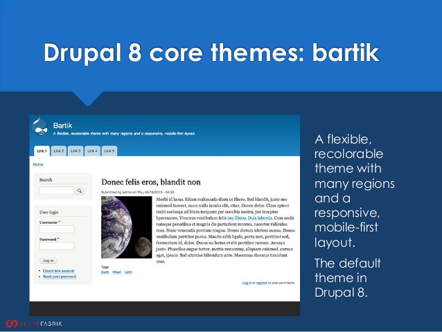
All the Drupal 8 themes have also been transformed from desktop only to mobile first along with a useful backend platform along with a new default theme Bartik. Now that is remarkable!
Responsive images
Apart from making the web ecosystem easier to access for mobile users, Drupal has also made it easier for Drupal-developers to build them. In Drupal 7, developers were required to resize each image individually for platforms using image style but with Drupal 8 you just have to enter the responsive picture element regardless of its usage on the page and it automatically resizes itself according to the device accessing the image.
Drupal 8 has an in-built breakpoint mapping and image formatter which not only reduces the weight of the file and helps it to load faster but also make it visually attractive.
Website accessibility
In order to make websites more accessible both on mobile and desktop, HTML5 is introduced in Drupal 8 which makes it easier for developers to reach their desired goals.
Also, to enhance the accessibility of rich internet applications, WAI-ARIA support is added, which comes with several improved features making websites more accessible on different devices.
Flexible tables
The built-in breakpoints in Drupal 8 keep a check on the height, width, and resolution of all the elements which help the platform in successfully effecting an ideal transition in-between different platforms.
Table format is included which helps to prioritize columns that will hide automatically upon reaching the breakpoints. It is classified into low, medium, and high priorities where the columns belonging to medium and low will hide at the mobile breakpoint resulting in a faster rendering, hence, bettering the overall user experience.
Mobile Administration
Managing content on mobile has never been so handy with the advent of Drupal 8. The toolbars and layouts adapt to the device you are working on making it easier to bring changes from any device regardless of its screen size.
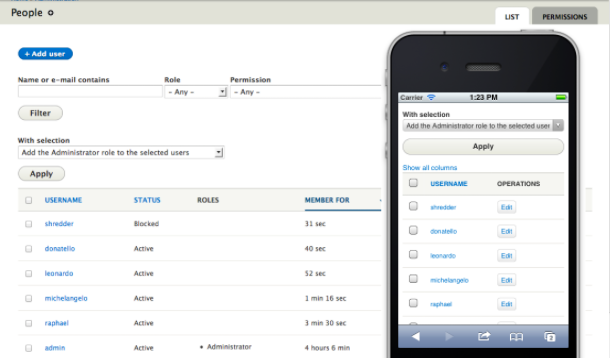
For instance, if the website is being accessed using mobile then the Mobile friendly navigation toolbar would be displayed hiding the Administration Menu and vice versa.
Some Modules which serve mobile responsiveness:
Retina Images
Retina Images solves this problem for Drupal by adding an option to the image effects that come with Drupal core to make them output high resolution images that look good on these Retina displays. I’m sure you’ve already heard of this whole Retina thing in one context or another. Well, it’s about high pixel density displays that basically render your images crappier than normal displays if the image resolution is not high enough.
FitVids
FitVids is a module that handles videos for your fluid layout so you don't have to worry about that. You know, when you embed YouTube or Vimeo videos they come with a specific size. Well this takes care of that and makes them resize automatically based on the container they are in. And for this it uses the FitVids.js library.
Tinynav
This one is about navigation. Tinynav implements the tinynav.js jQuery library to transform your menu into a select dropdown on small devices. I’m sure you’ve seen it on websites. You resize the browser and the main menu turns into an HTML select list with options that link to the menu pages. Pretty cool so do check it out.
Mobile Theme
Mobile Theme is an interesting module that allows you to select a different theme to be served on mobile devices. There are a couple of themes made specifically for mobile phones that you can use for this purpose. And I know, this is not precisely responsive, but I decided to add it because of its mobile friendly character.
The remainder
Understanding the emerging trends of the digital world and balancing them is one of the qualities which makes Drupal an ideal CMS for mobile. The entire credit for maintaining with pace of trends and evolving with them rests with its vibrant and thriving community which strives to provide best experiences to web users all over the world. We at Opensense Labs have been delivering responsive Drupal platforms to businesses in need. For your development needs you can reach us at [email protected].
Subscribe
Related Blogs
What is HTMX & How it Works for Server-Driven Web Interfaces?

“HTML was designed to explain user interactions. HTMX pushes that behavior back where it started, the markup itself." This…
DrupalCon Chicago: Key Product & AI Updates

“The DrupalCon Chicago keynote looks back at Drupal’s 25-year journey while outlining how the platform is evolving. It…
DrupalCamp Delhi Returns After 6 Years: Here’s What to Expect
“After the COVID period, this marks the first time the camp is returning to Delhi. Over the years, the camp and the local…