You don’t want people to treat your website as an outcast. You don’t want to be the ugly duckling in this sharp, serious and extremely competitive world.
Correct?
Thus, owning a professional looking website becomes an important platform for all sorts of business. It doesn’t really matter whether you are planning to make money or not, treating your website just like your employees is a must.
Why?
Well, because it creates an impression of your business, a place where people come to see who you are and what you want. Whether it is a big e-commerce site or a one-pager - a good website would always bring values to you and your company.

As important as the website is for you, the themes contributes highly to the user experience and functionality of a particular site.
Your theme is the overall look, feel and styling of your website and the very first thing which the audience witnesses. And nothing can beat Drupal in this area.
Beginning with the Zurb Foundation
So here is Zurb foundation for you.
Zurb Foundation is the prototype theme that is used to prototype in the browser. It allows you to rapidly create a website or application while leveraging mobile and responsive technology that is well tested.
The front end framework is the collection of HTML, CSS, and Javascript containing design patterns. These design patterns help the user in persevering time by helping them to dodge boring, boilerplate codes. The sites that are built on this foundation works great when there are multiple screens which include laptops, mobile phone, PC, iPad. The reason is that Zurb foundation has a responsive framework that uses CSS media queries and a mobile-first approach.

Different versions of Zurb

Zurb Foundation 3
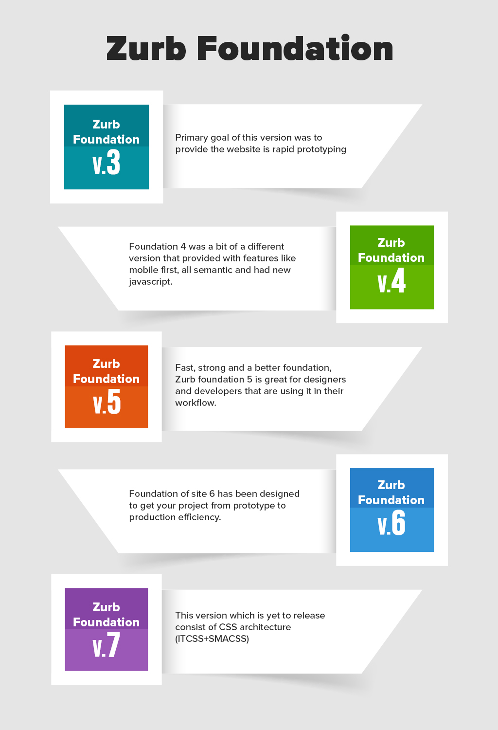
If the primary goal for your website is rapid prototyping then Zurb foundation 3 is for you. This theme is developed in Sass, which is a powerful CSS pre-processor that helps you to write, clean and organize CSS which can be maintained easily over time.
One of the biggest advantages of using Zurb Foundation 3 was the shift of development of the framework to Sass and compass rather than pure CSS.
Sass grants the user with variables, functions and powerful mixin that speeds up the development of framework as well as made the code more coincide.

Zurb Foundation 4
This version of Zurb foundation brought many new functionalities and changes in its framework. Started from being a mobile-friendly theme, Zurb foundation 4 supported some complex layouts, grids, and media queries.
This version brought about flexible and powerful built-in tools with the advantage of it being accessible to different screen size (new, simpler syntax that better reflects how the grid works)
Apart from this, Zurb foundation 4 is all about semantics. Users were granted with the power of removing and writing all the presentational classes from the markup with built-in sass mixins and extensions.
Zurb Foundation 4 also presented the users with some splendid plugins that worked well with AJAX.

Zurb Foundation 5
Fast, strong and a better foundation, Zurb foundation 5 is great for designers and developers that are using it in their workflow. The foundation specifically focused on smart coding that introduced the users with better coding practices. And if it is a team then this would give them an idea to start from a common point. The advantage: It helped them to put together all interactions and workflow in a shorter period of time.

Zurb Foundation 6
Foundation of site 6 has been designed to give the users with production efficiency in their project. It includes a wide range of modular and flexible components that are not only lightweight but easy to maintain as well.
Foundation 6 is also half the size of foundation 5, in other words, there was a reduction of 50 % code. All these codes have come with ARIA attributes and roles alongside instructions.
The base style in foundation 6 act as a coded framework, which makes the work of the user even more easy and flexible. Simpler CSS styles allow the user to easily modify them and fit it according to their needs.

Zurb Foundation or Bootstrap?
If talking about Zurb and its different version, bootstrap tends to make its way between all this.
How?
Well, because Bootstrap and Zurb are the major participants when it comes to web designing methods. Often designers and developers seem to get lost in the mist while battling and choosing between one.
| Zurb Foundation | Bootstrap | |
| Community | The community here is smaller as compared to bootstrap but it is growing with decent technical support. | The community here is smaller as compared to bootstrap but it is growing with decent technical support. |
| CSS Preprocessor | Foundation supports SASS | Bootstrap also supports SASS but it is a less camp. |
| Customization | Minimalist approach to its pre-built UI components giving room to the designers to create new things. | Bootstrap consist of basic GUI customizer which most of the time doesn’t allow the users to create something new. |
| Browser Support | Supports Chrome, Mozilla Firefox, Safari, opera, android | Supports Chrome, Mozilla Firefox, Safari, opera, android, and IE8 |
| Grid System | Foundation was the first one to go mobile friendly and adapt to the grid system. | Bootstrap has ample of time to bridge the gap in terms of features and functionalities. |
| Advanced Feature Elements | Zurb foundation of X-y grid, responsive tab, off-canvas etc | It is customizable with a variety of designs. |
| Releases | Zurb has more releases w.r.t the development requirement. It has 6 releases and the 7th one is yet to come. | Bootstrap has 4 release. The 4th release was on August 19, 2011 |
Why choose Drupal for Zurb foundation?
When building a website what is the very first thing which the user sees?
Content? Functionalities? Information? Or Layout?
Selecting the theme and functionalities of a website is one of the most primary decisions that a website owner has to make and Drupal is the CMS that can help you achieve this task. It has about 1,316 themes where each theme has a variety of strengths
Out of which Zurb Foundation theme is grid-based, mobile first CSS. When used with Drupal, Zurb provides efficiency to the front end developer. It is a platform-specific method that helps you achieve various functionalities.
- The foundation XY grid (in timeless condition) allows the user to easily create and layout Drupal content.
- The top bar of the foundation is combined with Drupal’s menu navigation and works well with submenus.
- The off-campus region in the Zurb foundation are available as Drupal blocks and the menu bar that is placed in this region are automatically themed.
Creating Sub Themes
It is imperative that the user creates a sub-themes that allow Zurb foundation to apply on any website.
There are two ways of creating a sub-theme:
Drush: Drush is basically a command line access to common Drupal administrative tasks and configuration. The user can change the directory with the help of Drush.
Manually: The user can also create sub-themes manually. They can complete the task by expanding the theme folder and then replacing it with starter files.
Contributed Drupal modules that can be used with Zurb
The Zurb foundation aims to do theming without the help of any dependencies but there are many modules that help in theming better.
Modules like panels, block class, display suite, special menu items.
Panels: Panels module allow a site administrator to create customized layouts for one or more users. It provides an API that allows the configuration and placement of
blocks into regions.
Block Class: Block class allows the user to add classes to any block through the block’s configuration interface.
Display Suite: Display suite allows the users to take control over content fully using drag and drop interface.
Menu Items: This module allows the user to create dropdown divider and all sort of headers in the navigation menu.
Case Study on MIT Press CogNet
MIT Press CogNet is an essential online resource for all the students and scholars that are into cognitive sciences.
The objective of this project was to provide a completely responsive design in all devices for the users. An organization worked closely with the CogNet team. With the CogNet team, they developed a basic wireframe. custom Drupal theme based on the zurb foundation was built.
Zurb foundation theme and sass for CSS preprocessing were used to rework the already existing theme. To guarantee a seamless experience on any type of screen the developers used jQuery to construct slick navigation, scrolling, and content exploration.
The results were eye-catching. From being a desktop-only website, MIT Press CogNet was modified into an accessible one where the users were able to view it in any device. The biggest achievement of the whole procedure was that it was done under the budget provided by the organization.
Future of Zurb Foundation
Zurb is yet to launch another version of the architecture (ITCSS+SMACSS).
Zurb Foundation 7 separates the view layer from the logic layer to make it easy and reliable.
It would dramatically improve your freedom to shift between JavaScript frameworks with a super-powerful pluggable JavaScript architecture. In short, there are two major changes that would take place in Zurb Foundation 7
The first one as mentioned would dramatically let user shift between javascript frameworks with javascript architecture. UI framework today tends to either go in one framework or have different and independent ports for different JS framework.
And yes, the second major change in the foundation is the ITCSS based architecture with the usage of SMACSS. This would make it easier to build and maintain scalable sites and themes.
Conclusion
Remember that themes are connected to the protagonist's internal journey. It is not just the visuals but it is also the journey of the user experience that they would have while going through your website.
At OpenSense labs, we understand how important it is to create a website that matches your goals and objectives. Ping us at [email protected] so that we can arrange services to make your website what you have always hoped for.
Subscribe
Related Blogs
Exploring Drupal's Single Directory Components: A Game-Changer for Developers

Web development thrives on efficiency and organisation, and Drupal, our favourite CMS, is here to amp that up with its…
7 Quick Steps to Create API Documentation Using Postman

If you work with API , you are likely already familiar with Postman, the beloved REST Client trusted by countless…
What is Product Engineering Life Cycle?

Imagine constructing a house without a blueprint or a set of plans. It will be challenging to estimate the cost and labor…


