7 best practices for creating a great e-commerce website
Running a successful E-commerce website comes with a lot of pros, but also features a ton of challenges one must overcome. Arguably, the most challenging aspect of running an E-commerce website is having to wear multiple hats. Not only do you have to provide a quality service or product, but you also have to tackle stuff like marketing, writing content, and come up with SEO-optimized product descriptions. On top of that, you need to keep an eye on all the latest developments, as well as your competition.
Speaking of which, there are currently 12-24 million E-commerce websites on the web, and the figure will continue to grow in the future. Of course, not all of those websites are hugely profitable, and only a small percentage of those are earning any serious money. This is actually good news, since there is plenty of room on the market for those which are just starting out. Also, the E-commerce industry grows 23% year-over-year, and despite that, there are still 46% of small businesses in the US without a website.
With that in mind, let’s take a look at seven things you need to keep in mind in order to make your E-commerce website successful.
1. Make Sure the Website Design Reflect Your Products
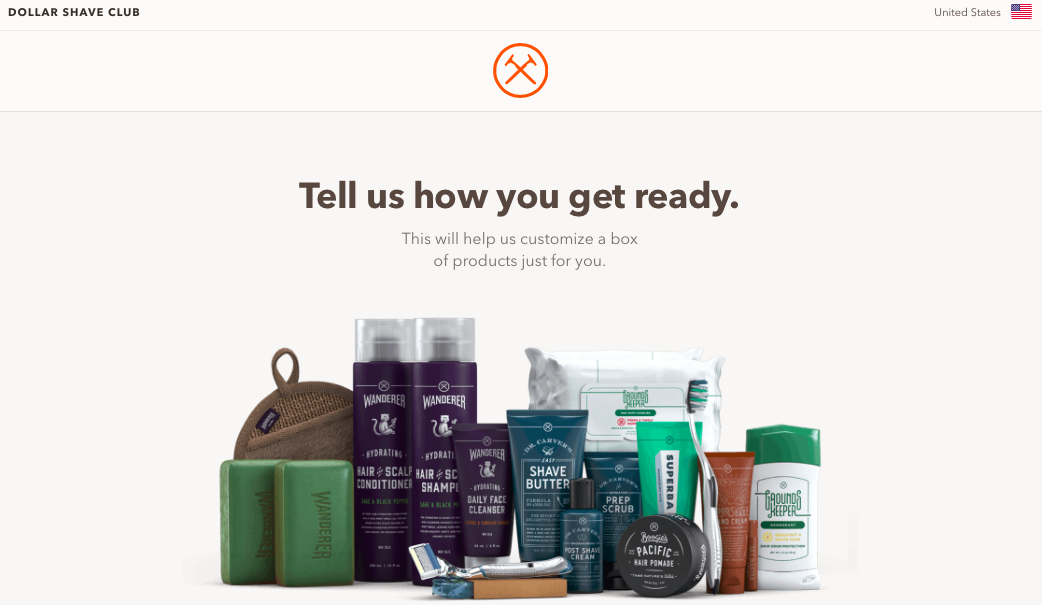
In addition to adhering to the latest trends when it comes to web design, your website’s look, and overall feel should match the products you are selling, whether we are talking about jewellery or customer papers. This applies not just to the theme of your E-commerce website, but also its fonts, images, tone, and color schemes. For instance, if you are selling toys online, you can get away with your website being more colorful and less serious. If you are selling beauty products for women, your website should feature lighter, pastel colors. And if your target audience is mostly male, then the best example out there is the Dollar Shave Club.

2. Simplify Website Navigation
One of the key elements of providing a great customer experience, according to Do My Essay web designer Tim Connor, is enabling your customers to find what they need in just a couple of steps. This includes your website’s navigation and menus. Regardless of how diverse your offering is, putting everything into separate categories will only overcomplicate things and confuse your customers, and they will go somewhere else to do their shopping. For example, if you are selling clothing and apparel, have only a few categories which allow customers to find the desired items, instead of being super-specific. For instance, The North Face displays only a few categories on its navigation bar.

3. Add a Search Bar
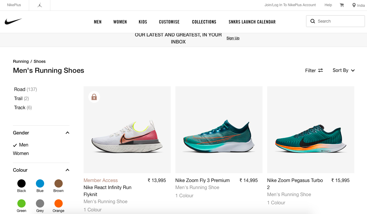
Now, having a streamlined menu can only take you so far in some cases, especially if your product line is very specific. Now, once your customers access any of the categories, they should be able to view all of the subcategories, but you should also include a search bar for those who don’t want to flip through different menus. This works especially for E-commerce stores which have hundreds or even thousands of different items in their selection. One of the best examples of search bar implementation and search filtering is Nike’s website, which allows you to search for their items by name, gender, type, size, color, or even their designer.

4. Do Your SEO
It is pretty much an ideal situation when people are visiting your website directly. But, if you are a small hardware store or a brand new resume writing service, you will have to work hard in order to show up among the top search engine results, since 46% of all searches start with a search engine. The solution to this is to do SEO, because it directly affects your Google ranking. Since Google looks at over 200 major and over 10,000 minor SEO signals, it’s best that you focus on the three most important ones: great content, keywords, and link building. This brings us to our next point.
5. Start a Blog
When it comes to content and SEO, you can only do so much on your website. On top of that, you can’t count on your customers to visit your E-commerce website every day. But, even if your customers aren’t making purchases from your footwear or custom writing service, you can still keep them engaged by starting a blog and publishing on a regular basis. In addition to that, there is no limit to the number of blog posts you can create, with each one targeting a keyword and improving your visibility on Google. Also, once they are on your blog, they will be more likely to visit your store and purchase something, especially if you have provided them with useful information.
6. Don’t Forget About Mobile
Ever since Google has rolled out mobile-first indexing, mobile has become the primary way of consuming content. While it’s still lagging behind desktop when it comes to E-commerce, there are still plenty of shoppers who use their mobile to purchase products and services, so you need to cater to that customer base as well. Aside from that, regardless of how great your website looks on desktop, Google will take it down a few notches when it comes to ranking, because it’s not responsive. Your website needs to look and function as well as it does on desktop. There is no way around it.
7. Streamline Your Shopping Cart Design
For a lot of E-commerce businesses out there, the design of their shopping carts feels almost like an afterthought, when it should be anything but. It’s really tough to get people to your store to buy something, and if your shopping cart is poorly designed, it can undo all of your efforts. So how should you go about designing it? Well, first of all, it should be easy for customers to add new items to the cart with ease, and remove them. Second, it should feature relevant product images, ratings, and price. Third, it should show existing items inside the cart, as well as order summary, much like the shopping cart on Sephora’s website, which is simple, but very effective.

Conclusion
Running a successful E-commerce website is hard enough as it is, but it can be made a bit easier and effective by implementing the tips laid out in this article. You will be able to see the results in no time. Good luck!
Subscribe
Related Blogs
Why should you prioritize lean digital in your company?

We are living in an era where the change and innovation rate is just so high. If you want your organization to reach new…
How to measure your open source program’s success?

Along with active participation, it is very important to look after the ROI of open-source projects, programs, and…
Understanding the significance of participating in open-source communities

Do you think contributing to the open source community can be difficult? I don’t think so. Do you have to be employed by a…


